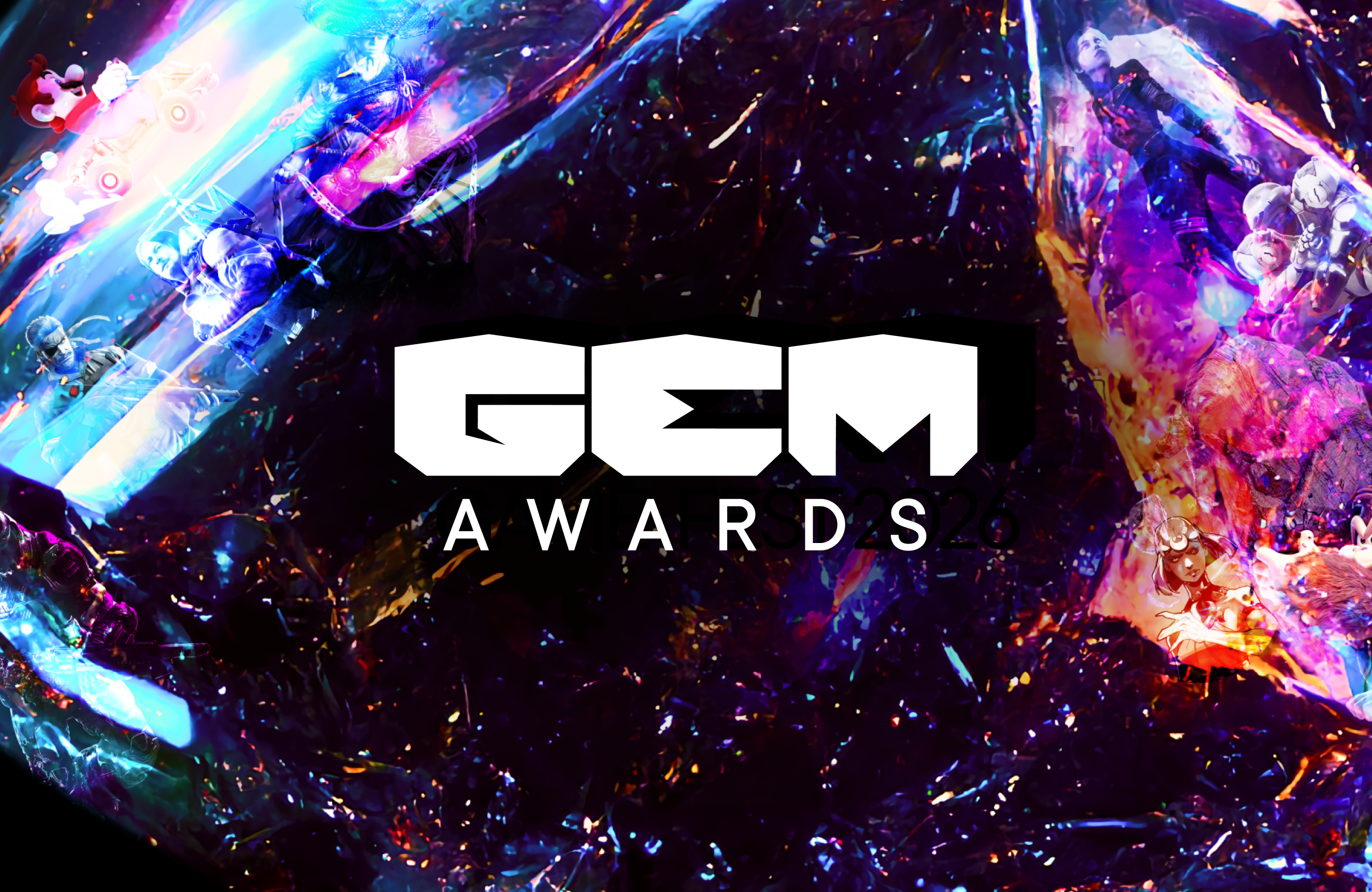
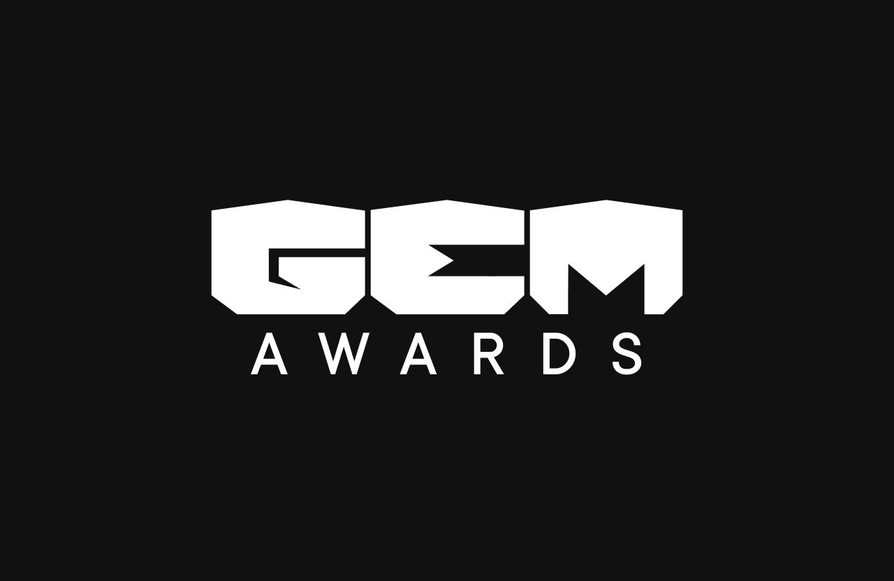
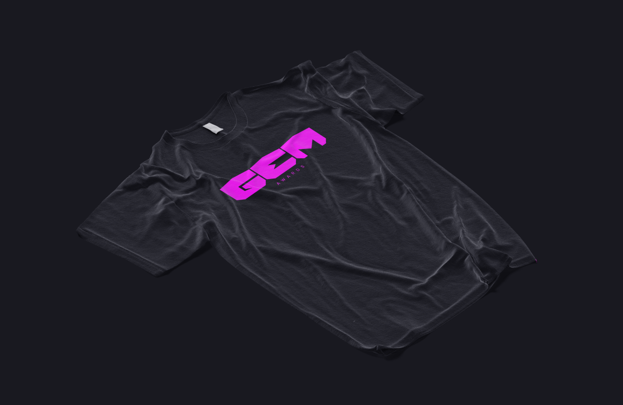
GEM
Awards
The global video game industry was facing a crisis of institutional legitimacy. For years, the sector’s major award ceremonies had operated within opaque structures shaped by powerful industry monopolies. Meanwhile, the true economic and cultural driving force of gaming, its community, was often reduced to the role of a passive spectator.

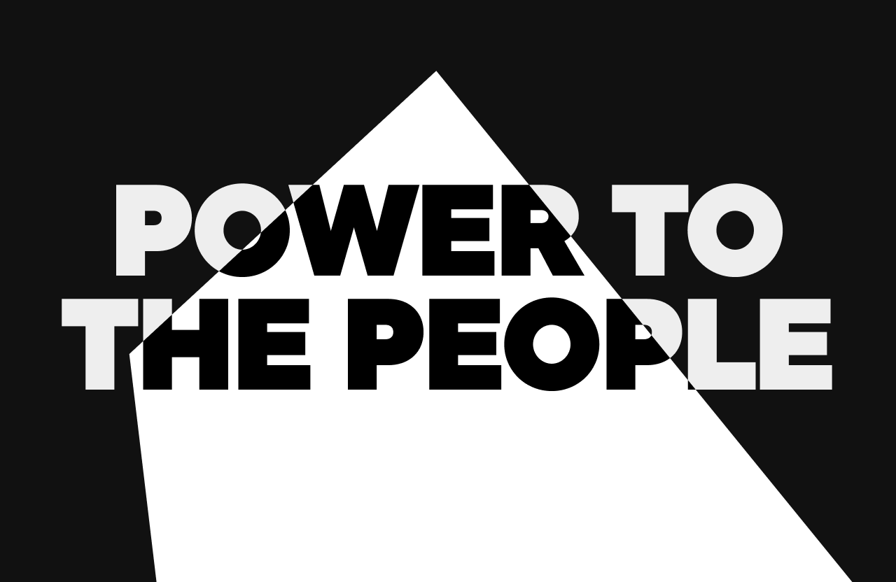
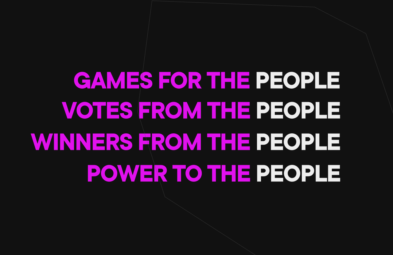
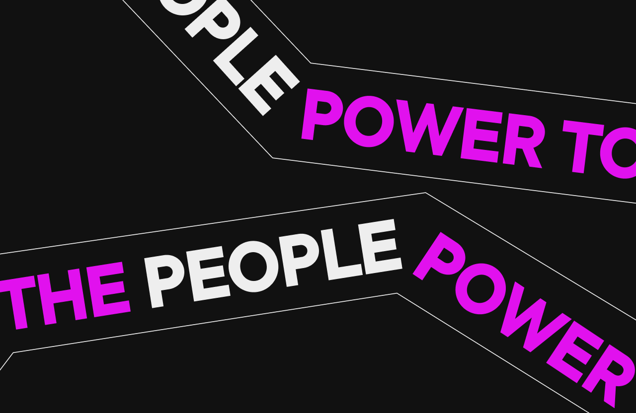
Power to the People
Under its uncompromising motto, “Power to the People”: Games for the people, votes from the people, winners from the people, the project required the creation of a brand platform capable of acting as a democratic catalyst for the gaming community.
For Personaje Studio, the conceptual challenge was to design an identity that could bring together two worlds that, at first glance, seemed almost opposite: the monumental presence, prestige and institutional weight of major cultural awards such as the Oscars, the Goya Awards or the Emmys, with the native, interactive, digital and decentralised culture of the gaming ecosystem.
We deliberately moved away from the overused visual clichés of the industry: cheap neon cyberpunk, generic robotic typefaces and noisy layouts. The goal was to elevate video games into the realm of high artistic expression, cultural relevance and strategic craft.

The Synthesis Behind the Name
The naming process required a rigorous exercise in linguistic distillation. After analysing and discarding dozens of proposals that felt too corporate, too descriptive or too literal, such as Stars Game Show, Madrid Gaming Gala, Gamer’s Glory Awards or Infinity Play Awards, we were searching for a word that was extremely short, memorable and conceptually strong.
The answer came through a precise formal and linguistic convergence: GEM.
First, it works as a subtle wordplay with the English word GAME, reducing it to its most essential and valuable form.
Second, it connects directly with the gem, a universal archetype within video game narratives and mechanics: the ultimate item, the coveted object, the reward for effort and a symbol of mastery.
Finally, by embracing its Spanish form, GEMA, the name immediately gained the classic and institutional resonance of the world’s great film and television awards, giving the ceremony legitimacy from the very sound of the word.
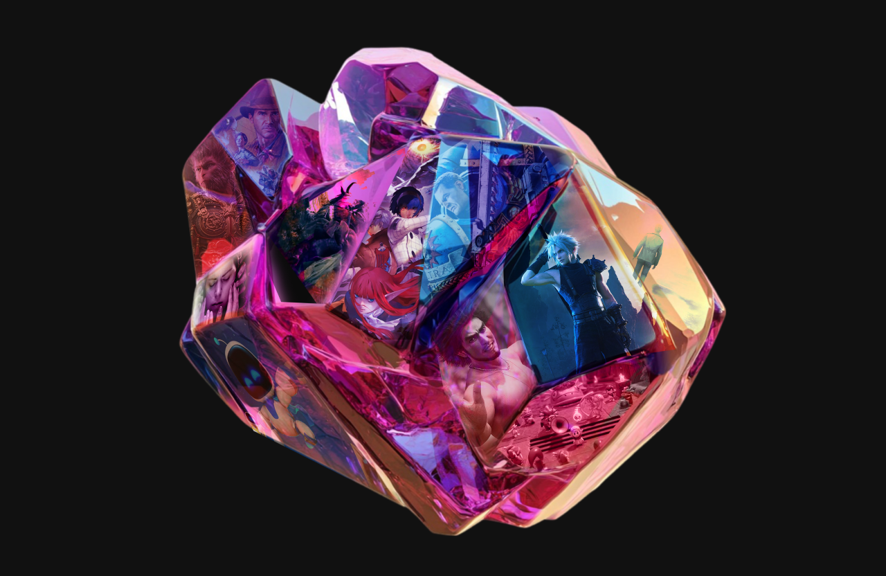
La Geometría Sagrada del Modelado 3D
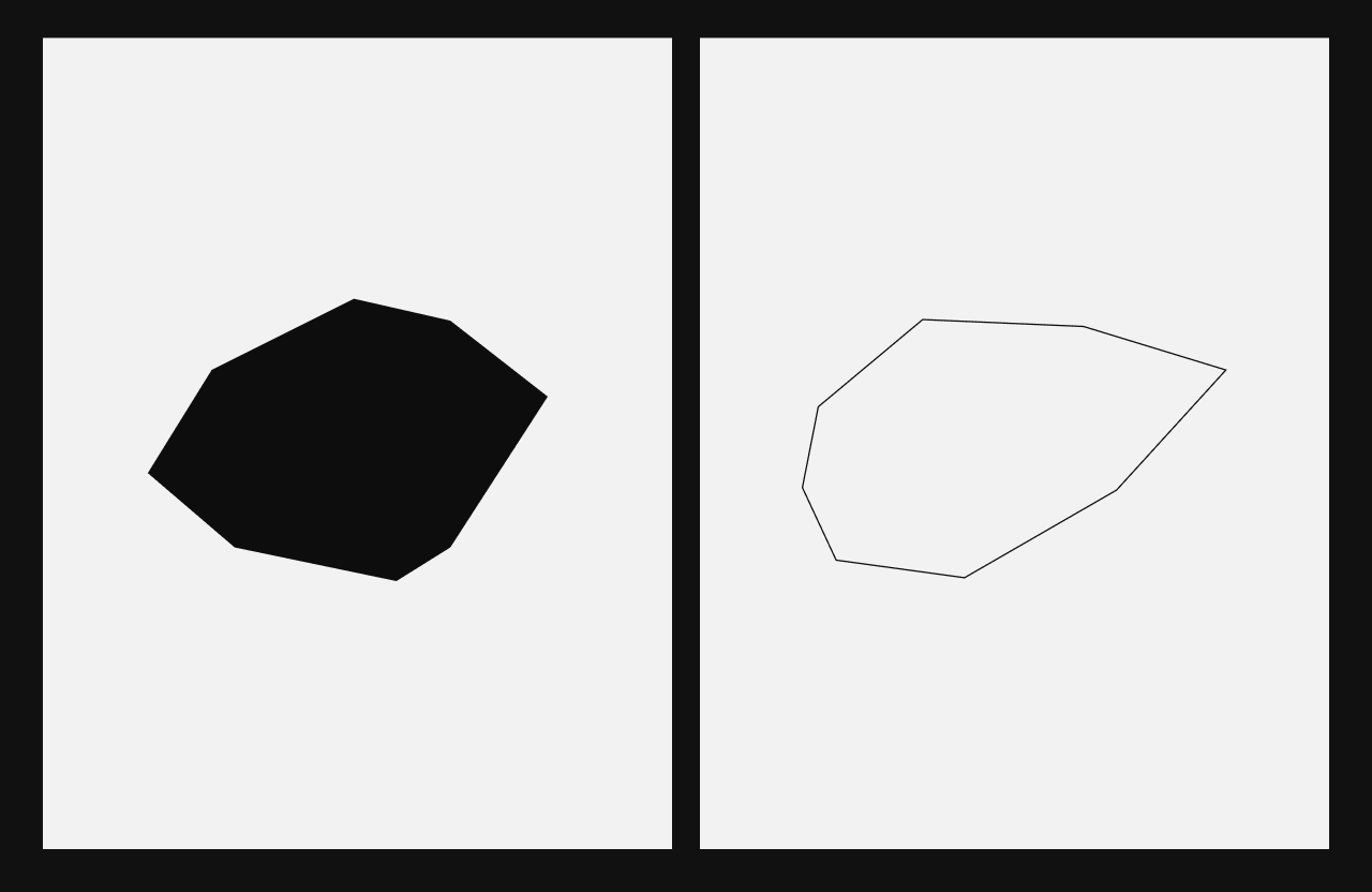
La dirección de arte se ancló en una analogía formal compartida entre la artesanía física y el desarrollo digital. El punto de partida fue el polígono. En la historia y técnica del videojuego, los polígonos constituyen los bloques de construcción esenciales para el modelado en tres dimensiones de personajes, escenarios e ítems. A su vez, las geometrías facetadas de los polígonos digitales guardan una correlación visual exacta con la estructura de las gemas preciosas pulidas.
Establecimos una transición morfológica pura: un viaje gráfico que parte del círculo de la pantalla y el píxel, se fragmenta a través de la retícula geométrica del polígono y culmina en la síntesis vectorial de la letra "G".
Esta decisión conceptual nos permitió estructurar un universo gráfico expansivo, donde la marca no se limita a usar un logotipo estático, sino que convierte la propia faceta en una ventana de expresión visual, un contenedor de contenidos y una retícula de layout para las comunicaciones.
Gems and Human Imperfection
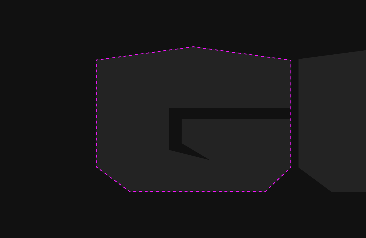
The GEM Awards logo was designed through a method of formal tension. It was built on a strict pixel grid, which allowed each anchor point to be positioned with absolute geometric precision. Yet one critical design decision shaped the identity: we deliberately altered the perfect symmetry of the characters.
The lower forms of the letters G, E and M echo the shape of a raw, semi polished gem. By intentionally breaking mathematical symmetry and adjusting specific anchor points to balance the optical weight of the logo, the mark suggests the presence of the human hand.
In a massive, highly industrialised and increasingly automated industry, this graphic gesture gives visual coherence to the brand manifesto. It reminds us that players and creators are the true protagonists.
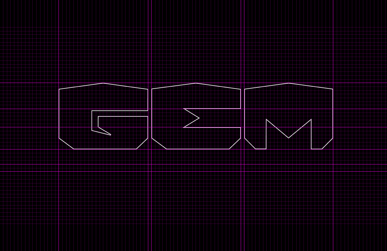
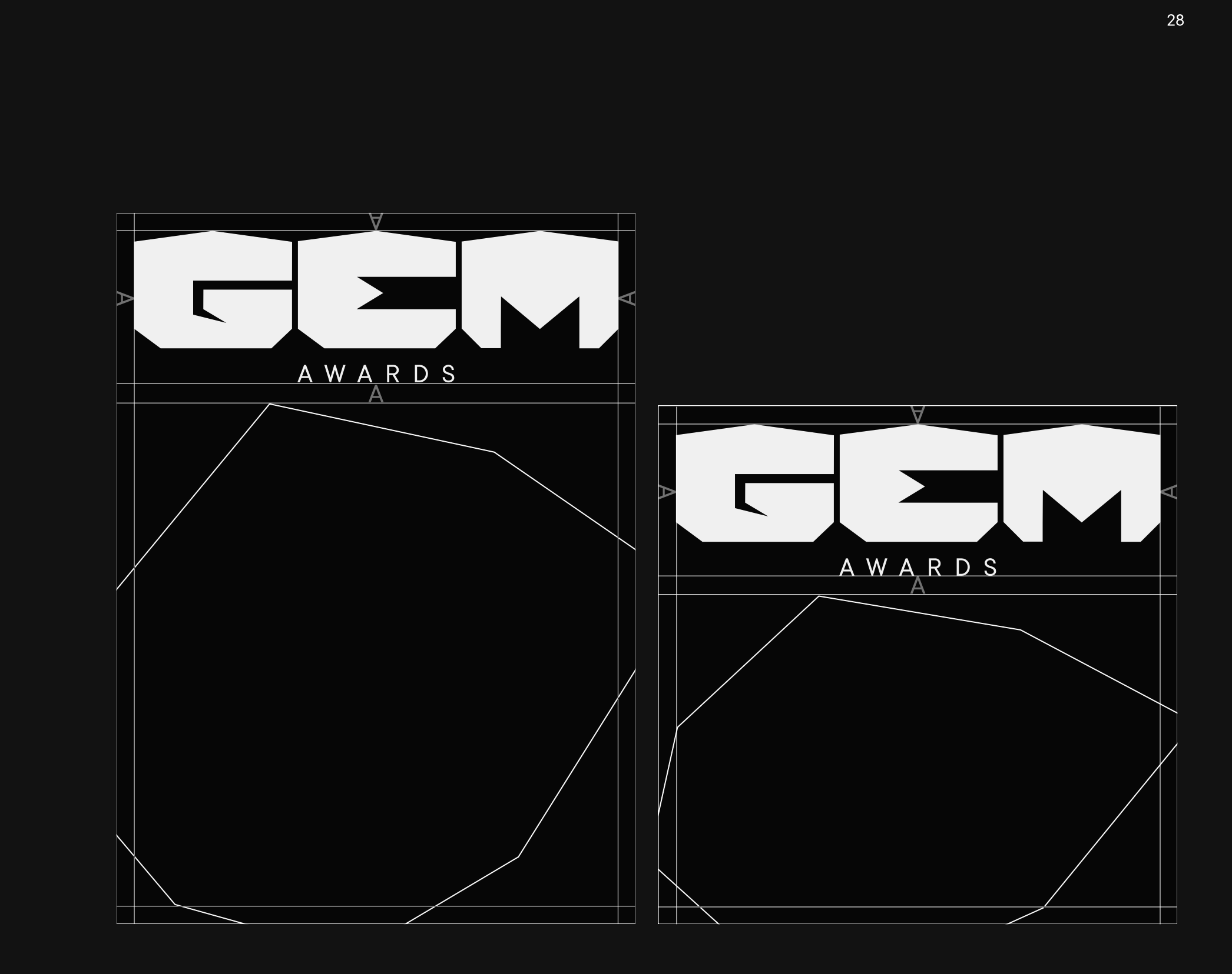
The identity system defines the behaviour of the logo block through precise microtypographic rules.
The “AWARDS” Descriptor: The placement of the word AWARDS beneath the main logo is governed by a mathematical variable. The vertical spacing and line height correspond exactly to the distance from the base of the inner hook of the letter G. At the same time, the full horizontal width of the descriptor is delimited by the exact margins of the central E in GEM.
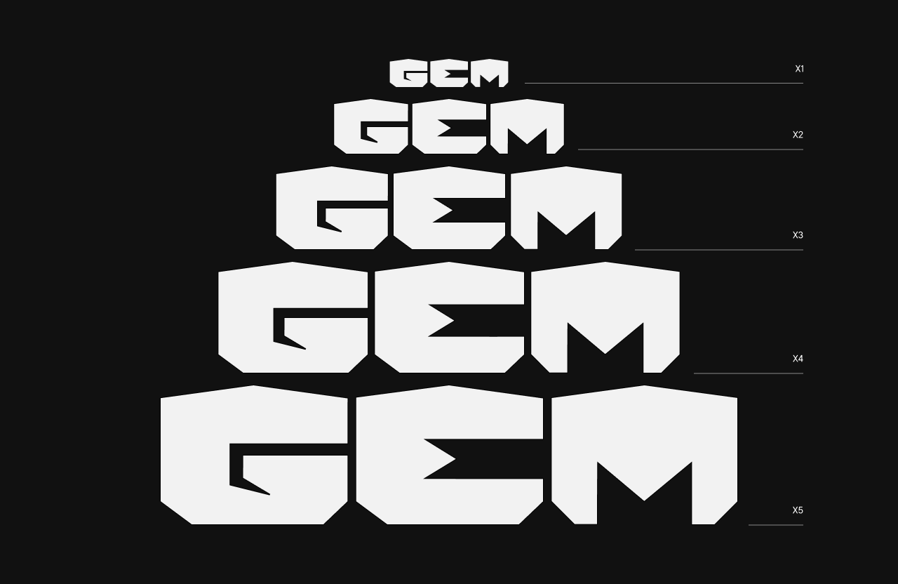
The Microscopic Scale Variant, X1: To ensure flawless legibility in small scale analogue and digital applications, we developed the architectural X1 version. The structural forms of the characters remain intact thanks to the strength of their construction, while the spacing between the G, E and M automatically increases by a proportional value of 1/2x at smaller sizes.
This prevents optical collapse and keeps the inner counterforms clear, even in reduced formats.
Textual Hierarchy
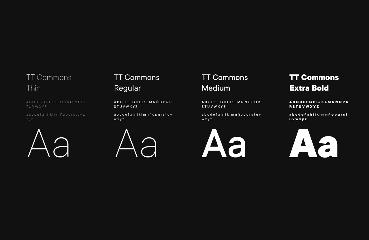
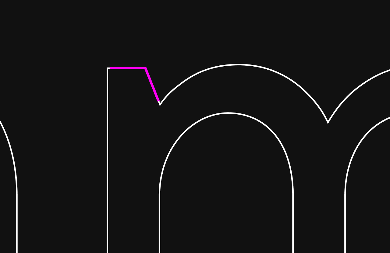
For institutional copy and corporate communication, we selected the TT Commons type family from Adobe Fonts. It is a contemporary geometric sans serif, versatile and subtly condensed, which fits naturally with the studio’s visual objectives.
What ultimately defined its selection was the typographic nature of its cuts, endings and terminals, especially in details such as the junctions of the i or the m. These forms create a clear dialogue with the angular geometries used in the construction of the logo.
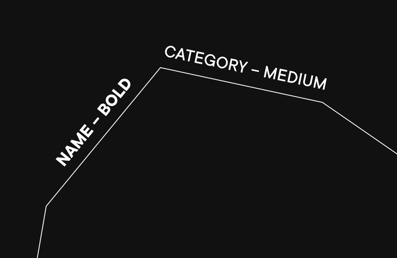
The typographic layout system establishes a precise semantic use of weight across all visual communications, especially when words are placed over the polygonal segments of the graphic gems.
TT Commons Bold / Extra Bold: Reserved exclusively for creator names, nominated video game titles and short key messages from the brand manifesto.
TT Commons Medium: Used specifically for award categories, such as Action RPG, as well as technical metadata within the layouts.
TT Commons Regular / Thin: Designed for longer explanatory texts, editorial blocks and secondary event details, ensuring clean contrast and optimal visual breathing space.
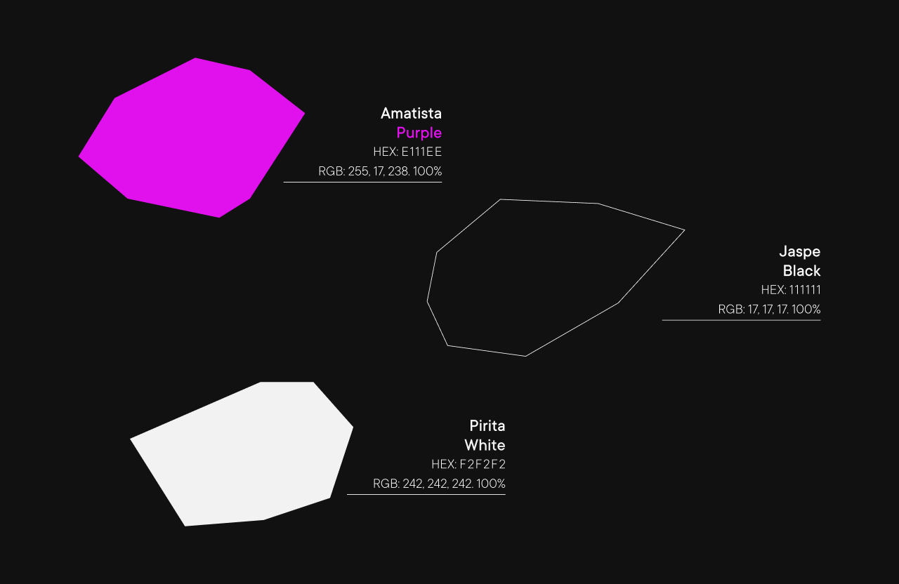
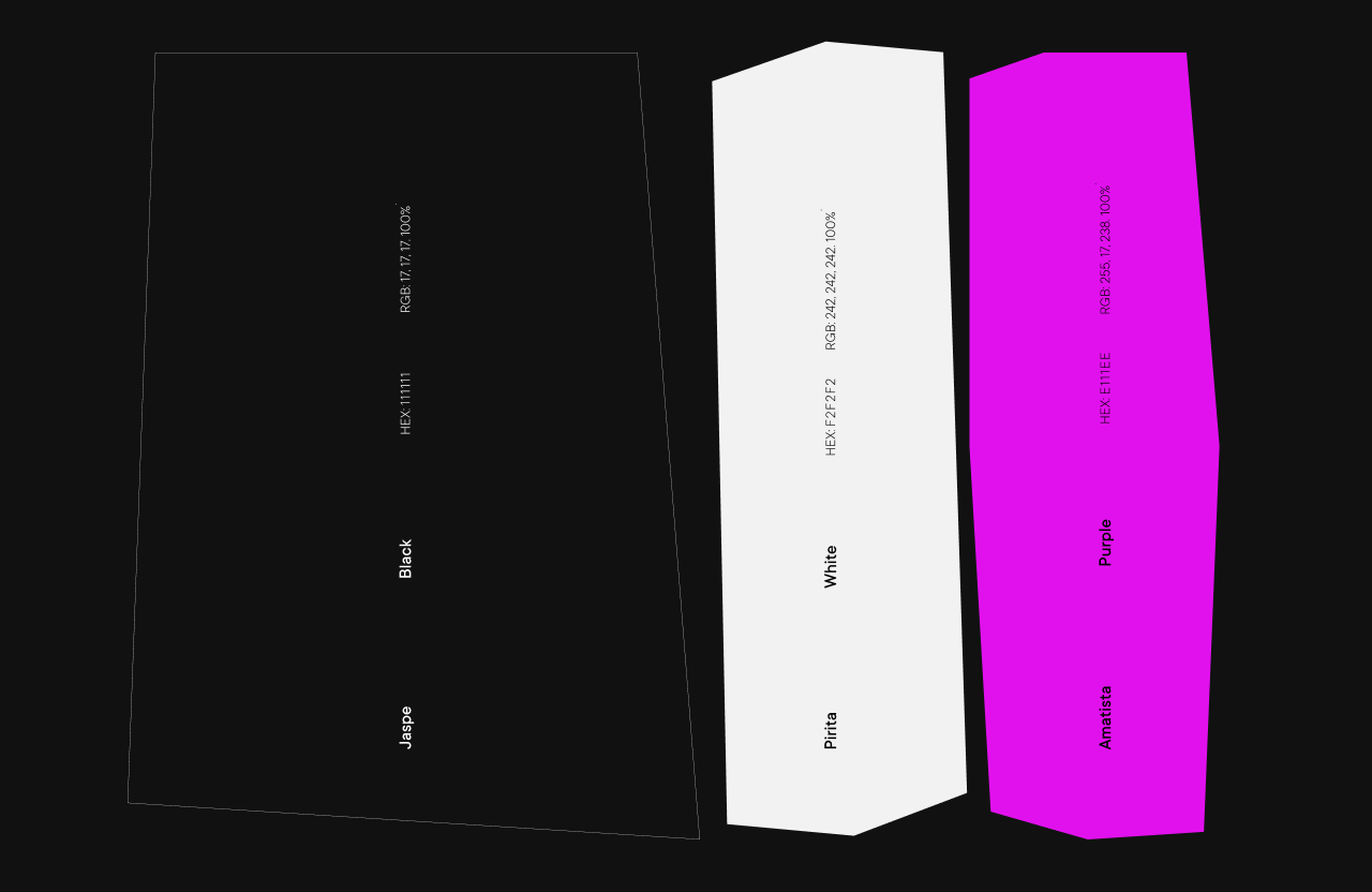
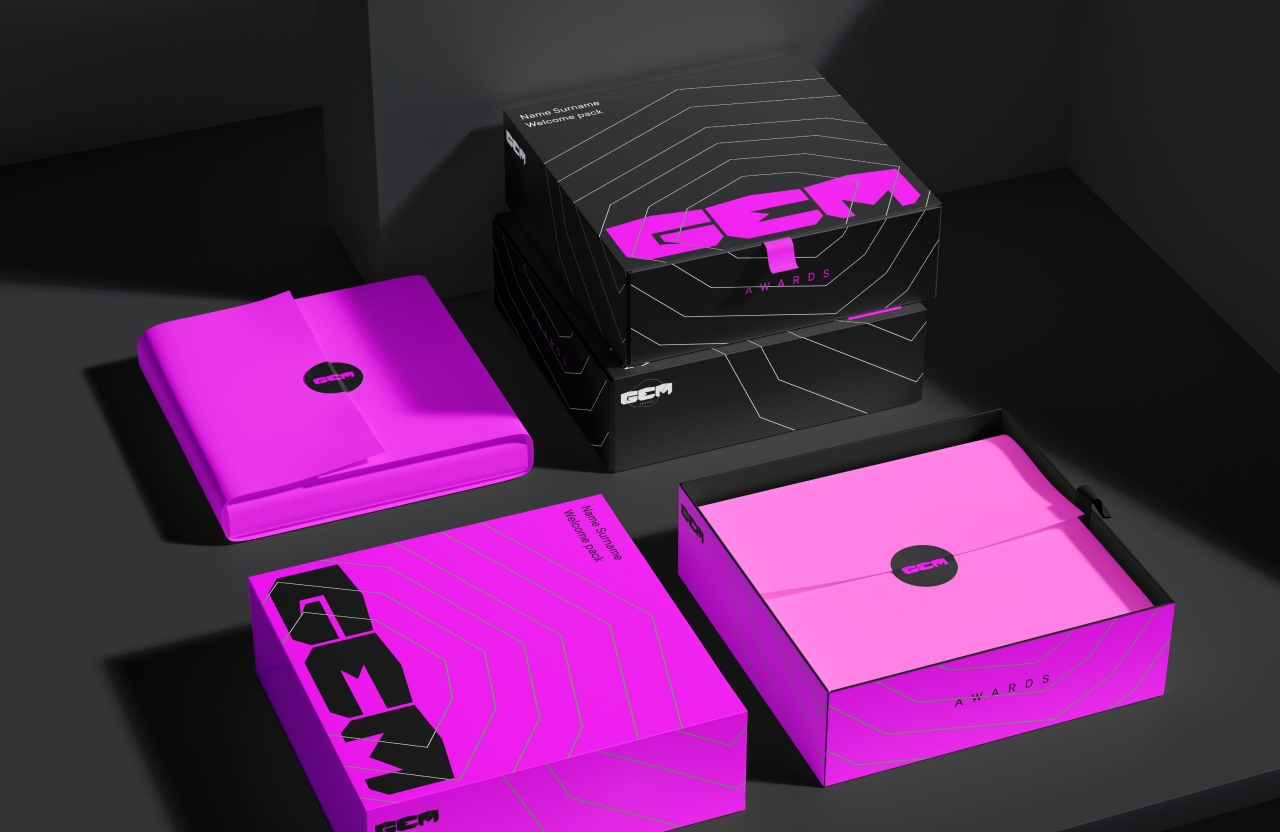
Mineral Chromatics
The colour strategy rejects the saturated light spectrum commonly associated with traditional streaming platforms. Instead, it adopts a palette rooted in the world of gemstones, with each tone named after the mineral that inspires it.
This conceptual approach elevates the perceived value of the event and brings consistency to the entire design language.
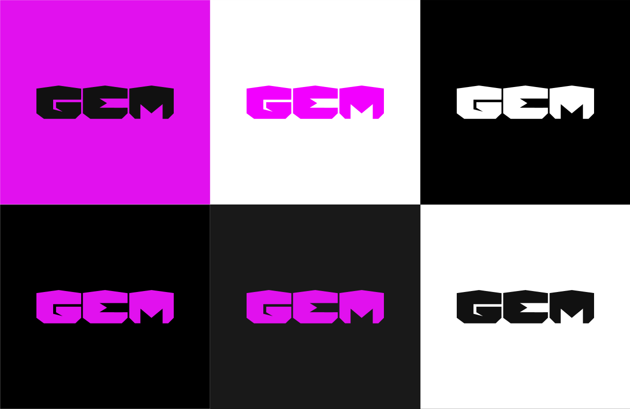
Black: The dominant identity colour of the brand. A deep, matte and immersive darkness that acts as the institutional canvas across all applications, screens and visual assets.
White: The primary contrast tone. An off white, mineral and solid shade that ensures maximum typographic legibility and purity in the inverted versions of the brand.
Purple: The main accent colour. A high energy tone that breaks the sober mineral base of Jasper and Pyrite, used strategically to highlight nominees, calls to action and the most powerful moments of the gala.
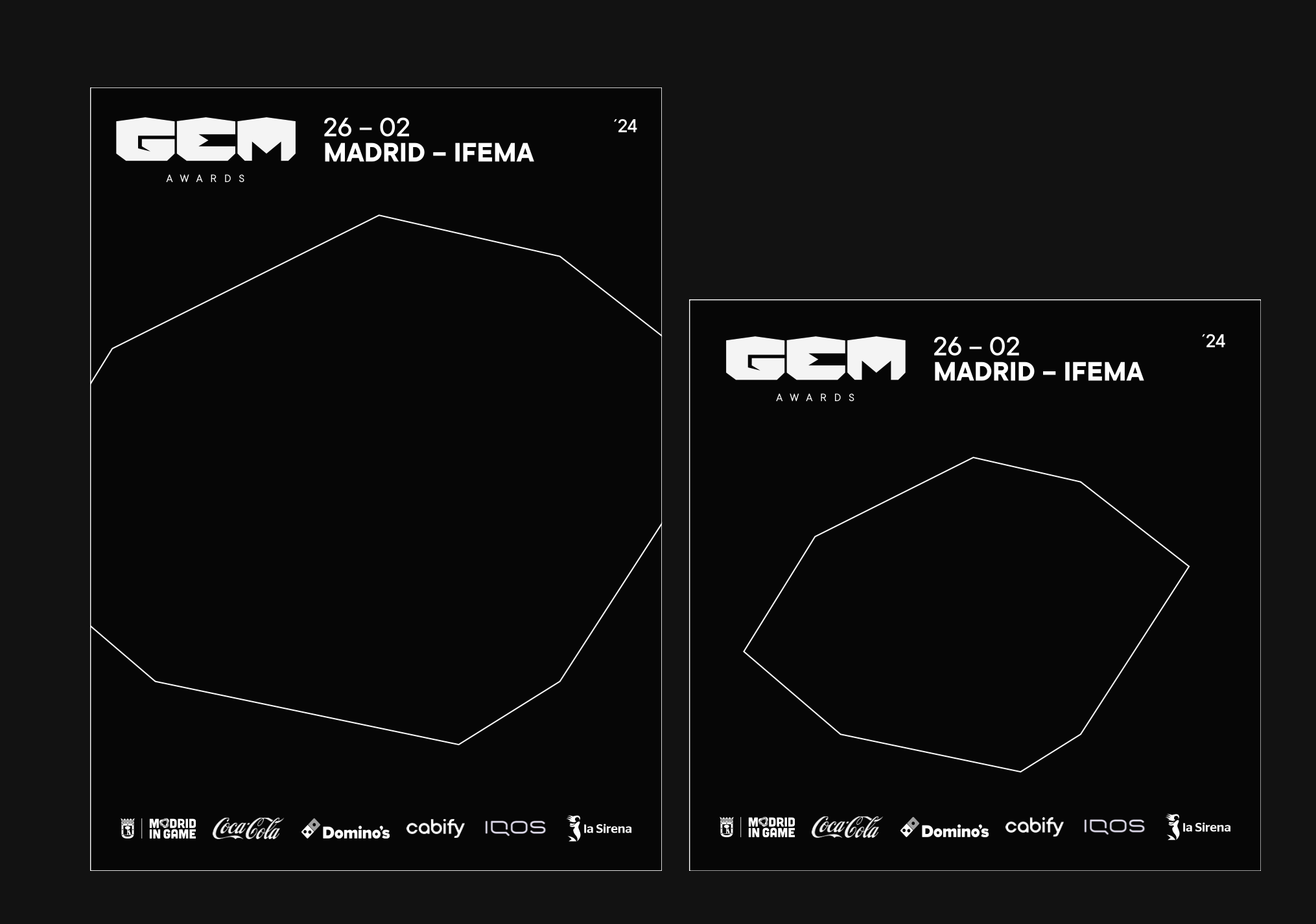
Omnichannel Layout System
The flexibility of the identity is expressed through the precise definition of its composition grids across both analogue and digital environments. The identity manual establishes three structural layout types designed to respond to any communication need, while keeping the brand system flexible rather than rigid.
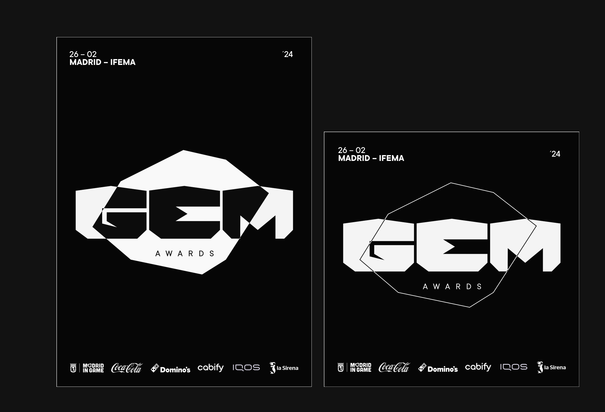
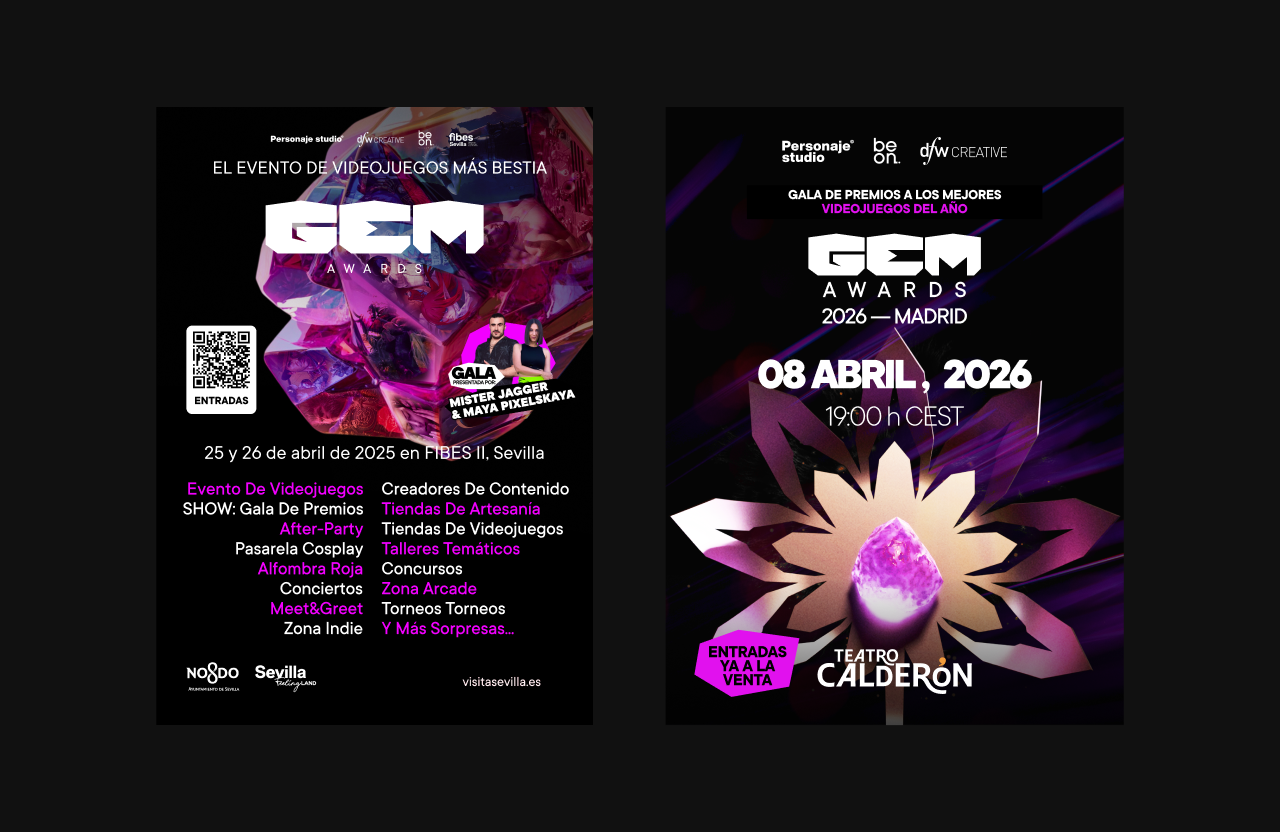
Basic Layout, Logo Centric:
Designed for iconic exposure and maximum institutional impact. The logo scales dramatically across the full available width of the frame and is positioned symmetrically in the upper centre of the composition.
The safe area and margin from the edges of the canvas are defined by the height of the letter A in AWARDS. Typographic assets and polygonal gem silhouettes used in the background respect this upper boundary, although they may expand to bleed through the sides and lower edge of the frame.
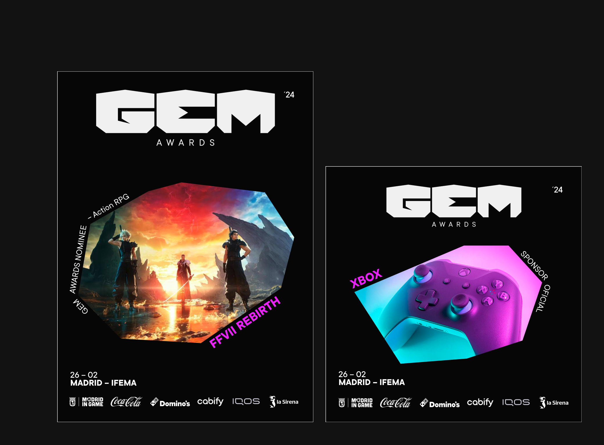
Promotional and Partnership Layout:
A modular structure created for communications where the visual weight is shared between nominated games, invited creators or official sponsors.
In this format, the GEM Awards logo is reduced and placed at the top. The geometric centre of the piece is reserved for the main communication objective, such as the cover of a nominated video game like Final Fantasy VII Rebirth, or an Xbox peripheral, framed precisely within one of the polygonal silhouettes of the brand’s gem system.
All complementary information, including dates, location and partner logos, is arranged in a clean and rigorous way within the lower band.
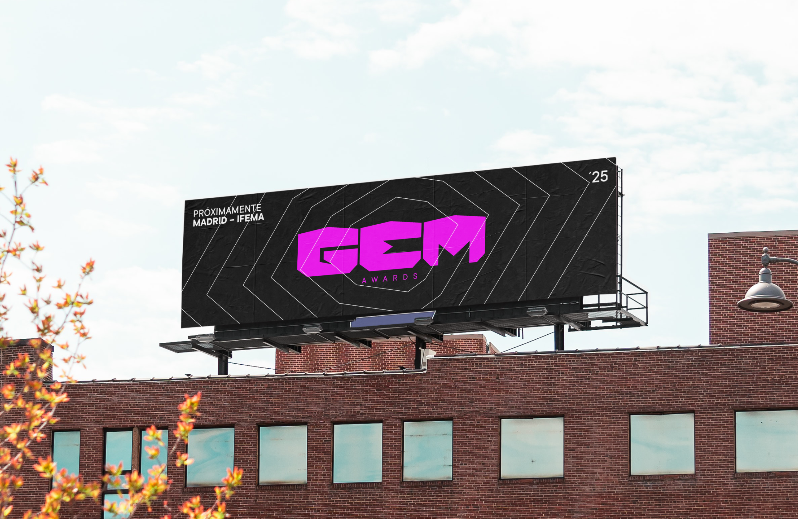
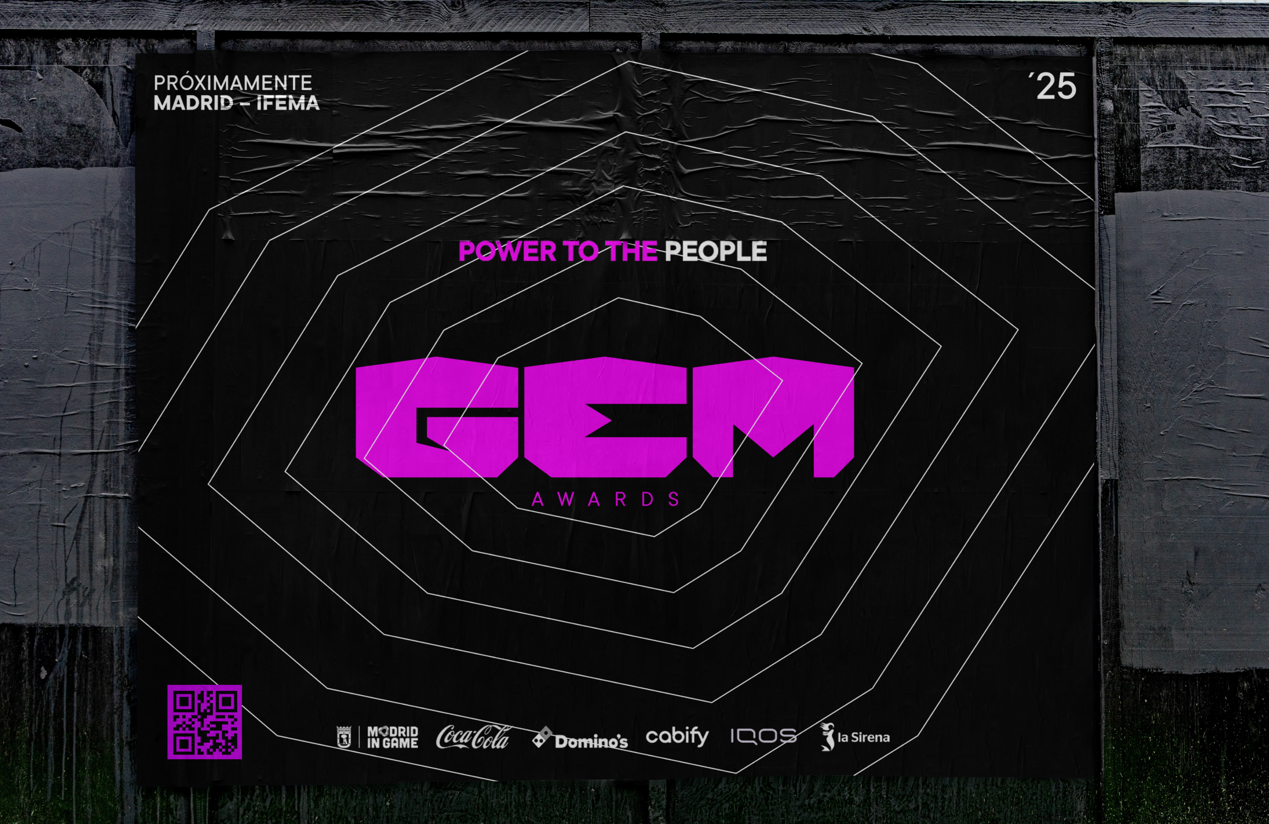
Large Scale Outdoor Advertising Layout, OOH:
Designed for large format public communication pieces, such as monoliths and urban billboards. The canvas is divided through an asymmetric hierarchy.
The institutional GEM Awards logo moves to the upper left corner, while the event date and the year mark ’25 are aligned on the upper right. The central block is fully dedicated to pure brand messaging under the Power to the People manifesto, using mineral silhouettes as typographic contrast masks through the Difference blending mode.
The lower plinth is reserved exclusively for sponsor logo architecture, applied in a flat monochromatic format.
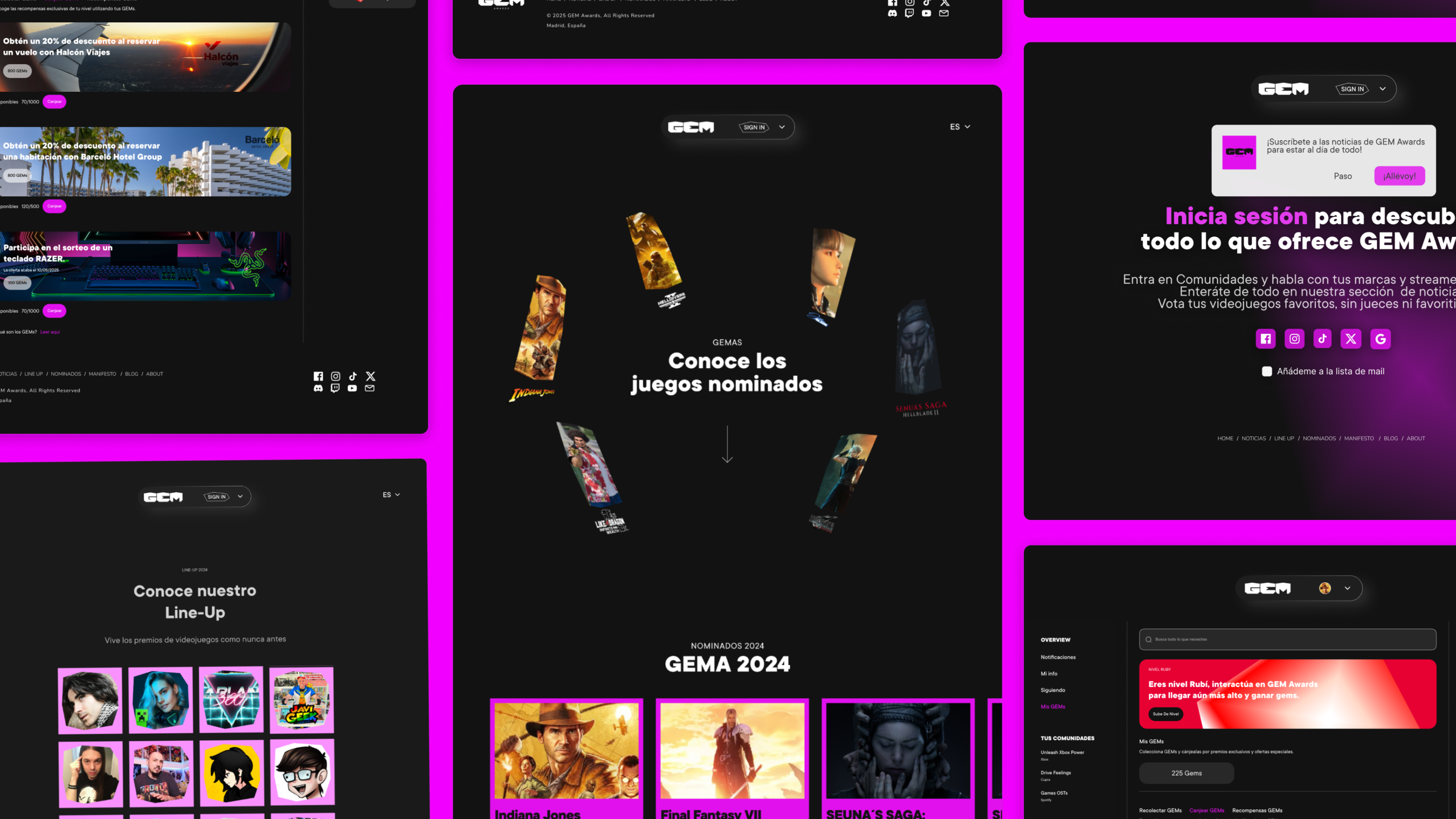

The Digital Translation
The brand’s digital ecosystem brings together all typographic, layout and colour rules into a strict, modular and type driven web experience.
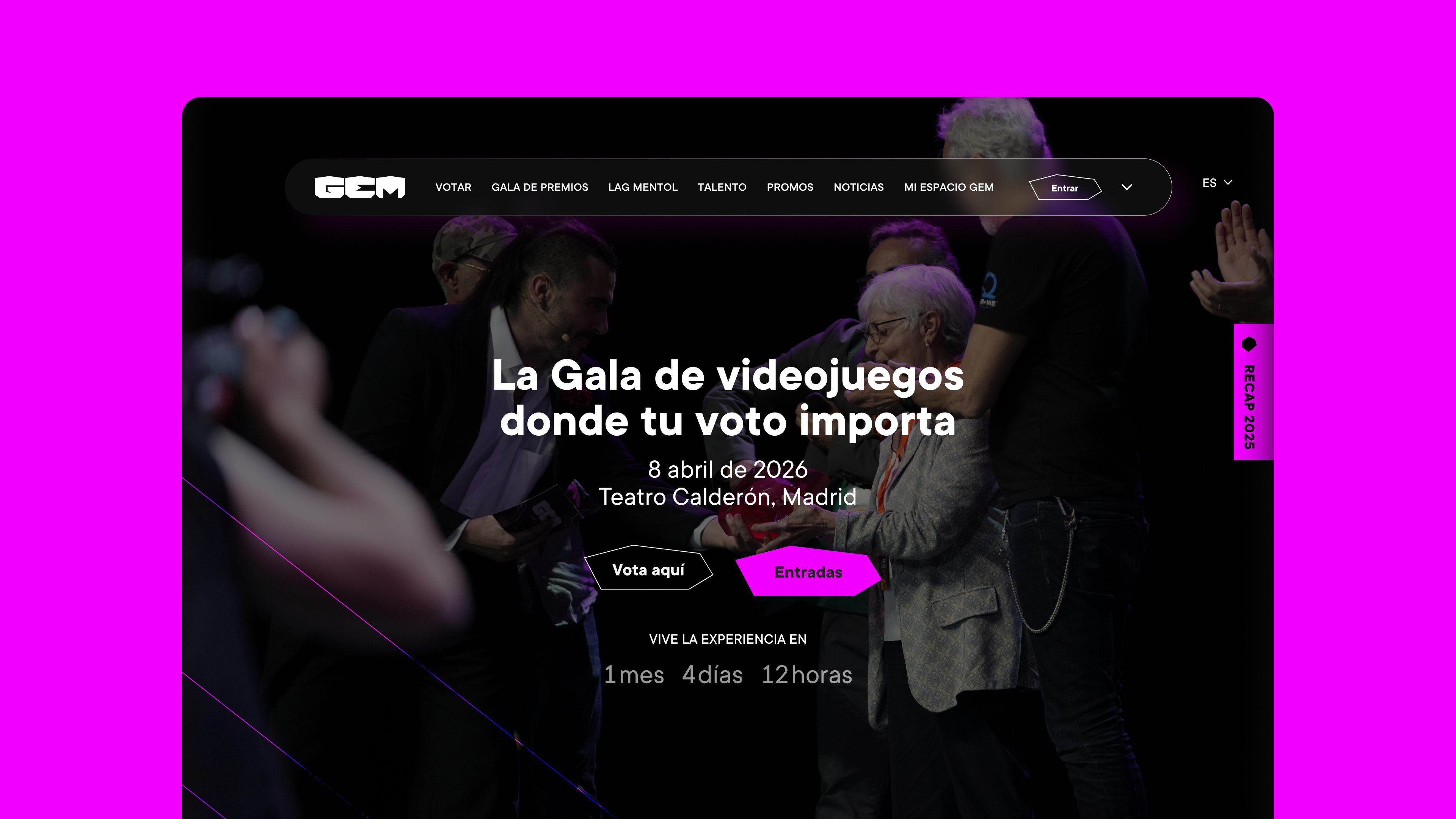
The interactive portal interface was built around a grid system where a large asymmetric silhouette of a polished gem acts both as the background and as the structural container of the main screen.
The top navigation menu organises the content with a clear editorial hierarchy: News, Event, Voices, Nominees, Manifesto and Q&A.
To build anticipation around the event, we designed a dynamic modular countdown component showing months, days and hours, enclosed within discreet octagonal polygonal shapes in the lower left corner. This sits in perfect hierarchy with the official trailer video player and the location information block for Madrid and Seville.
Within My GEM Space, the platform becomes its own social layer. Influencers, brands and users can interact through posts and forums, earning gems that can be exchanged for avatars, contests and prizes.
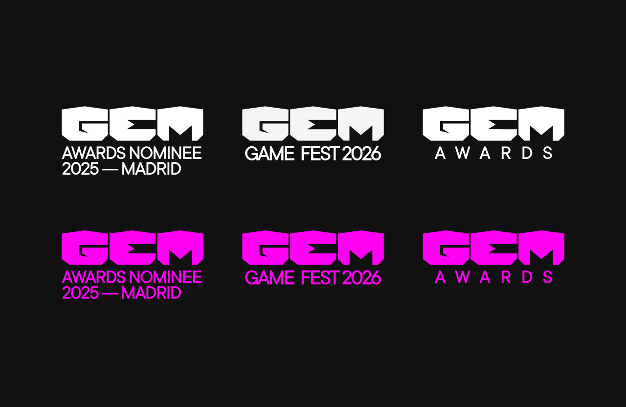
Scalability and Ecosystem
A contemporary identity system cannot behave like a static stamp. It must work as a living organism, capable of supporting different business lines while preserving its institutional strength.
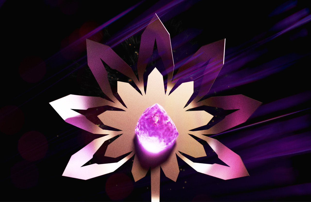
Starting from the main symbol, we developed a monolithic yet modular naming architecture that allows GEM to expand beyond the awards ceremony.
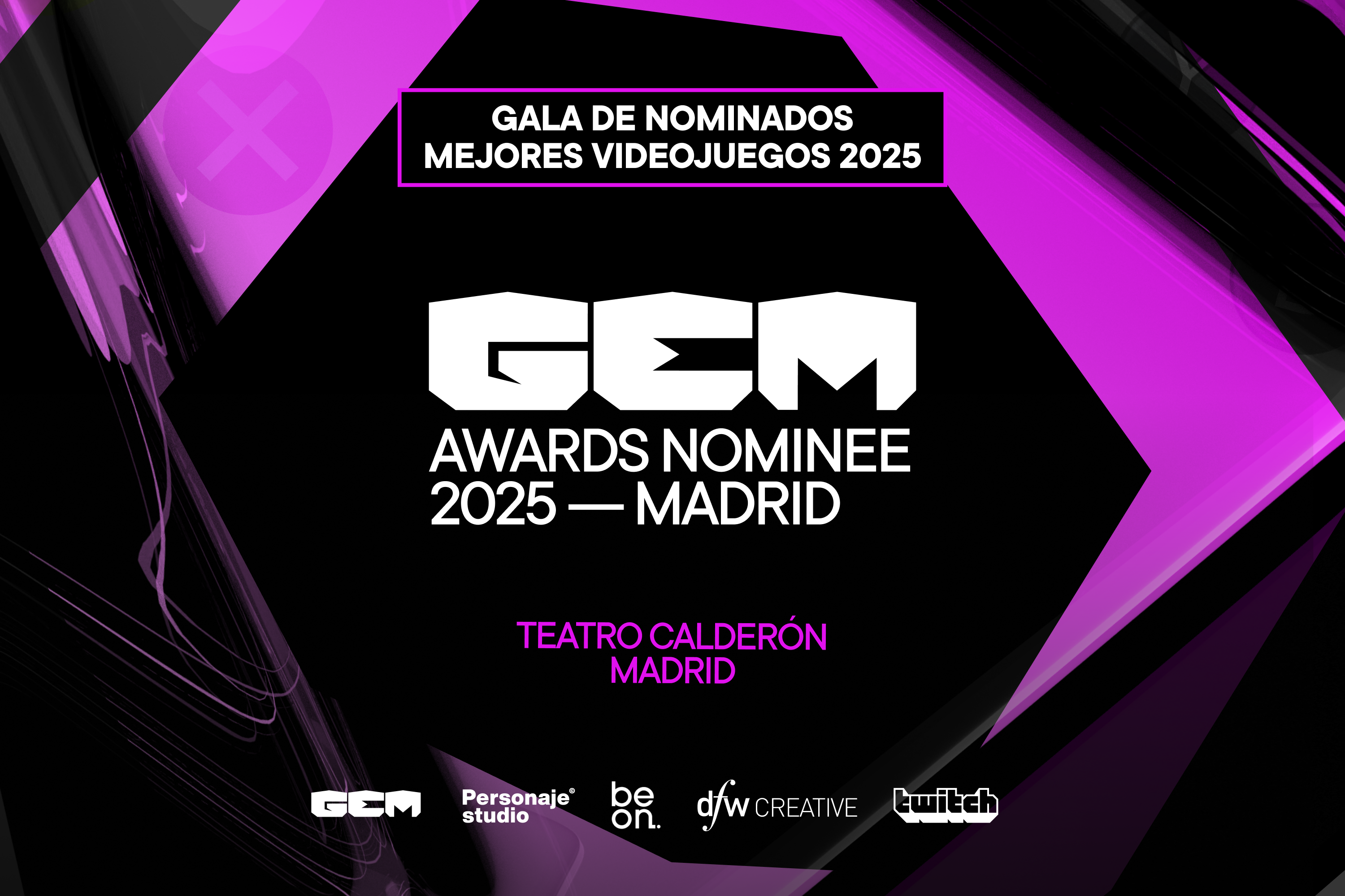
As shown in the system rollout, using Pyrite White and Amethyst Purple, the word GEM acts as the fixed architectural vault, while the lower descriptor takes on a more flexible, adaptive role.
Whether used to identify a seal of prestige, such as AWARDS NOMINEE 2025 MADRID, to define a parallel event like GAME FEST 2026, or to establish the parent brand through AWARDS, the hierarchy remains solid and unmistakable.
The TT Commons typeface adjusts its tracking and weight to align precisely with the width of the central E, or to expand organically depending on the needs of each block. This proves that the brand has both the structural flexibility of a large scale festival and the precision of a certifying institution.
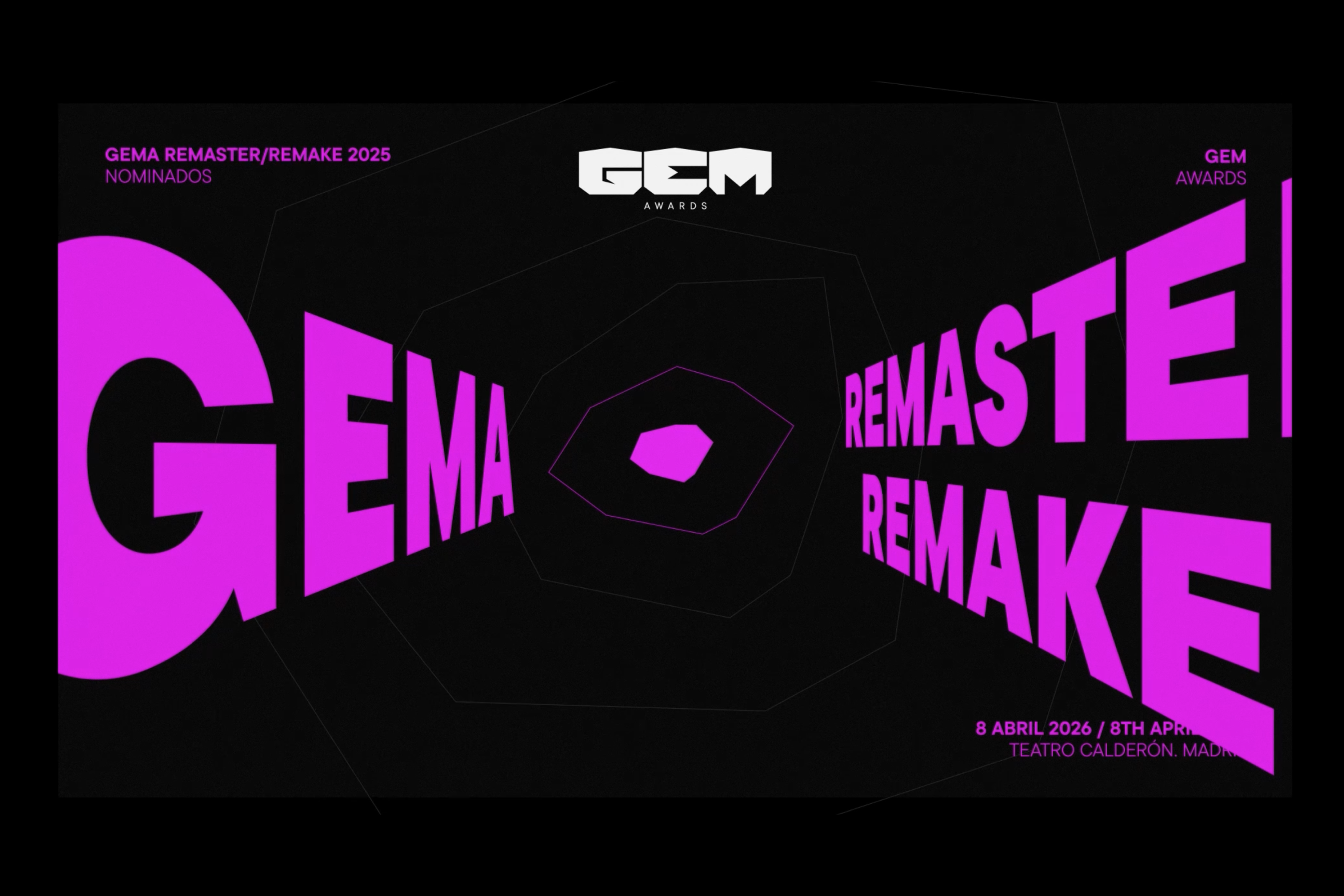
Isometric Tension
The layout system breaks away from the traditional flatness of posters and social media assets, bringing the depth of video game 3D modelling into a two dimensional graphic space.
Perspective and Geometric Mapping:
In applications such as the REMASTER / REMAKE visual, typography abandons its flat behaviour and is projected along the isometric axes of the gem’s facets. The word GEMA and its descriptors move through space, creating a visual resonance box and an illusion of volume that gives the piece a strong sense of kinetic energy.
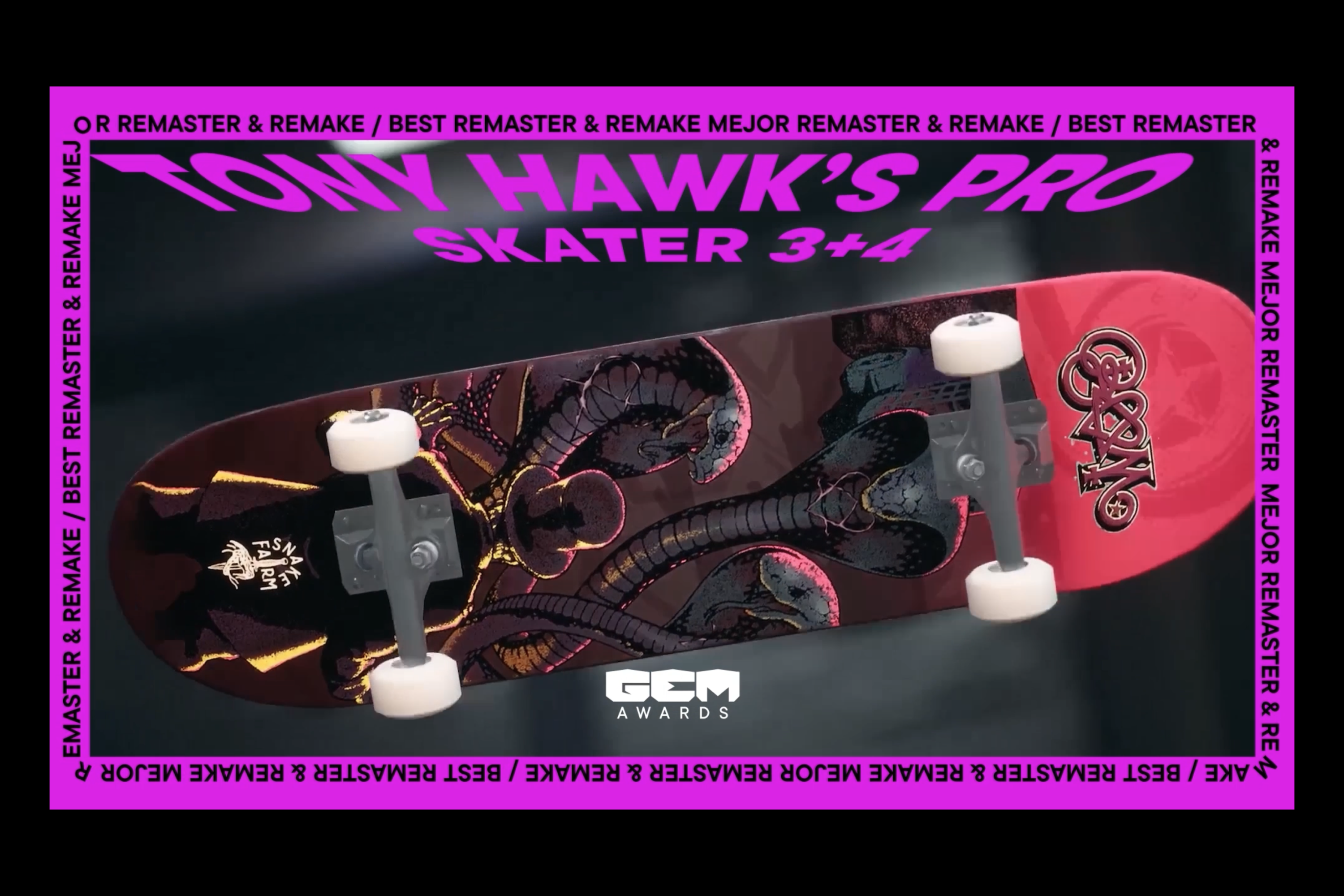
The Continuous Editorial Frame:
For pieces centred on a cult object, such as the Tony Hawk’s Pro Skater 3+4 deck, we introduced a perimeter brand device in Amethyst Purple. This border behaves like a ticker or endless ribbon of text, repeating BEST REMASTER & REMAKE.
It is a nod to functional brutalism, framing the content, guiding the eye towards the centre and giving the visual asset the status of a museum piece or an exclusive streetwear drop.
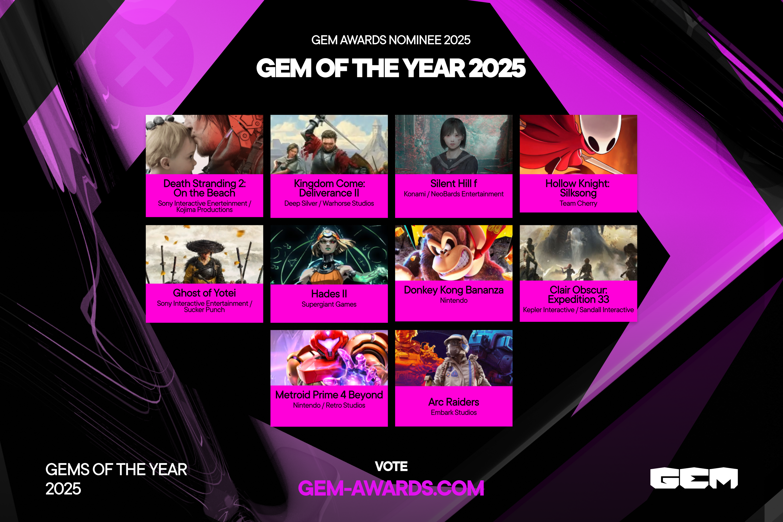
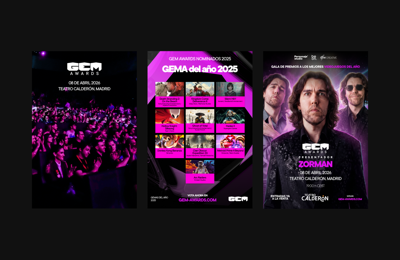
Diagonal Grids:
To reveal the nominees for GEM OF THE YEAR, we moved away from the dull orthogonal grid of corporate directories.
The game covers sit on blocks of Amethyst Purple, while the large faceted gem silhouette in the background defines the diagonal tension lines of the canvas. This integrates the cover art into the brand’s polygonal ecosystem and gives the entire composition a sharper, more dynamic structure.
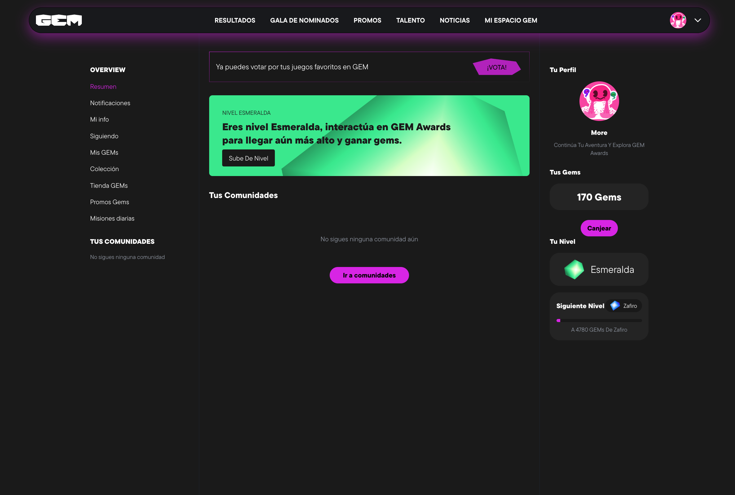
Gamification and Immersive Design
The GEM Awards web platform, gem-awards.com, is the clearest expression of the Power to the People manifesto. We did not design a merely informative website, but an immersive, dark and transactional command centre, built specifically around the rhythm of the event.
Type Driven UI and Contrast:
The interface embraces Dark Mode as a native language, using the Jasper Black background to let the gala imagery, content creators and nominated games breathe.
Amethyst Purple moves beyond a simple aesthetic accent and becomes the user’s interactive signal system. It defines key action buttons, such as the polygon shaped Tickets CTA, as well as progress bars and category labels.
Spatial Design on Screen:
In the Meet the Nominees section, the game covers are not arranged as a conventional gallery. Instead, they float and tilt towards the centre of the screen, evoking the fragments of an explosion or the vertices of a jewel. This gives the browsing experience a sense of movement while guiding the user’s scroll in an intuitive way.
Gamification Systems Integration:
The website goes beyond traditional voting by introducing a deeply gamified user dashboard, My GEM Space. Through concepts such as You are Ruby Level, Collect GEMs and unlockable reward systems, the interface speaks the native language of players.
The design of these modules, including discount banners and missions, preserves the editorial restraint of the parent brand. It proves that a user retention mechanic taken from gaming can be executed with the elegance, precision and visual discipline of a top tier design studio.

Craft as a Tool for Legitimacy
With GEM Awards, Personaje Studio proved that cutting edge design and typographic rigour can serve a greater purpose: the democratisation of a global community.
By replacing technological gimmicks and saturated neon aesthetics with a mature, sophisticated and mineral identity system, deeply connected to the structural heritage of video games, we gave legitimacy to an awards ceremony born with the authority and presence of a cultural institution.
We sculpted the visual manifesto of a movement where players finally reclaim the power.

“GEM AWARDS”
— “Players, at last, take the power back.”