WORLDSTOCKS
WorldStocks is an independent financial firm born in the Canary Islands, founded by three young economists with a shared passion for transforming the way people relate to money. The brand had already built a strong digital content ecosystem, supported by a highly engaged community and a clear voice in the financial education space.
The Opportunity
However, the project had reached a critical turning point. To scale its business model and formally introduce its new strategic lines, from advanced training in company valuation to the institutional launch of its own actively managed investment fund, WorldStocks needed to make a larger and more deliberate move.
The challenge was to consolidate a premium brand infrastructure that could reflect its specialisation in Quality Investing, a philosophy focused on identifying exceptional companies with durable fundamentals, still uncommon in the Spanish market, without losing the freshness and closeness that had connected the brand with its original audience.
The Strategic Challenge
The traditional financial sector suffers from a clear visual polarisation. On one side, the cold, elitist and opaque language of traditional banking. On the other, the visual noise, aggressive promises and false immediacy of the crypto world and low cost brokers.
The strategic opportunity for Personaje Studio was to occupy an unexplored middle ground: Human Rigour.
The main design thinking challenge was to balance two forces that often appear to be in conflict.
Authority and Institutionality: Communicating the seriousness, regulatory stability and analytical discipline required to manage people’s real wealth and savings.
Radical Transparency and Closeness: Breaking away from unnecessary technical jargon, distance and the aristocratic image of the traditional financial sector, in order to speak honestly to a new generation of investors.
We structured the brand platform around a shared narrative: money is not a tool for quick speculation. It is the result of each client’s effort, time and sacrifice. Investing well is an act of respect towards one’s own future.
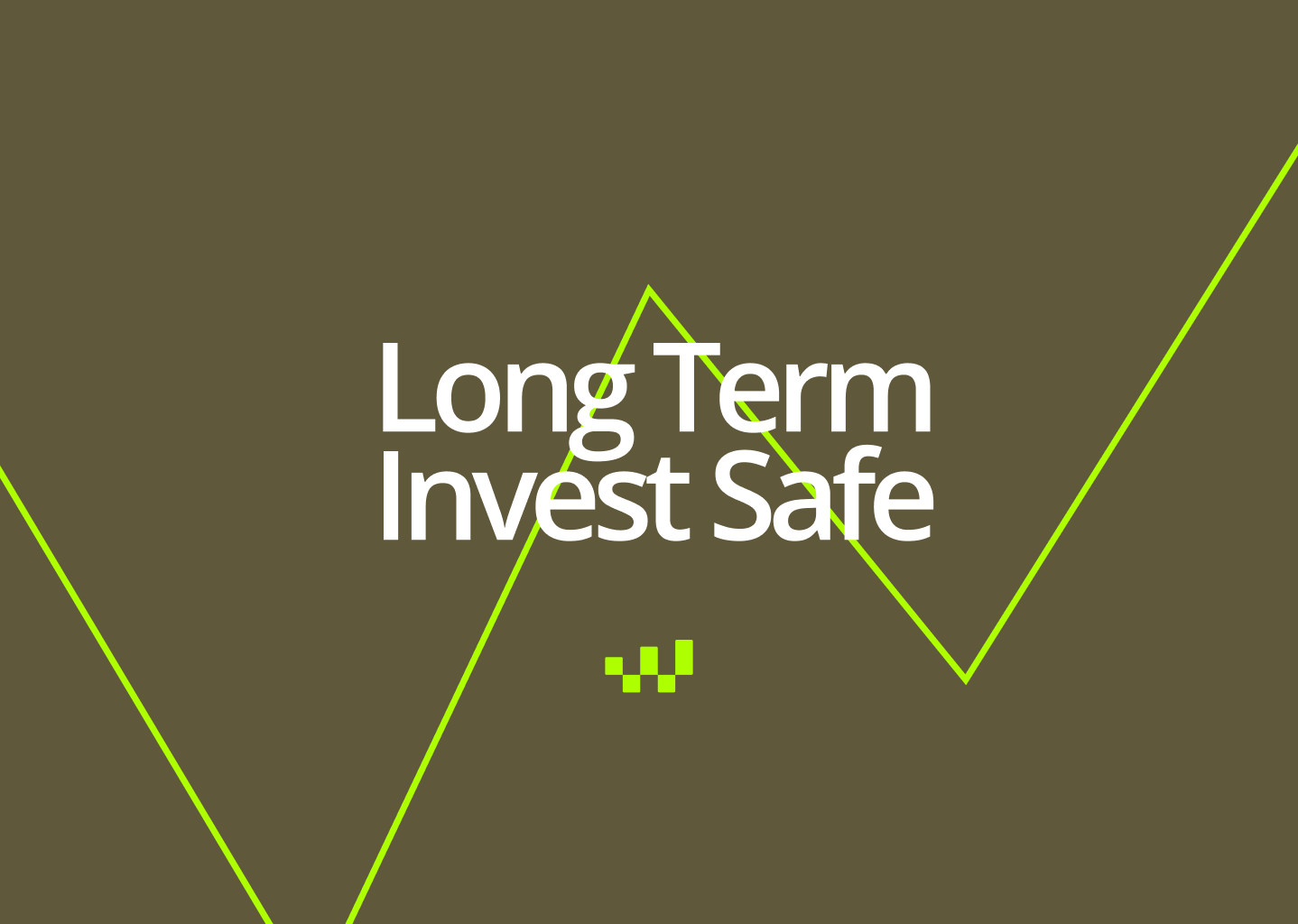
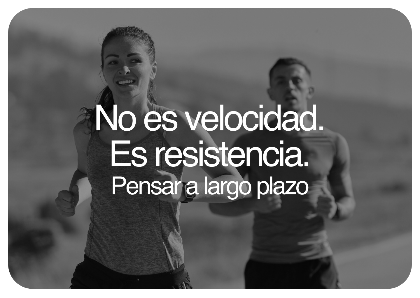
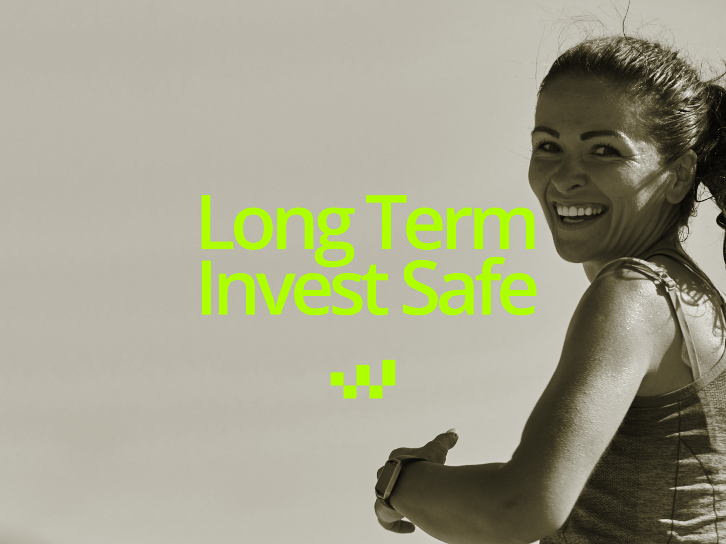
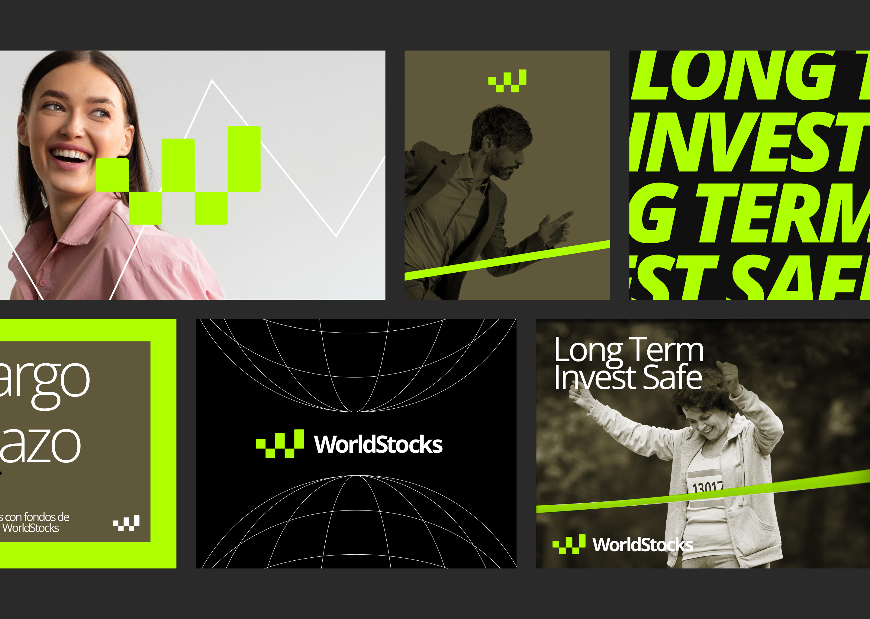
Life Is a Marathon
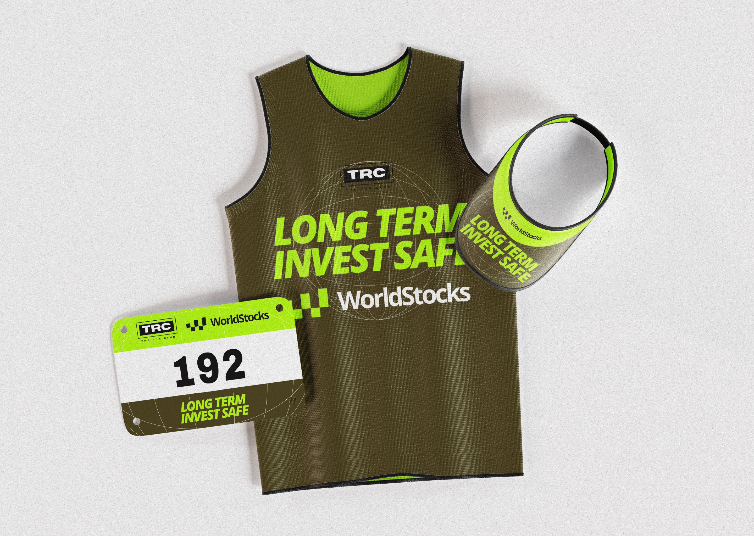
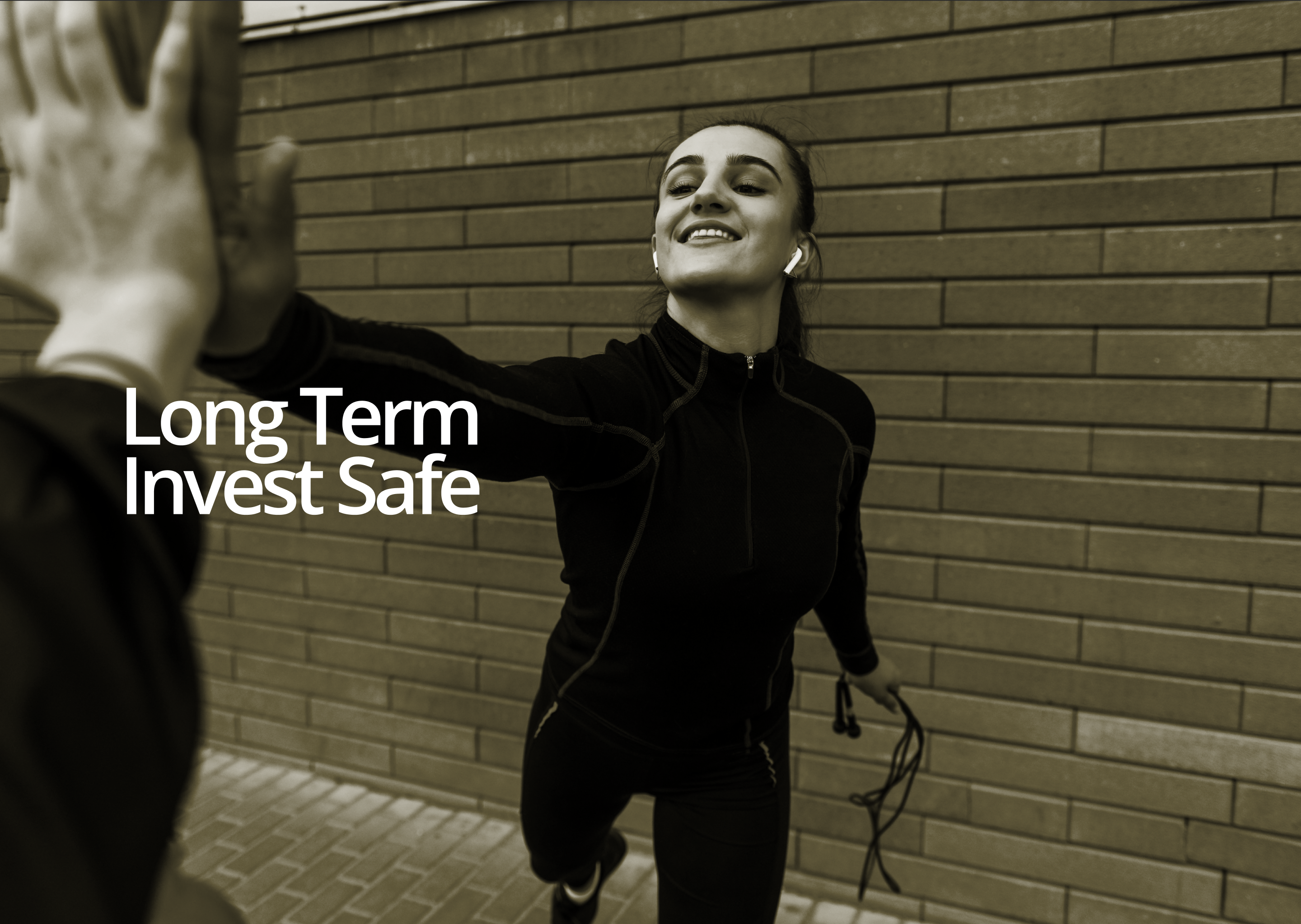
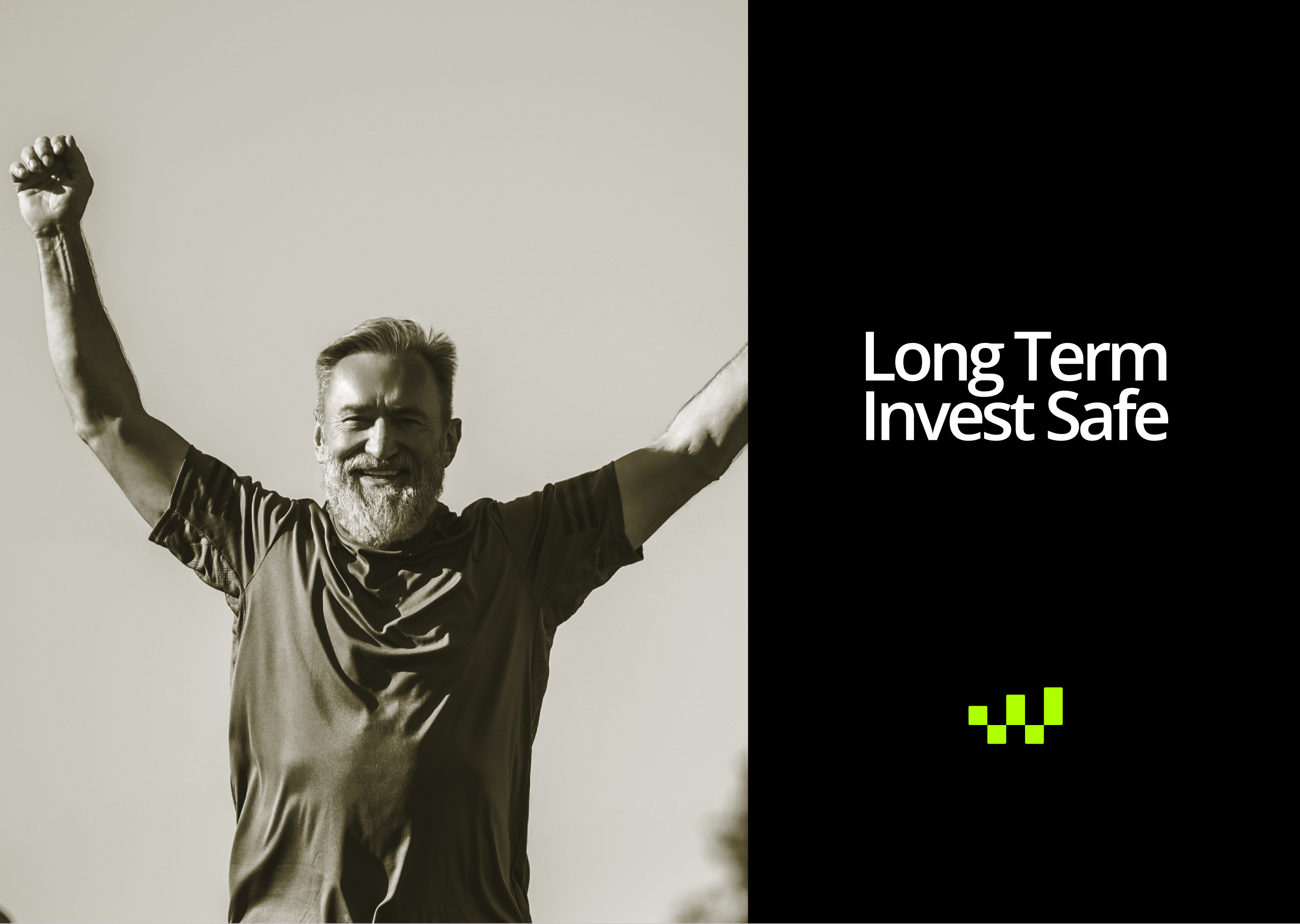
To articulate the entire visual and verbal system, we developed a clear and metaphorical conceptual axis: the financial marathon.
In athletics, a long distance race is a discipline where instant speed is irrelevant. Success is defined by endurance, strategy, discipline and the ability to maintain a steady pace over time.
Applied to the WorldStocks universe, this concept became the opposite of short lived speculation and short term trading.
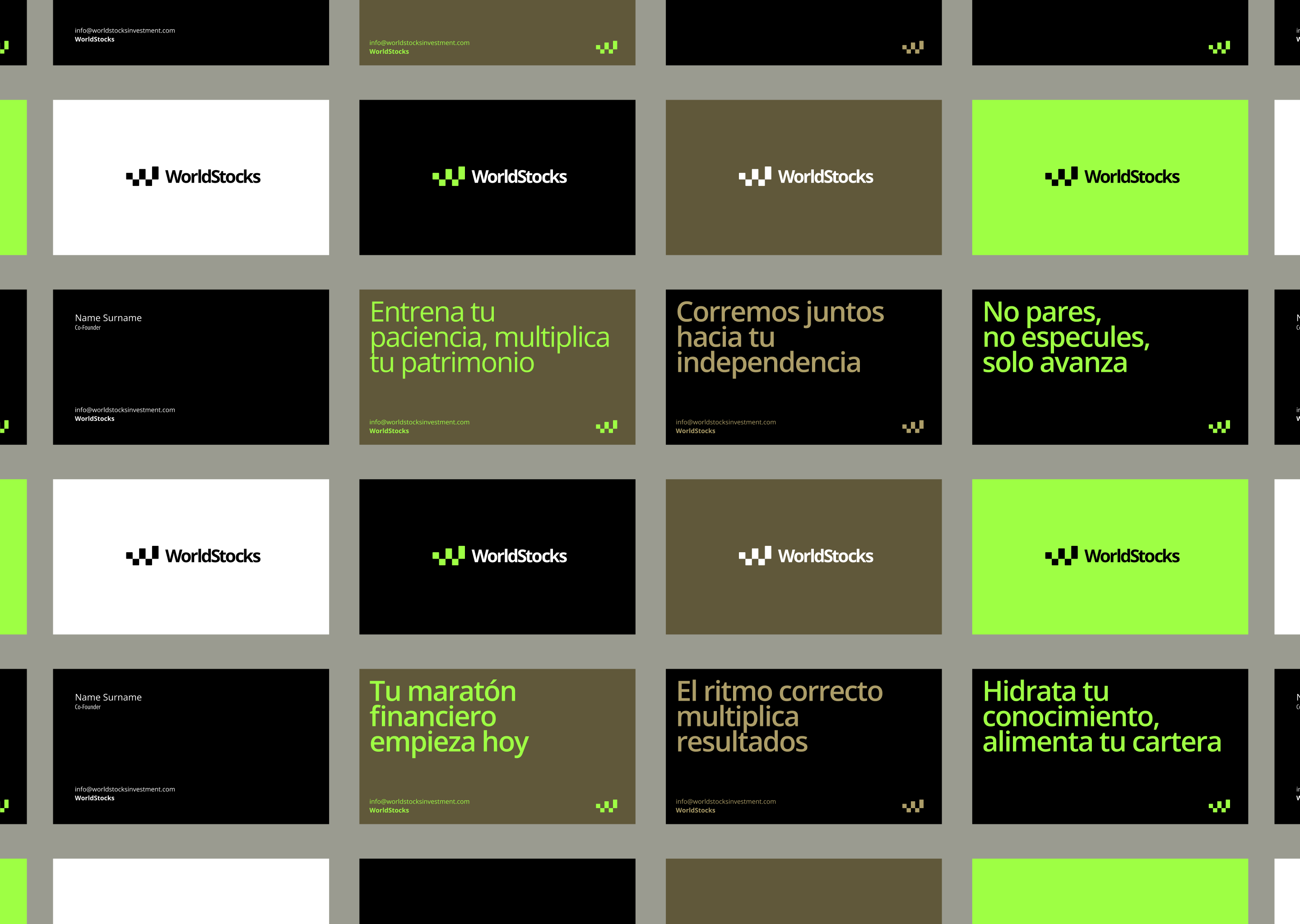
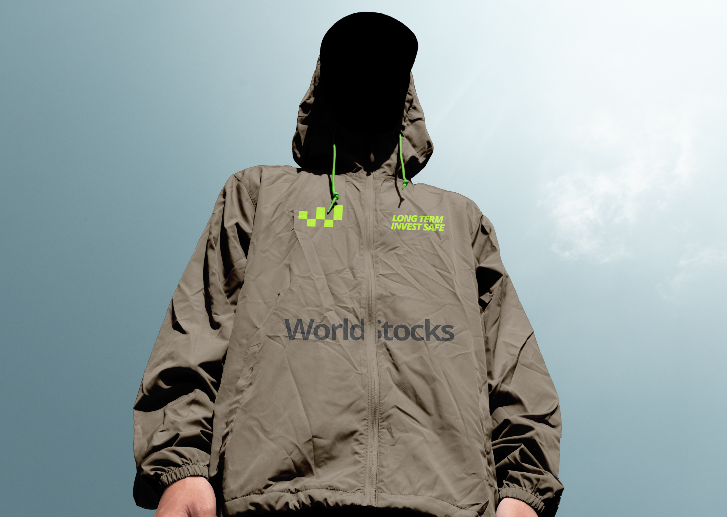
From this idea, the institutional copy system was born: Do not stop. Do not speculate. Just move forward., Your financial marathon starts today. and The right pace multiplies results.
The brand does not promise shortcuts. It promises technical guidance, consistency and support throughout the journey.


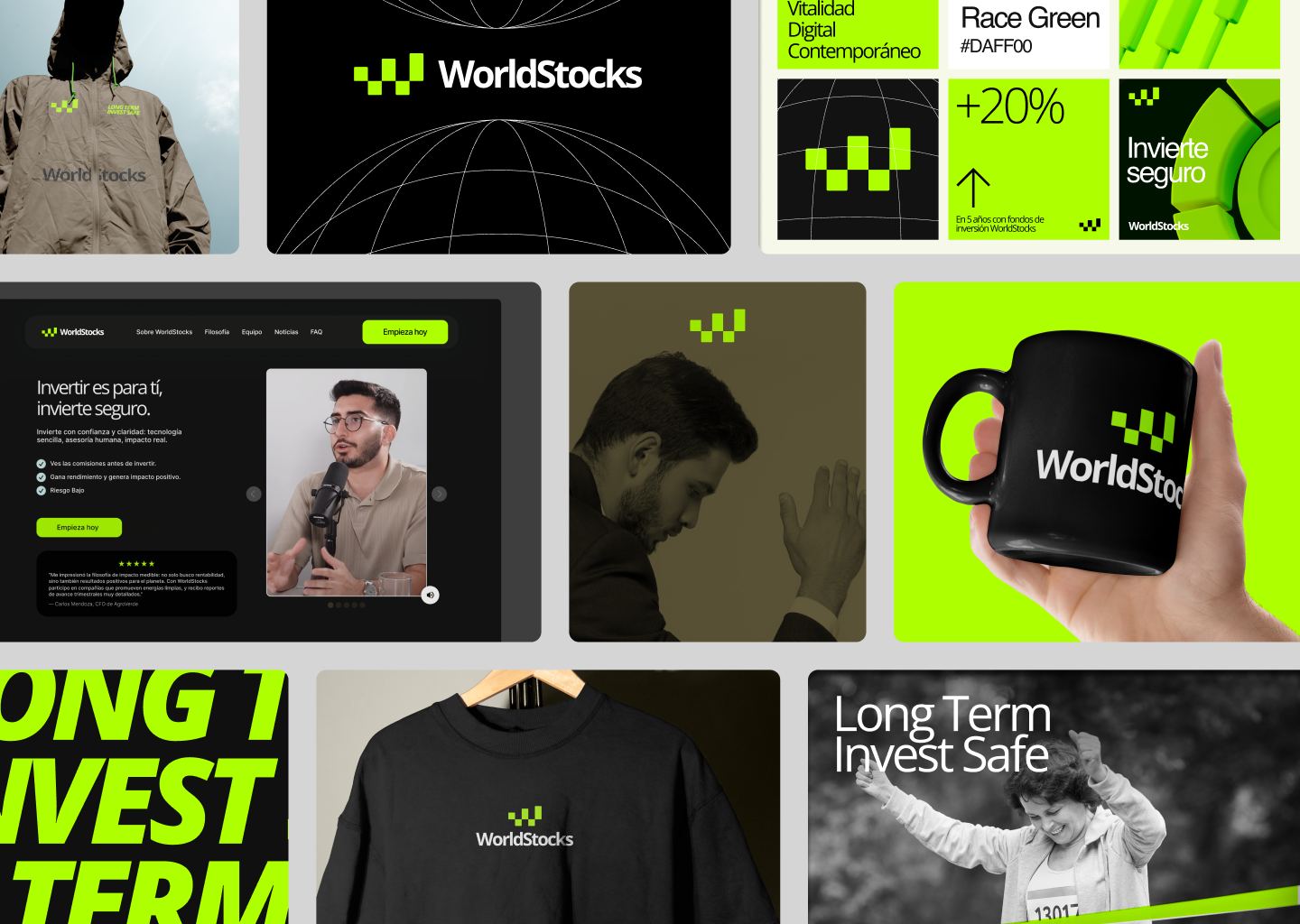
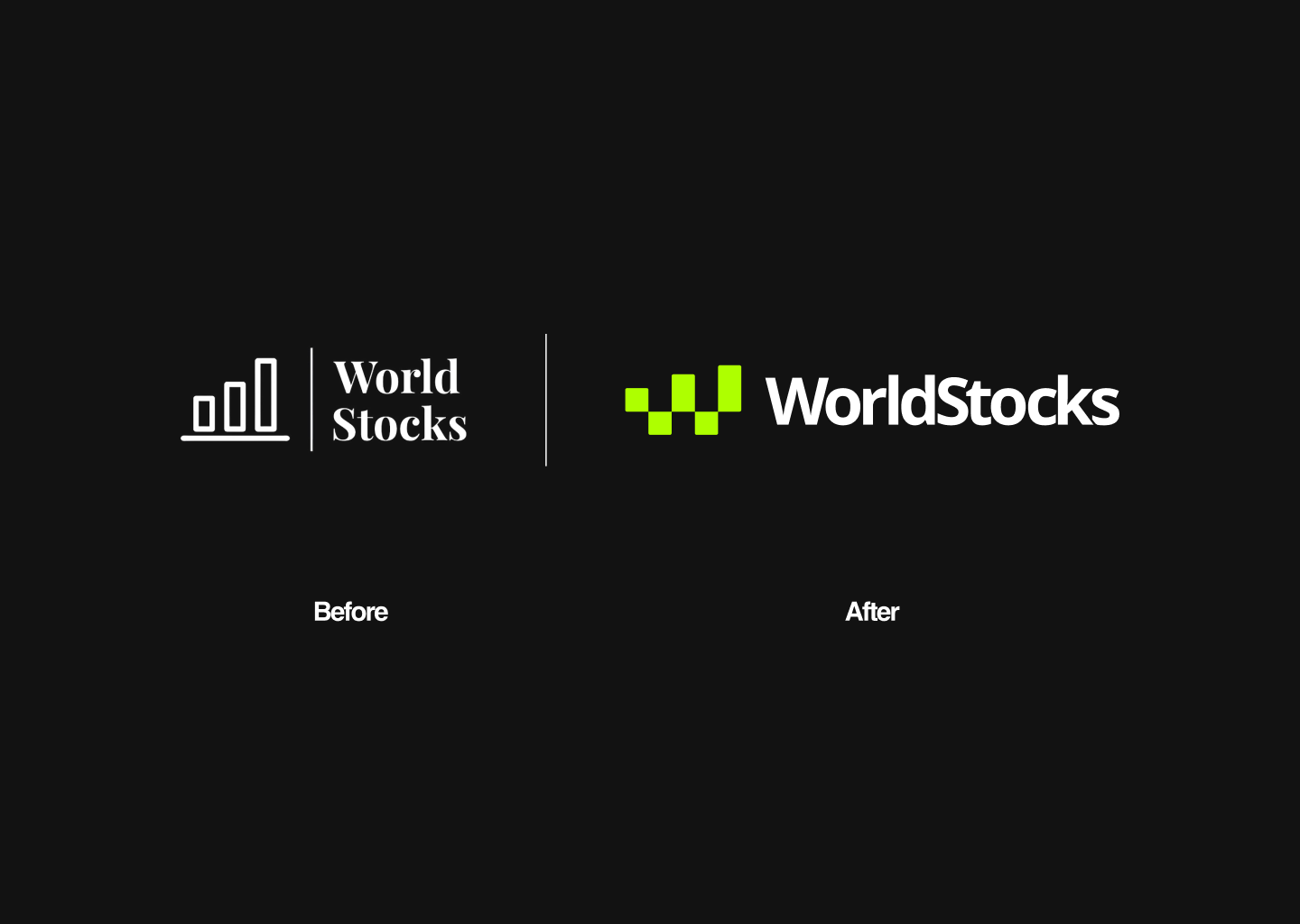
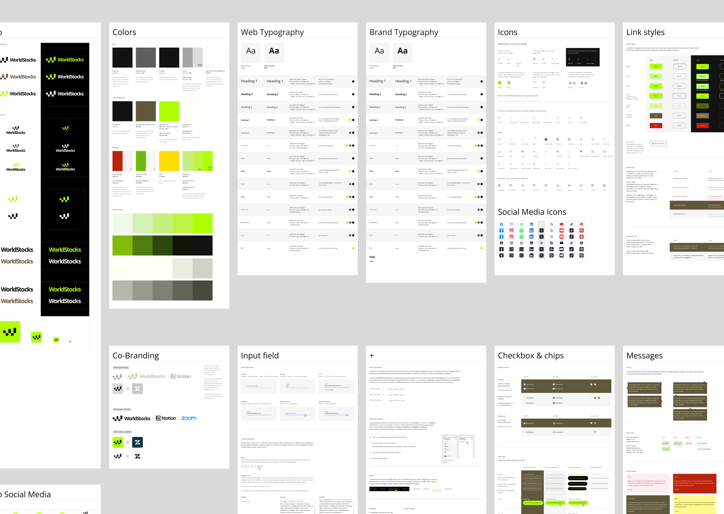
The Visual Identity System
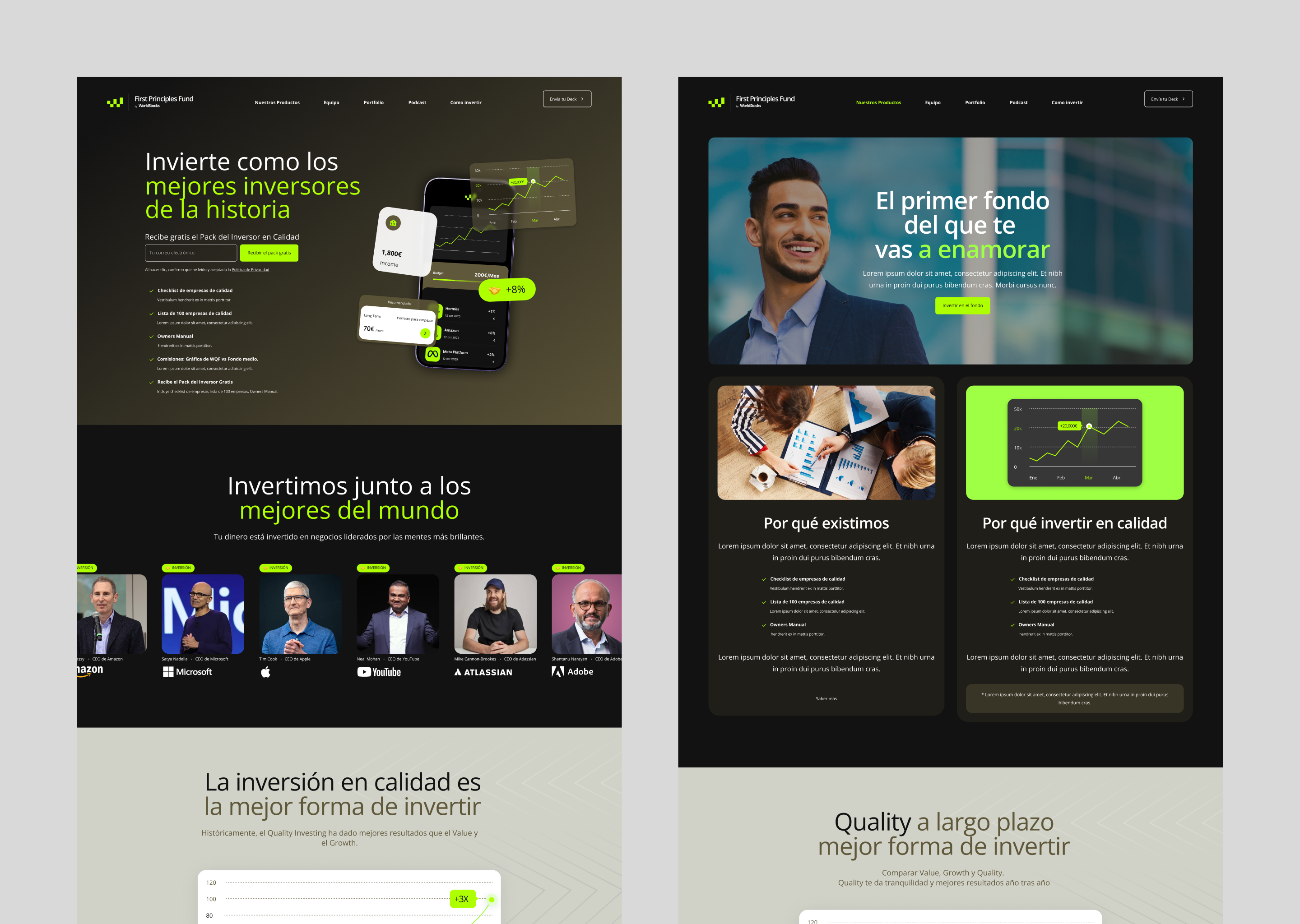
We chose a minimalist, systematic and high contrast design approach, allowing the brand to stand out across both complex digital interfaces and physical corporate applications.
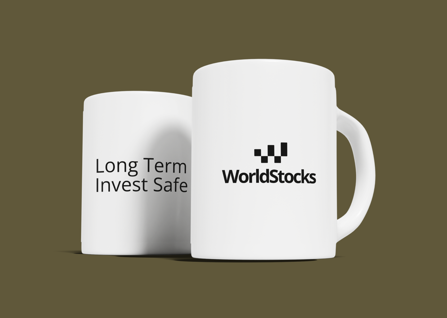
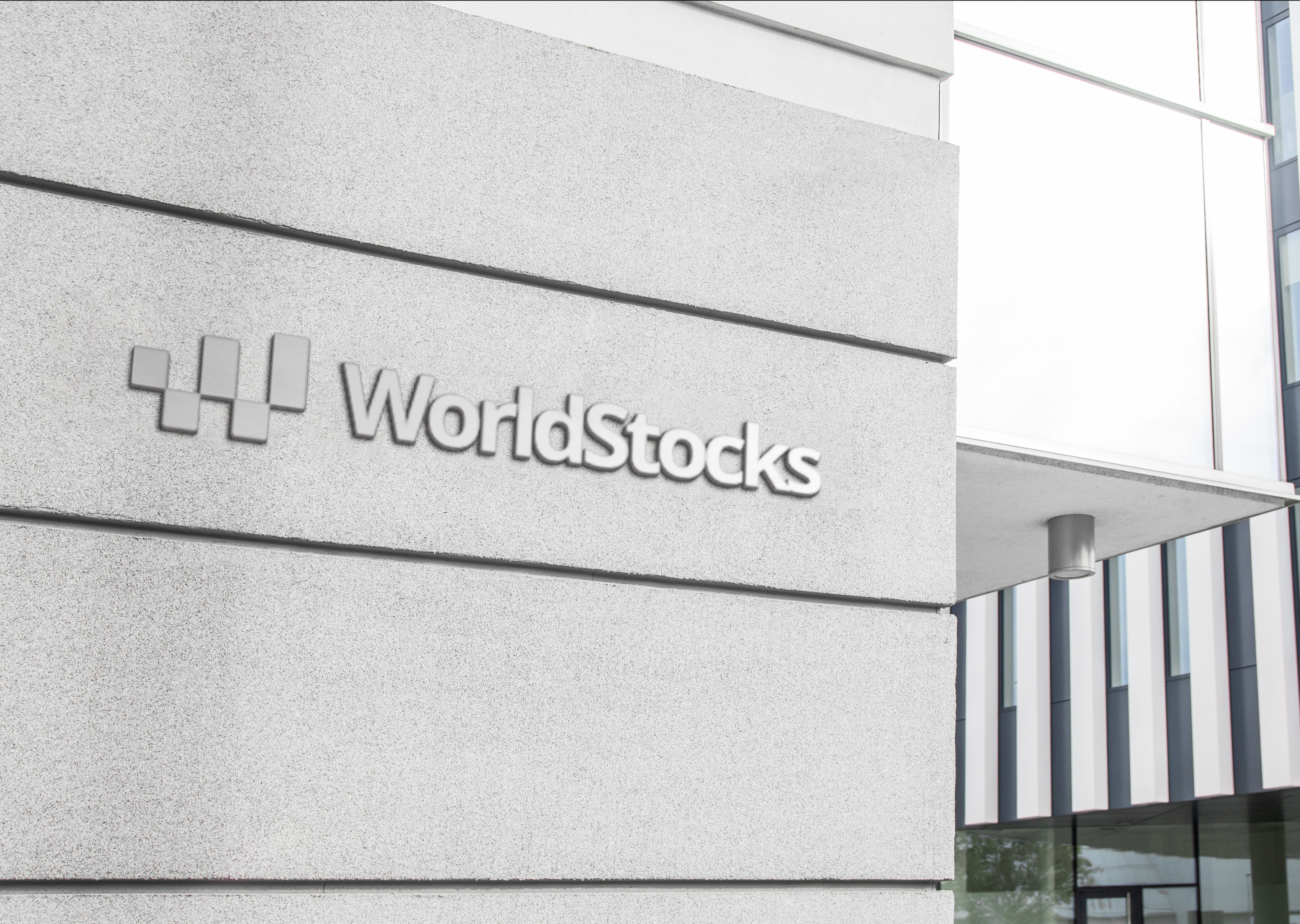
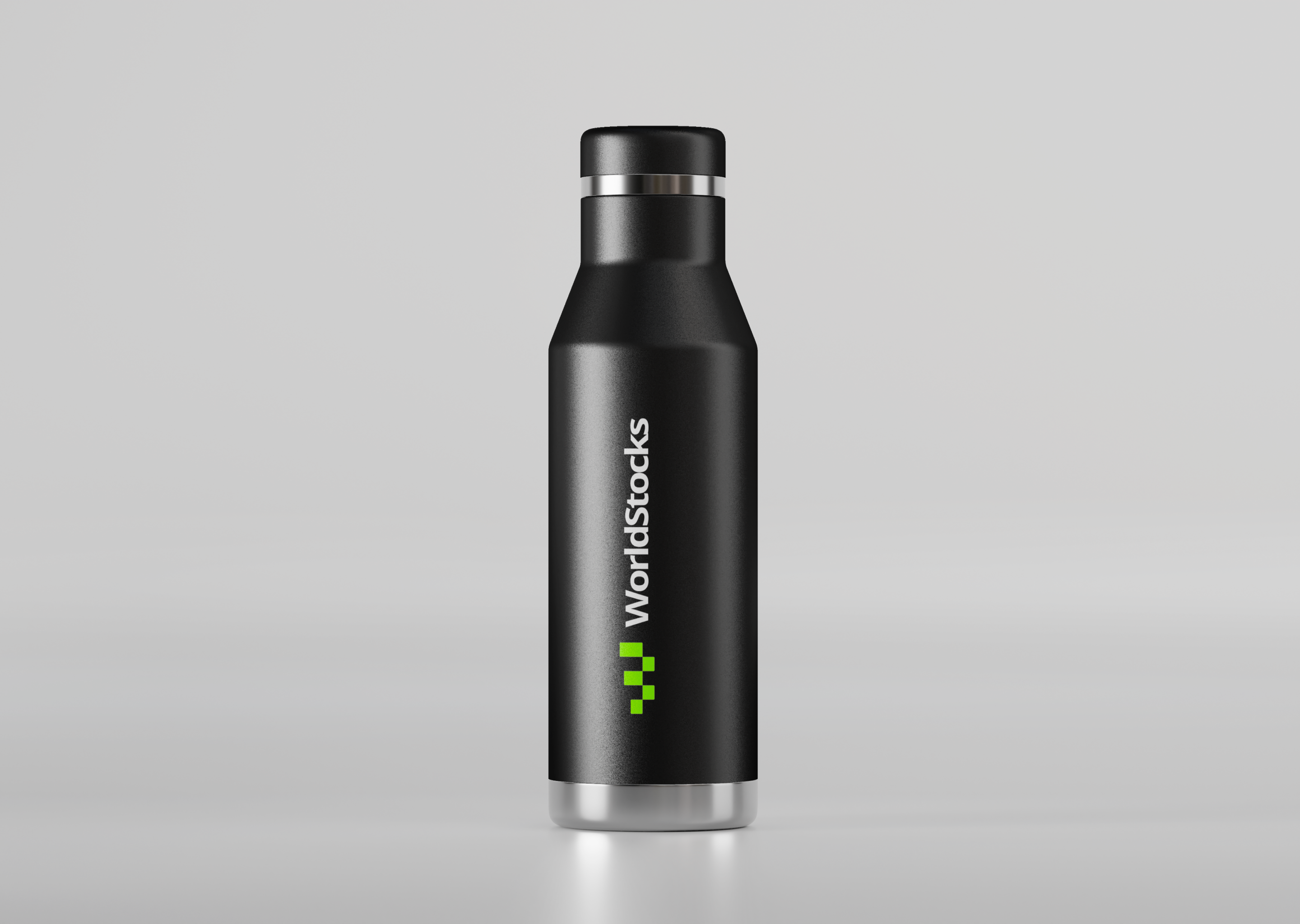
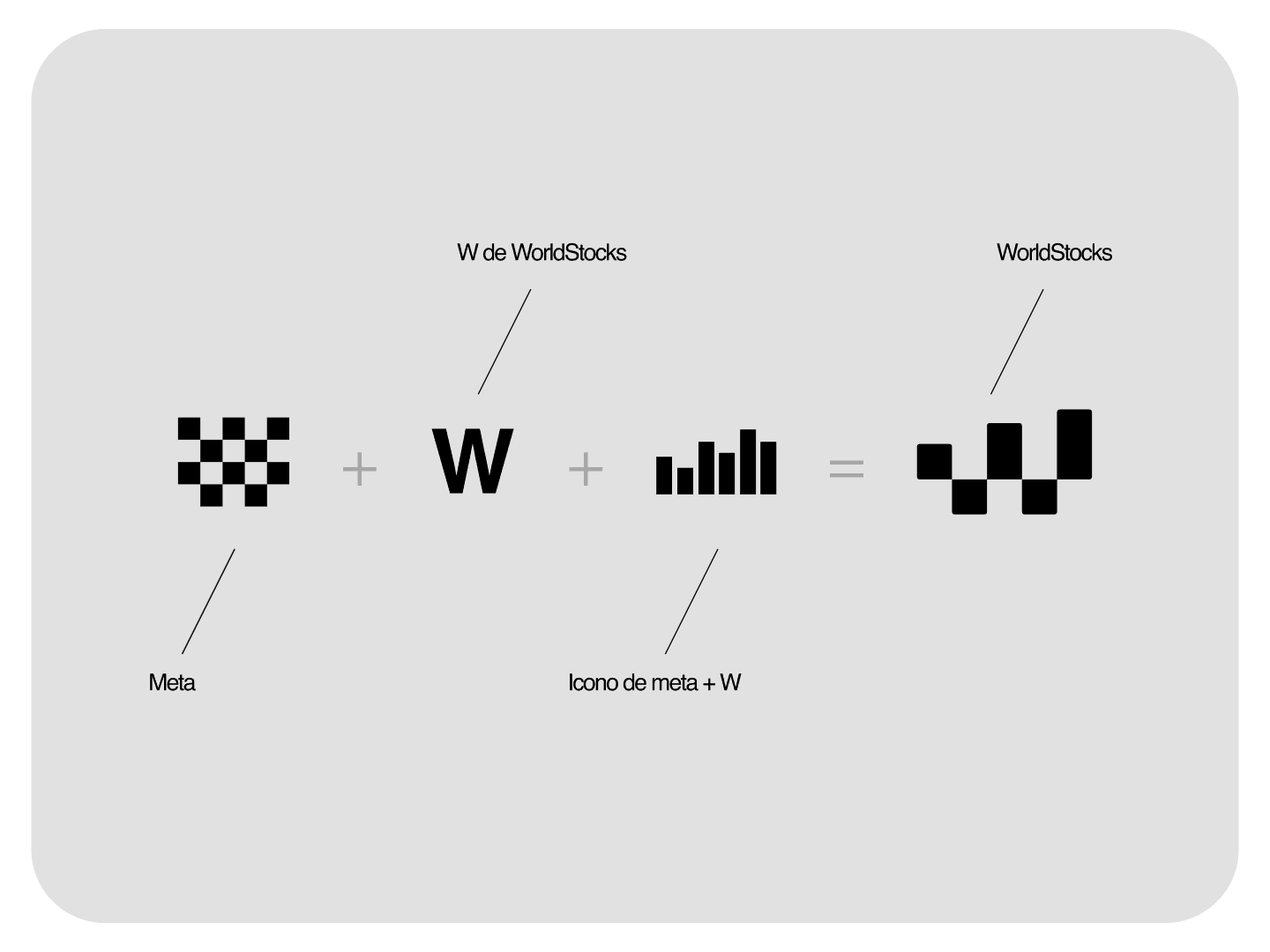
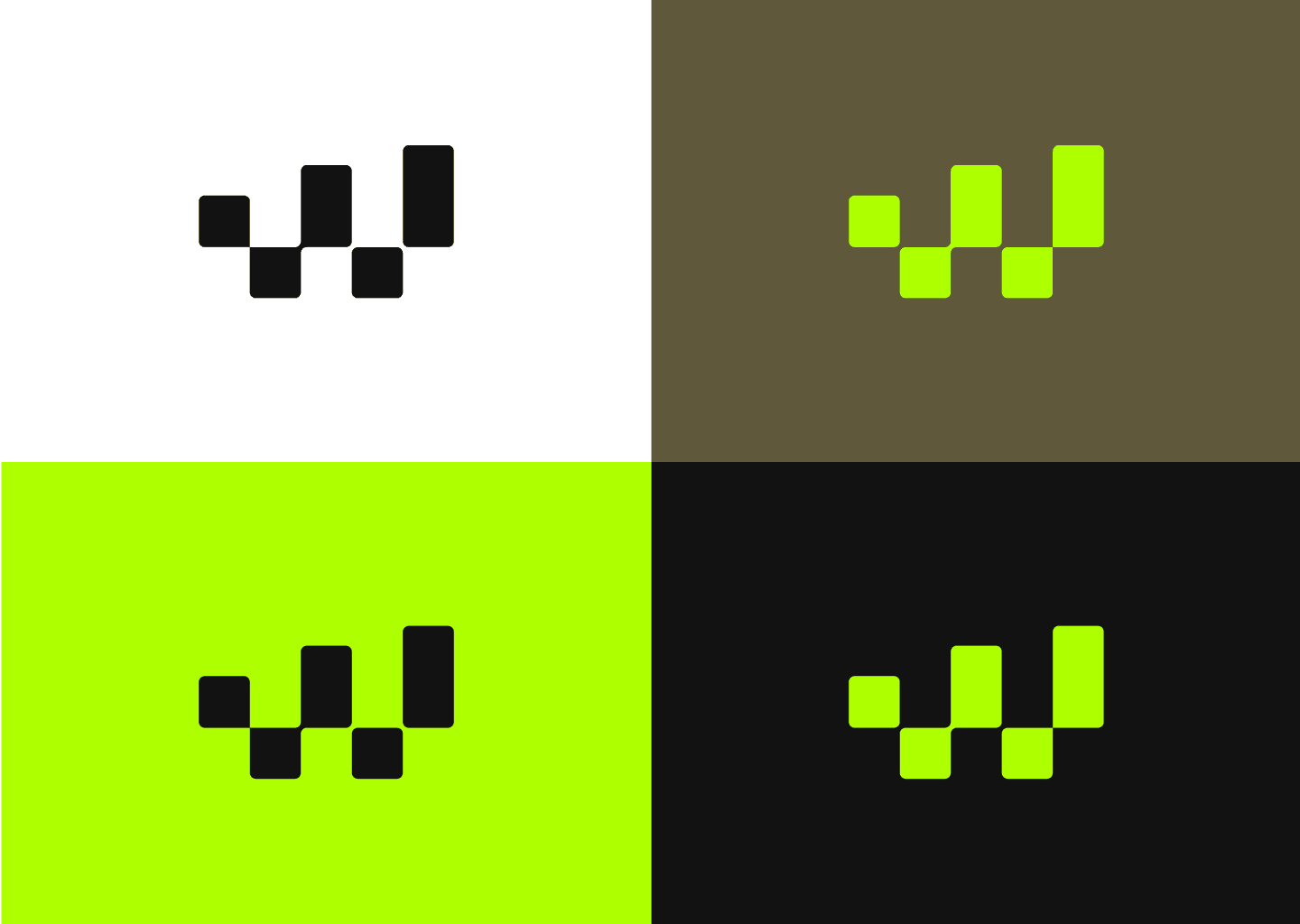
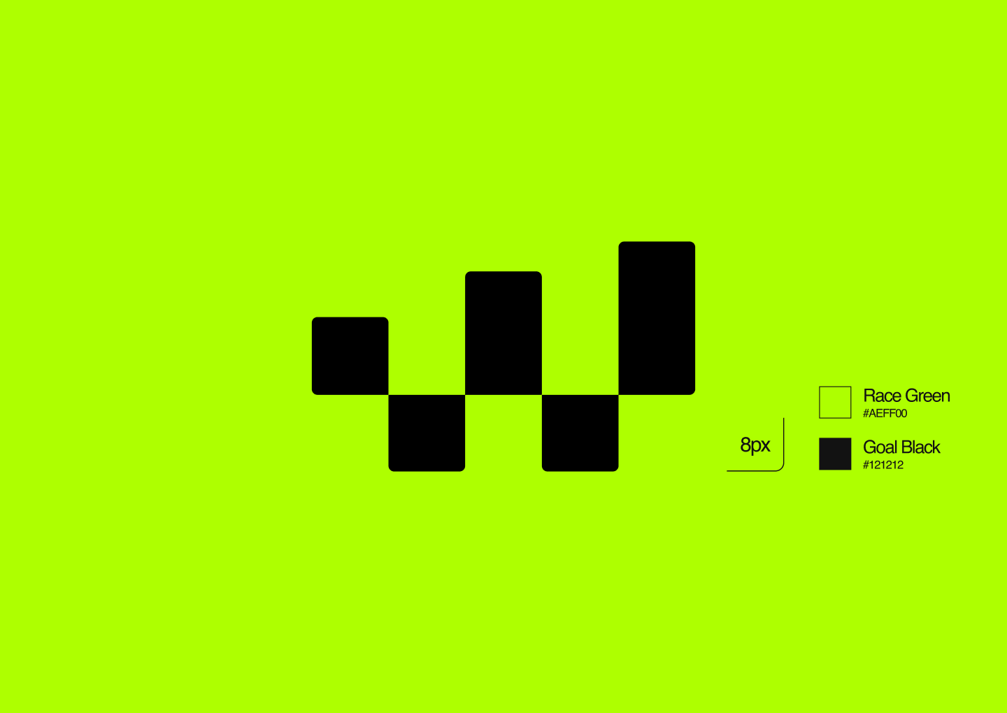
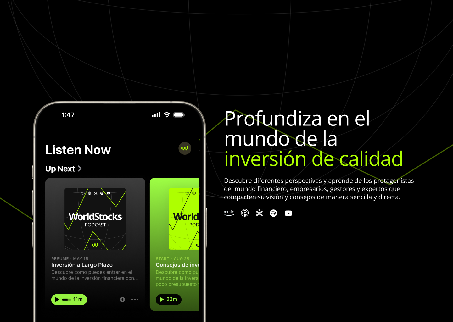
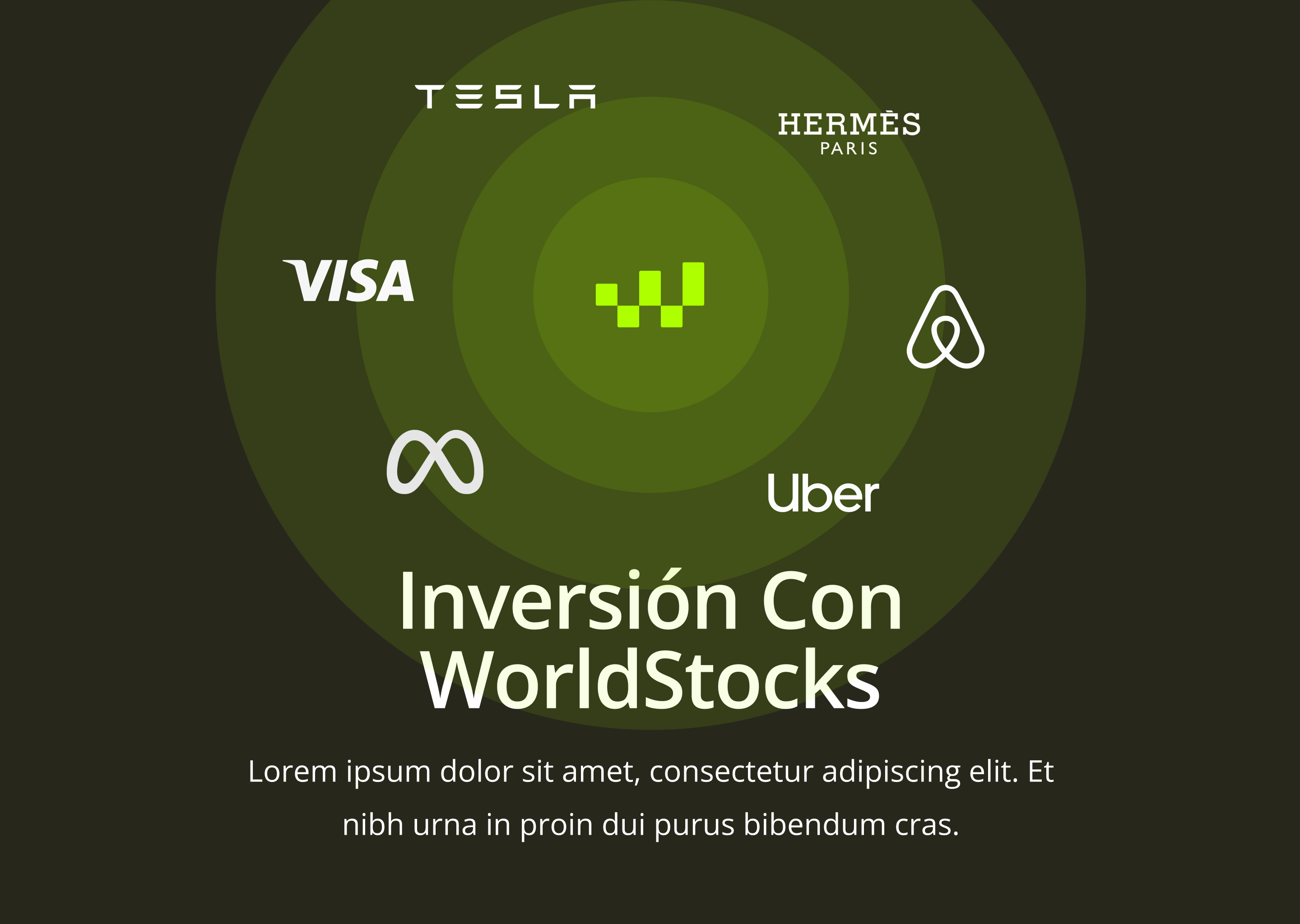
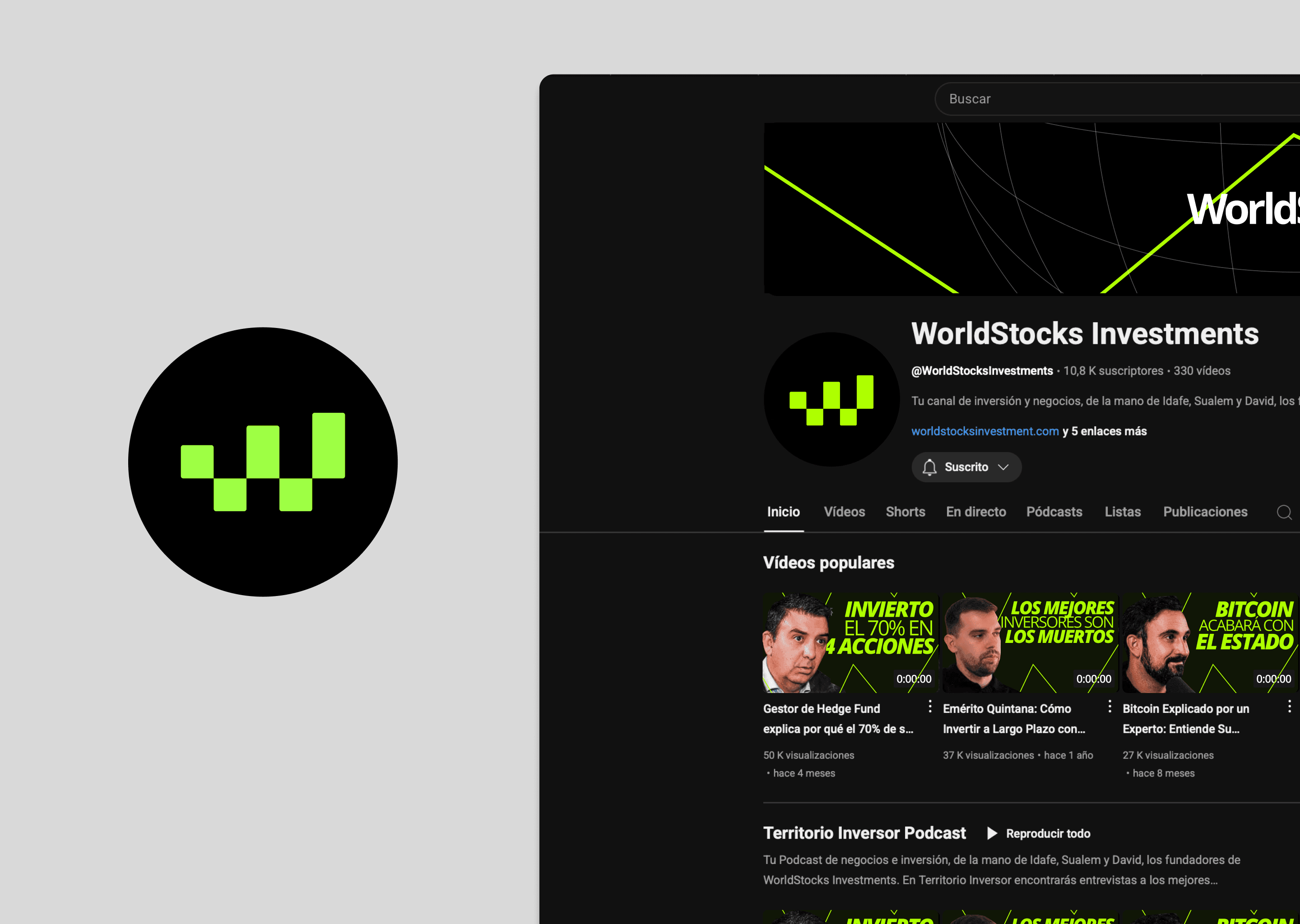
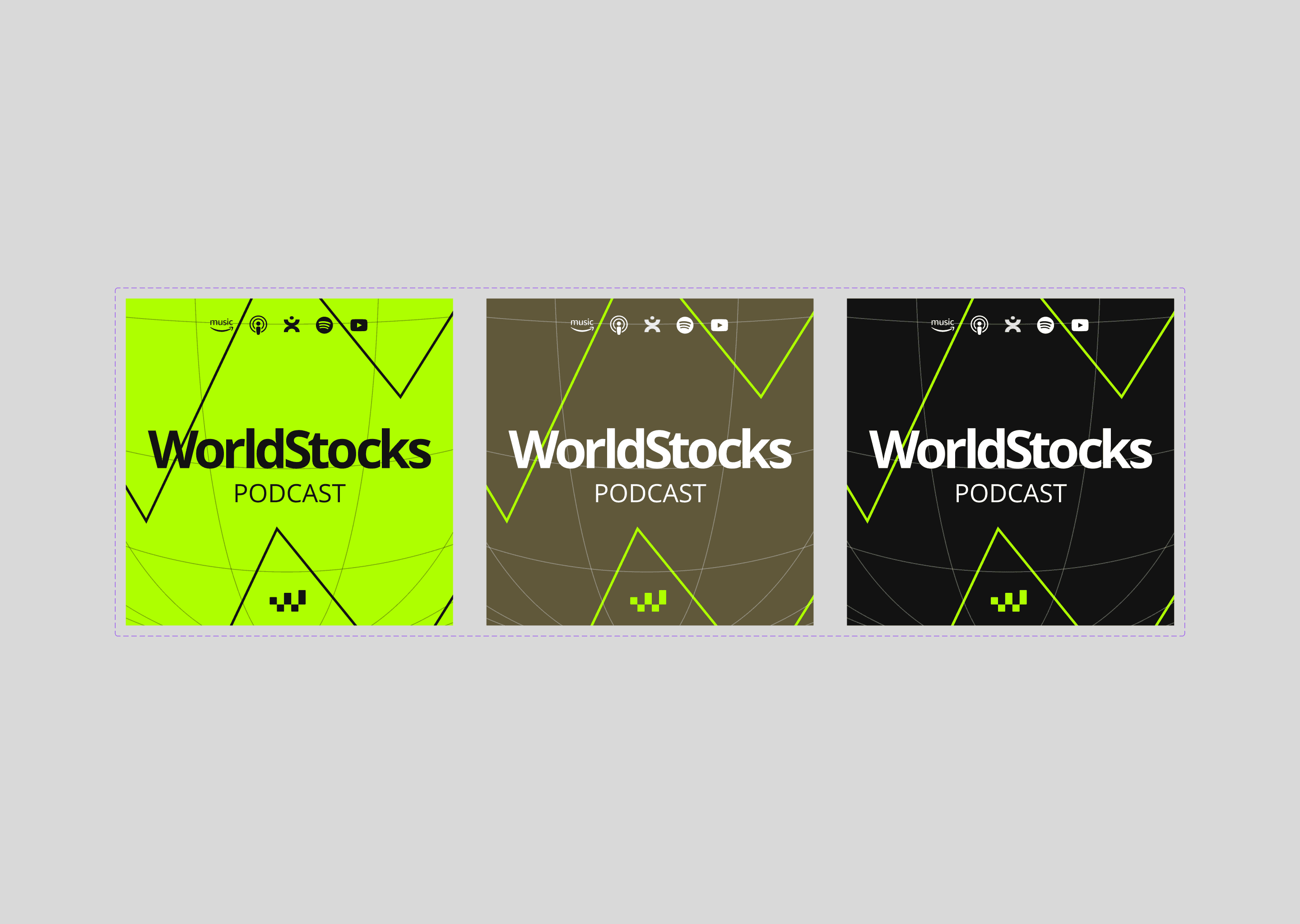
The WorldStocks symbol is a piece of precision geometry that brings together three abstract visual ideas in one clean, memorable form. It contains the initial W of the company, the checkered finish flag as a reference to achieving long term financial goals, and an ascending rhythm chart, where the alternating geometric blocks suggest technical stability at the base and solid wealth growth over time.
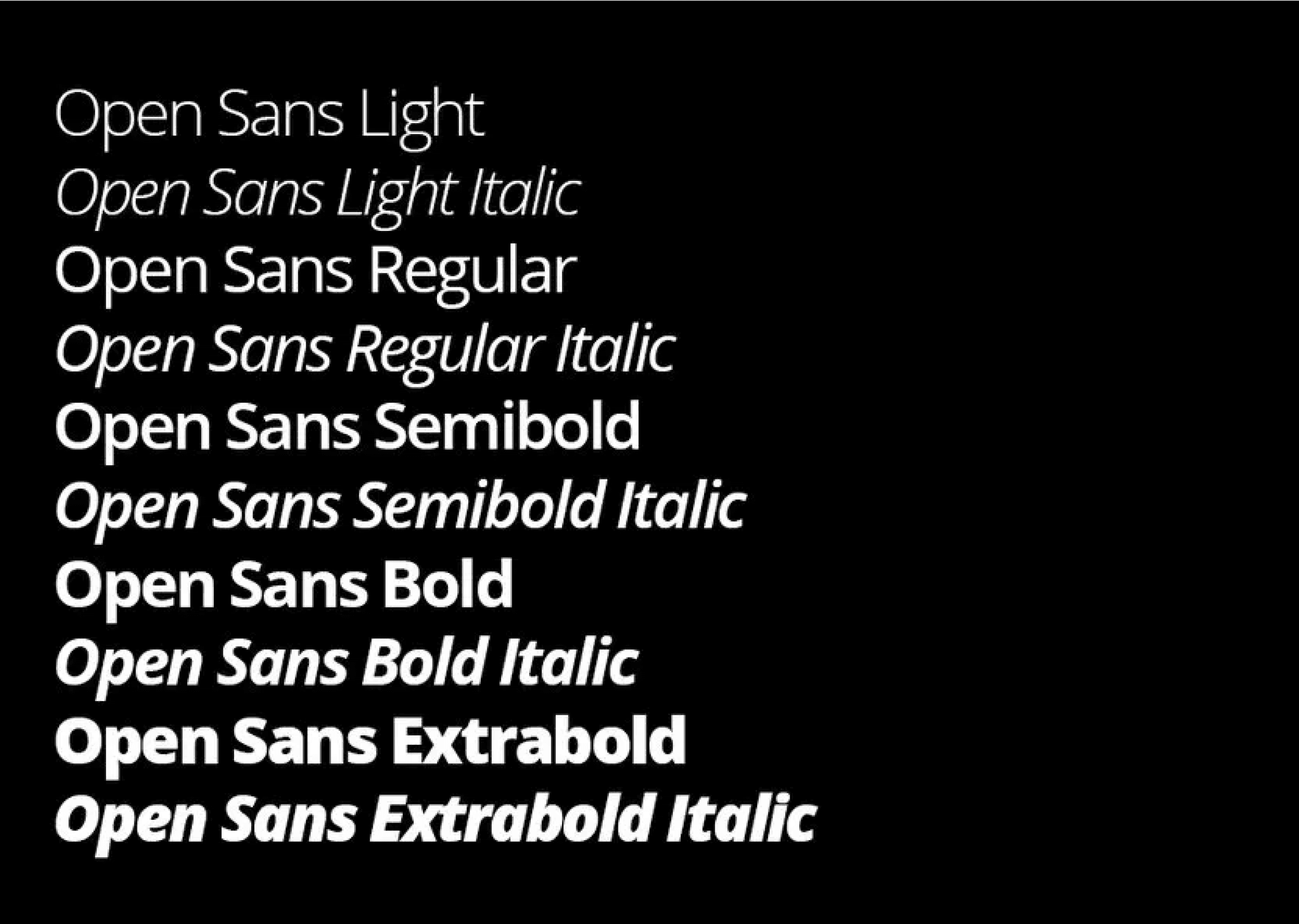
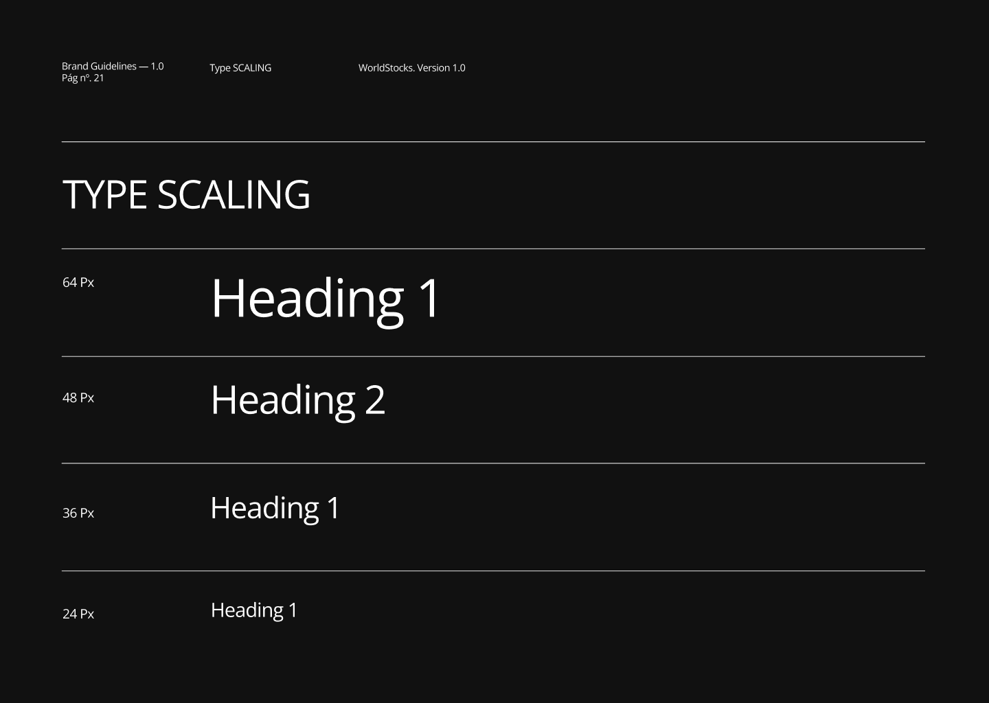
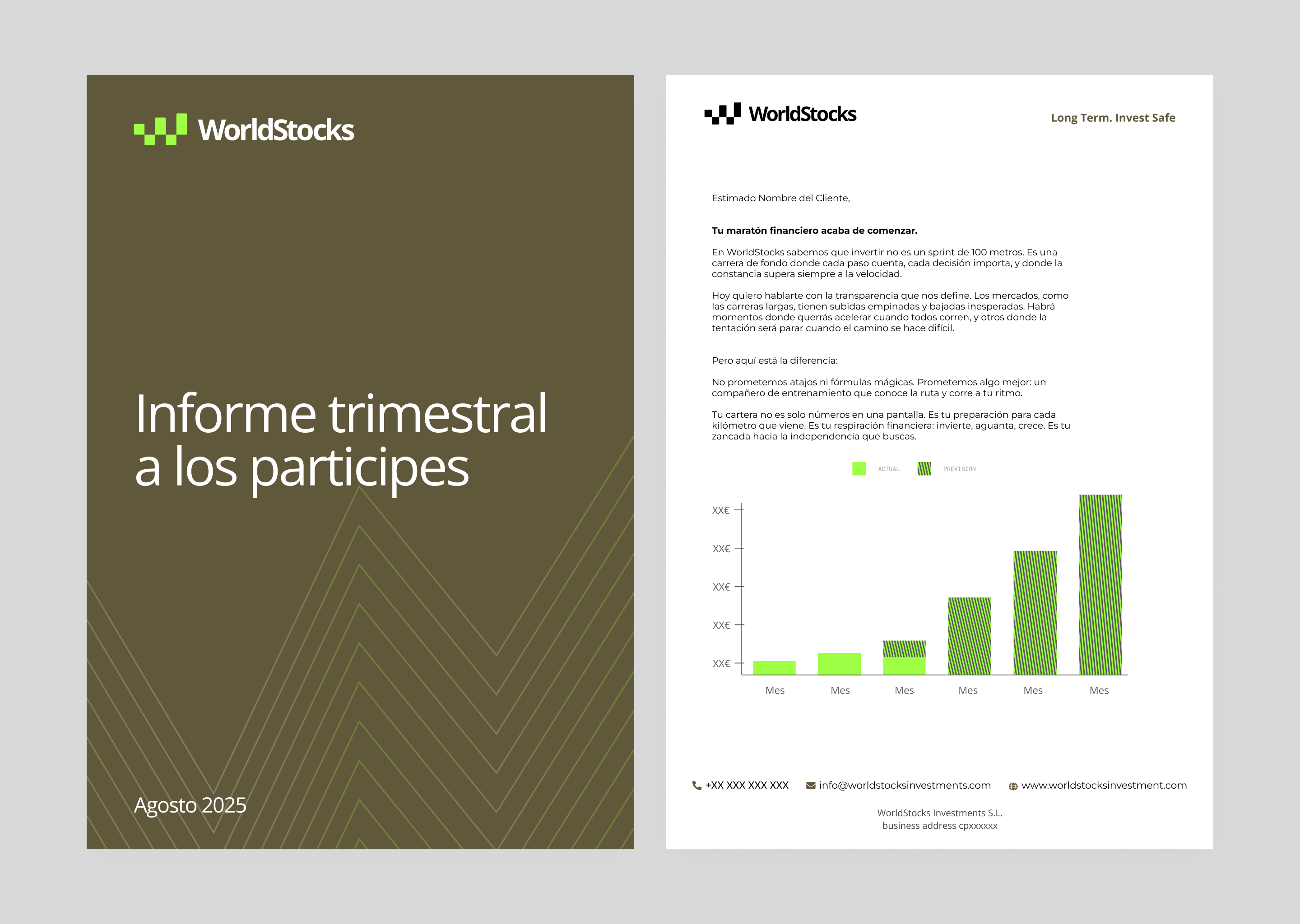
For the logo and the wider text system, we selected Open Sans. Its open, neutral and balanced forms ensure smooth reading and optimal legibility across low resolution screens, printed reports and reduced format documents such as investment thesis sheets or fact sheets.
By using its different weights, from the elegance of Light for editorial subtitles to the strength of Bold and Extra Bold for major platform headlines, we built a clear and accessible hierarchy without falling into the classical formality of traditional serif typefaces often used in the financial sector.
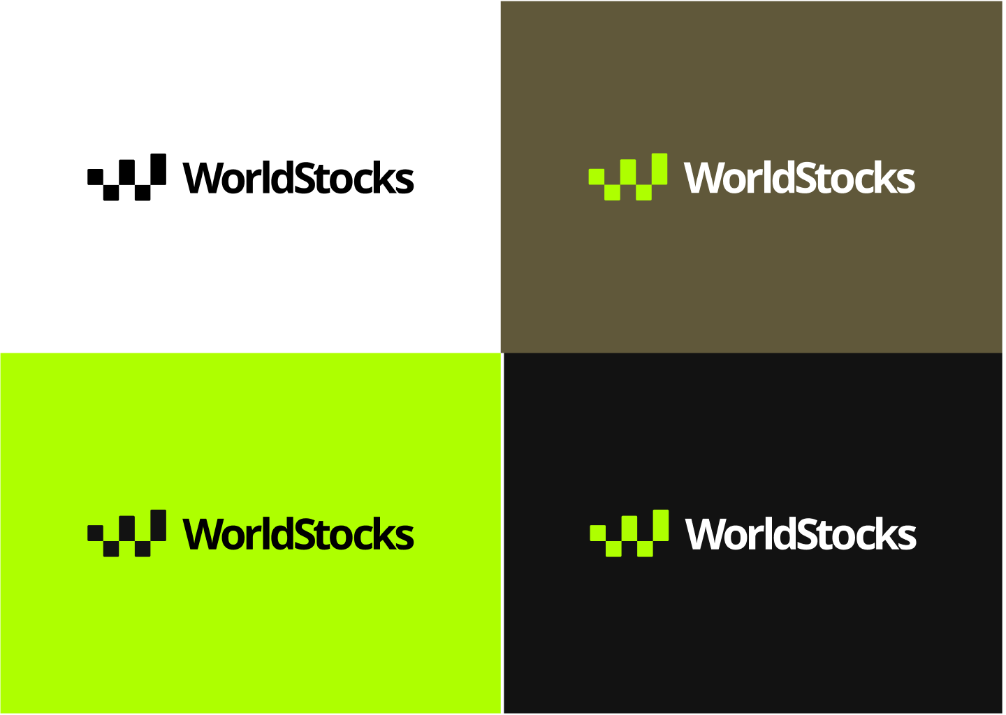
Tactical Chromatics
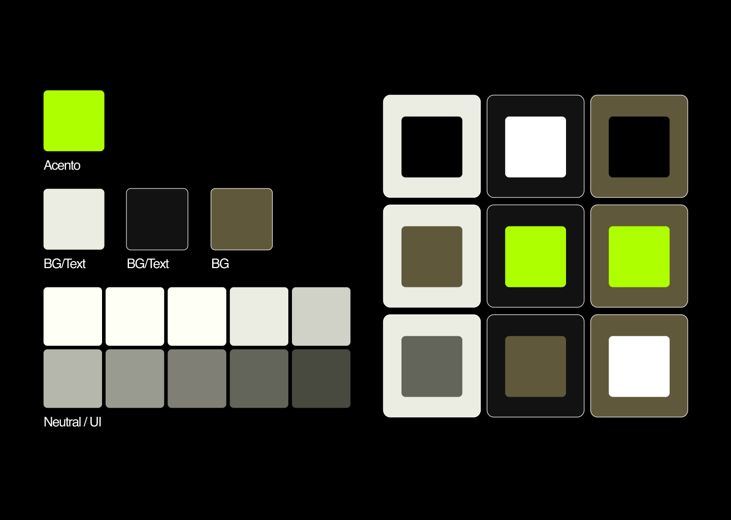
The palette was designed around a principle of visual restraint, avoiding fatigue while reinforcing the firm’s premium positioning.
Challenge Black #121212 and white operate as the dominant structural colours. Used in large blocks, they convey sobriety, elegance and absolute clarity.
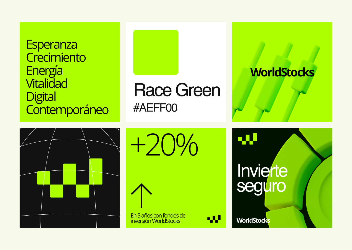
Race Green #AEFF00 introduces a vibrant and contemporary neon accent. It symbolises energy, digital vitality and exponential growth.
Its use is reserved exclusively for interactive elements, conversion buttons, key iconography and selected social media highlights. It is never applied to large background areas, preserving the platform’s usability and keeping the visual system sharp, focused and controlled.
Photographic Art Direction
We established a dual visual code for image treatment, dividing content according to its communicative intention.
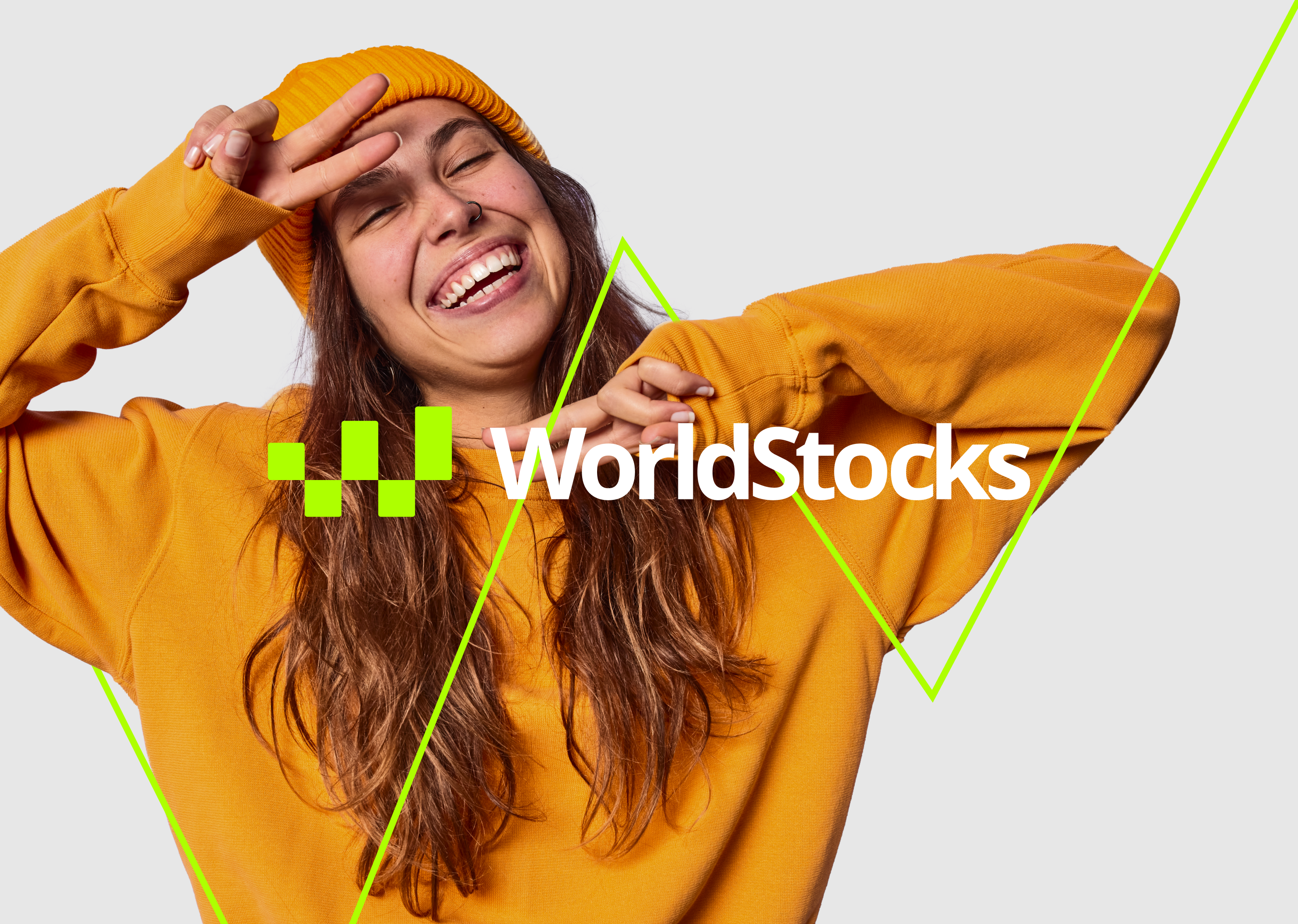
Human Approach: Portraits and Community: Full colour photography with natural, clean and warm tones. These images show young adults, between 25 and 40 years old, in relaxed professional settings, wearing smart casual outfits such as blazers, shirts or jumpers paired with jeans. The goal is to project professionalism without rigidity.
Conceptual Approach: The Journey
Black and white cinematic images of long distance runners. They avoid any sense of extreme fatigue, sweat or forced effort, focusing instead on sustained discipline and measured movement.
These photographs receive a subtle ochre treatment #B6B2E, adding warmth and calm while evoking the idea of a safe, reflective journey.
Digital Product Design
We developed a bespoke information architecture on WordPress, designed to support the brand’s different business lines with clarity and precision.
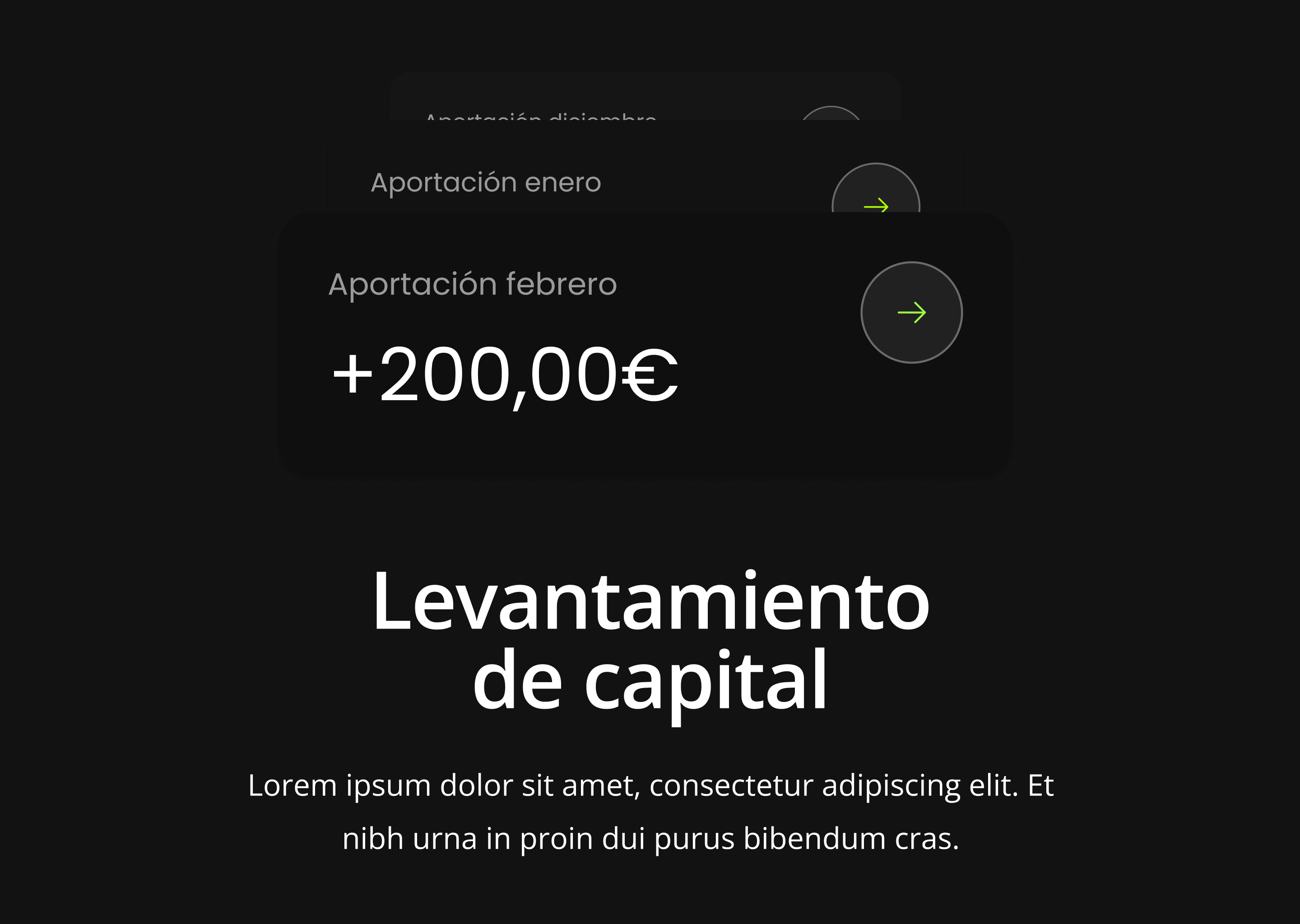
The corporate website for the investment fund was built around a non negotiable premise: mathematical and executive clarity. The interface focuses on immediately solving the needs of a qualified investor.
A design system was created in Figma to build the brand across social media and prepare the future digital products WorldStocks needed to implement.
Transparency Structure: Fact Sheets and Reports: We designed a direct download repository for monthly fact sheets, CNMV brochures and quarterly investor letters. The UI uses a compact typographic grid that communicates order, neatness and absolute analytical control.
Guided Subscription Flow: The user journey ends in a clean and direct conversion block, guiding investors step by step on how to join the fund through authorised distributors. The interface reduces bureaucratic friction through clarity, structure and an impeccable digital experience.


The Strategic Impact and Value of the Project
The work developed by Personaje Studio for WorldStocks demonstrates the real impact of connecting a systematic identity design approach with a company’s business objectives.
For WorldStocks, the value of this redesign was not merely aesthetic. It gave a young financial firm the visual and technological structure it needed to stop being perceived as an educational content channel and to position itself formally as a premium, honest and transparent investment house.
By unifying its communication into a coherent system, from its most rigorous technical analysis to its website, podcast visual identity and annual letters to investors, the brand now has a scalable digital platform ready to lead a generational shift in the Spanish speaking financial market.