Yolé
Redefining the Frozen Yogurt Landscape The frozen yogurt category had become saturated with predictable visual codes: overly sweet colour palettes, childish typography and a generic franchise aesthetic that diluted the true value of the product.
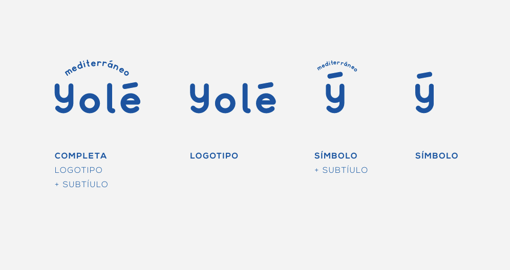
Mediterranean Spirit
The challenge was to conceptualise a global brand from the ground up, with the ambition to lead the category and the personality to stand out from day one.
We needed to build an identity that could break away completely from the competition, bringing the spirit, light and attitude of the Mediterranean into an international mass market product.
That is how Yolé was born: a brand designed to ask for no permission, with a bold attitude that celebrates product quality, pleasure and the joy of living.
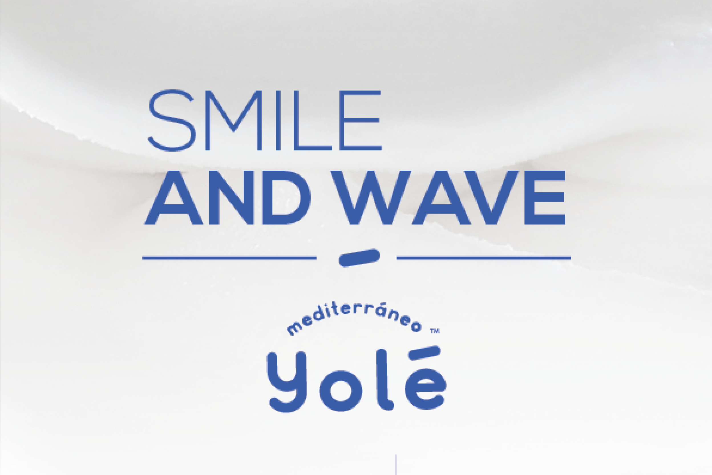
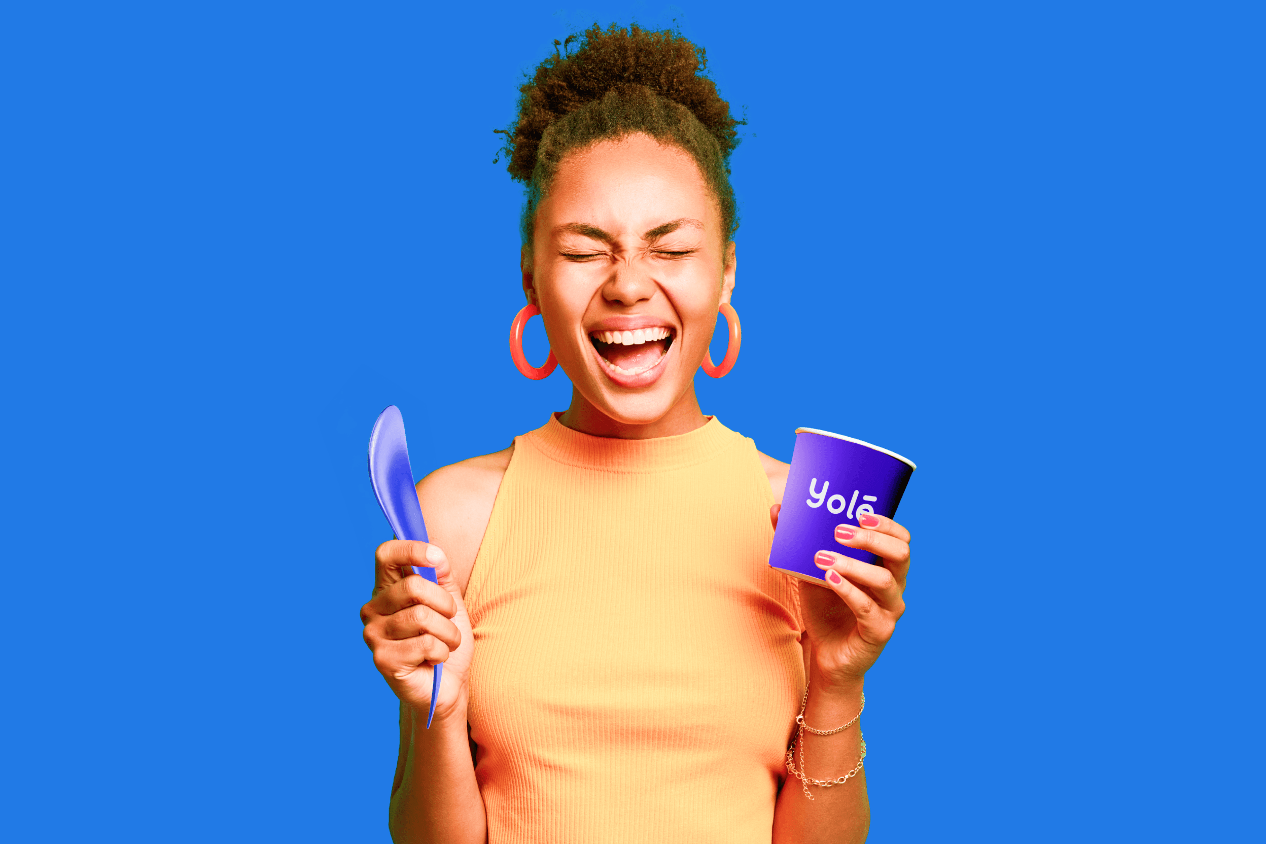
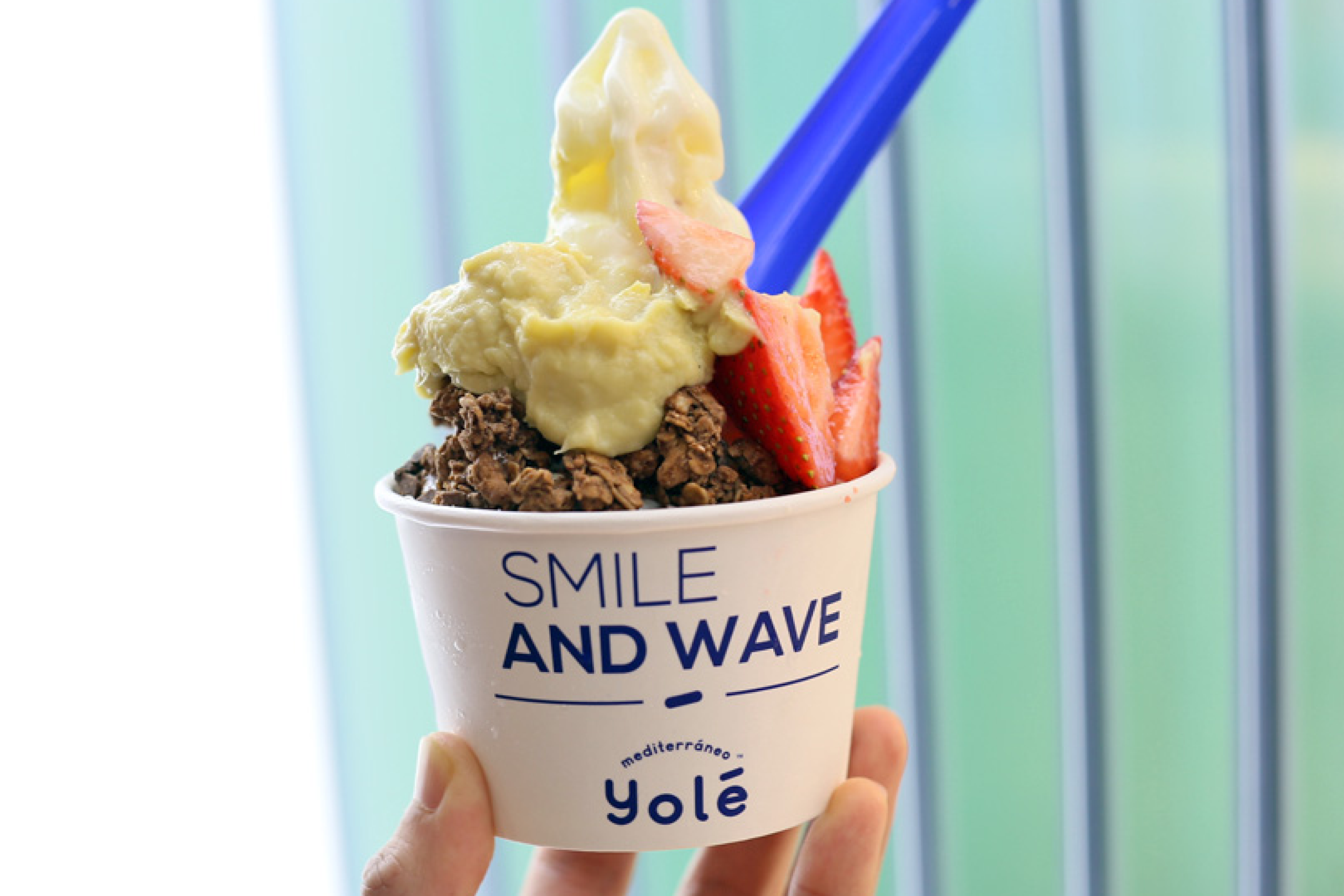
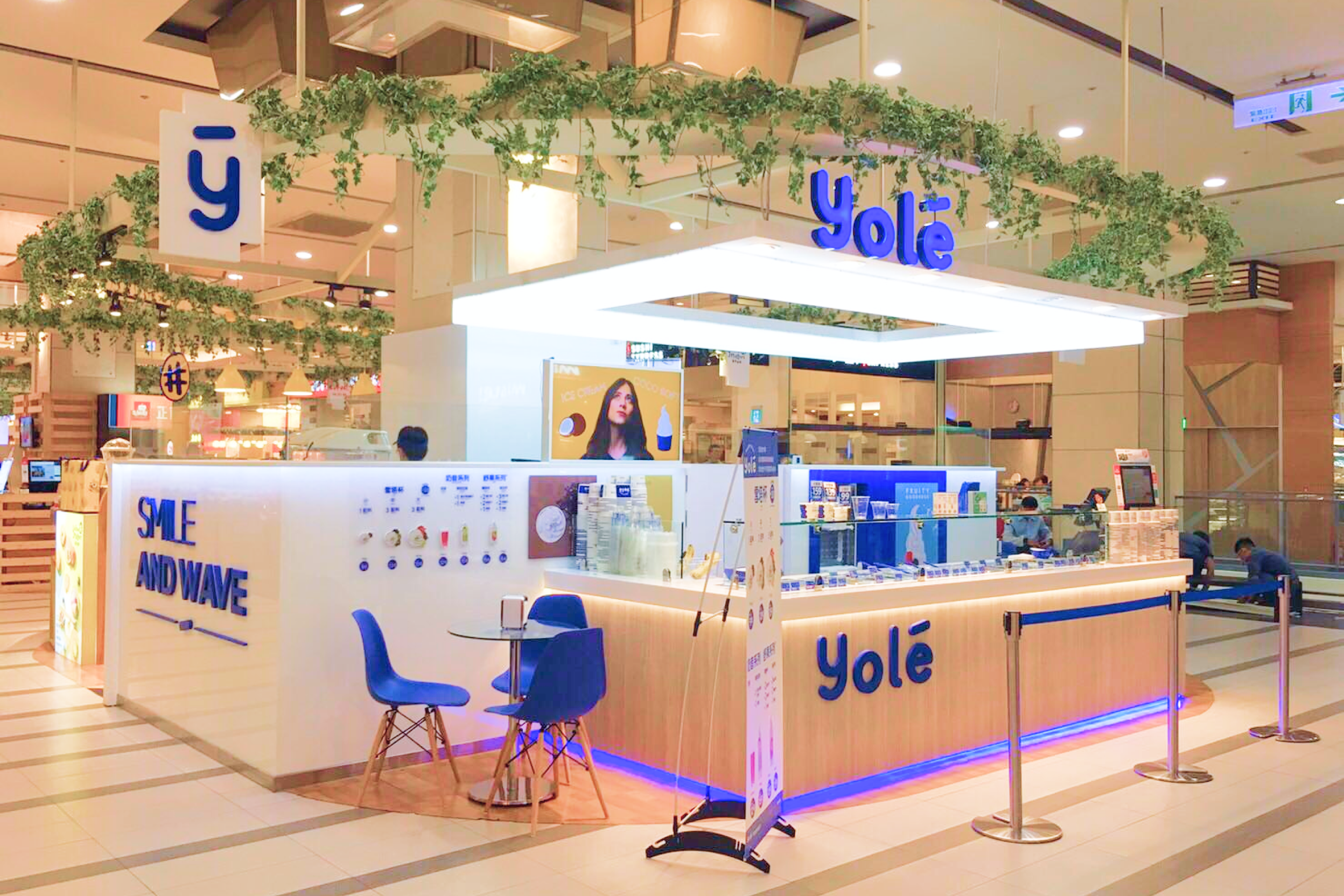
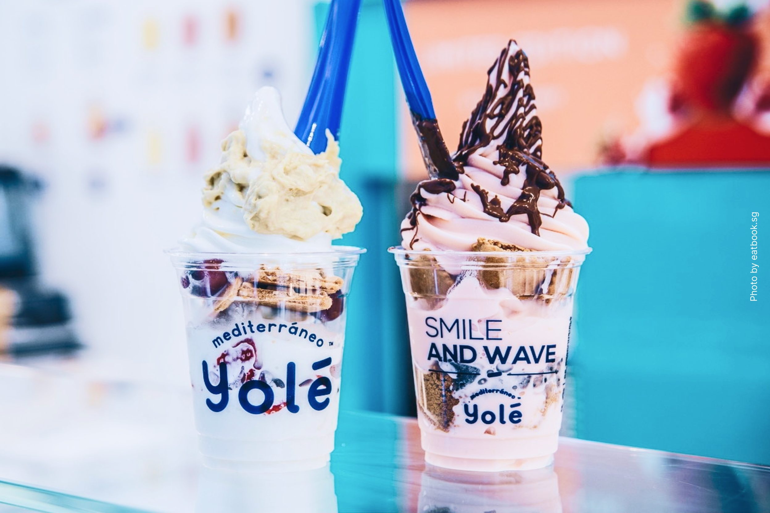
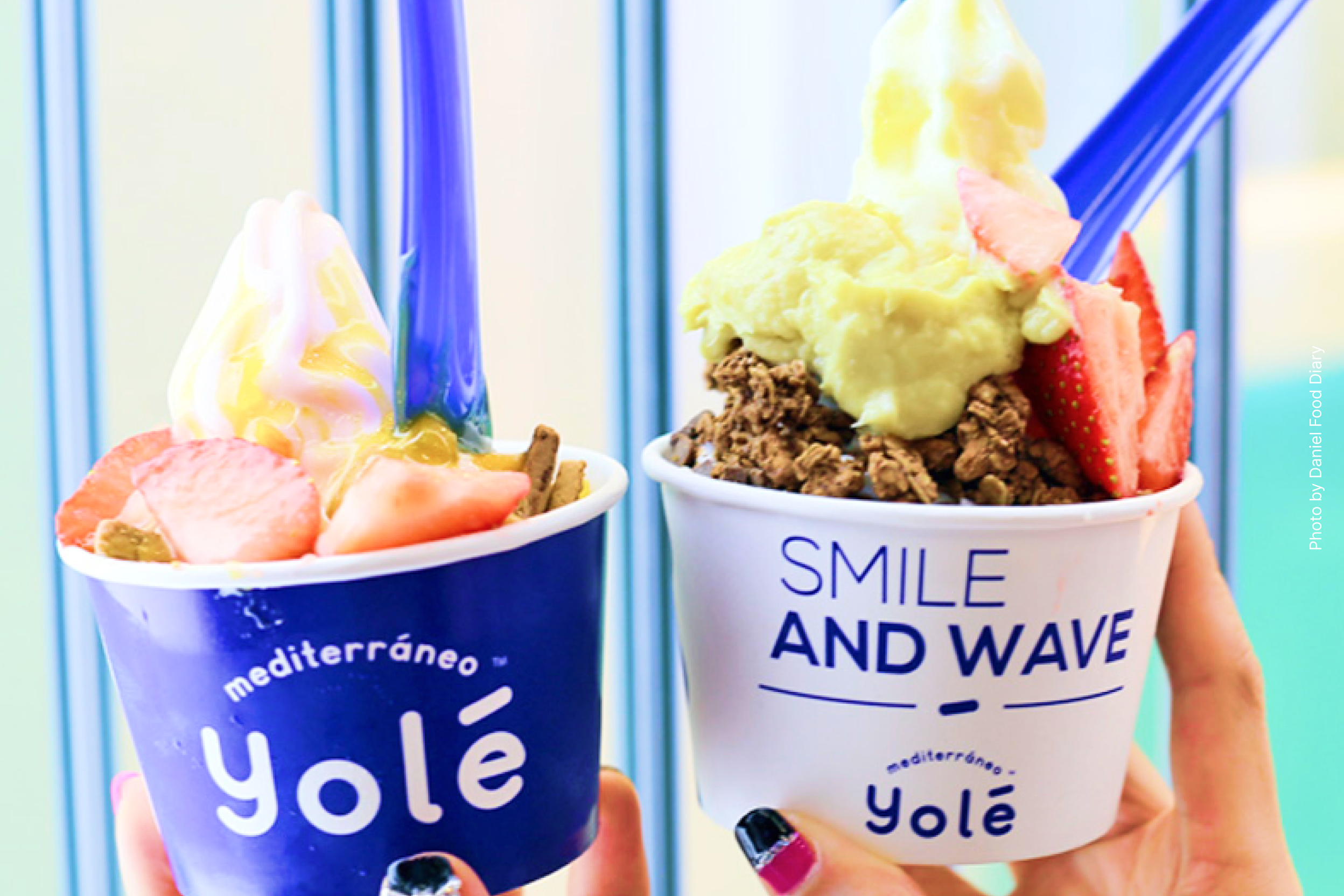
Smile And wave
Organic Geometry and Smile and Wave Attitude:
The development of the visual identity required a careful balance between corporate strength and organic freshness.
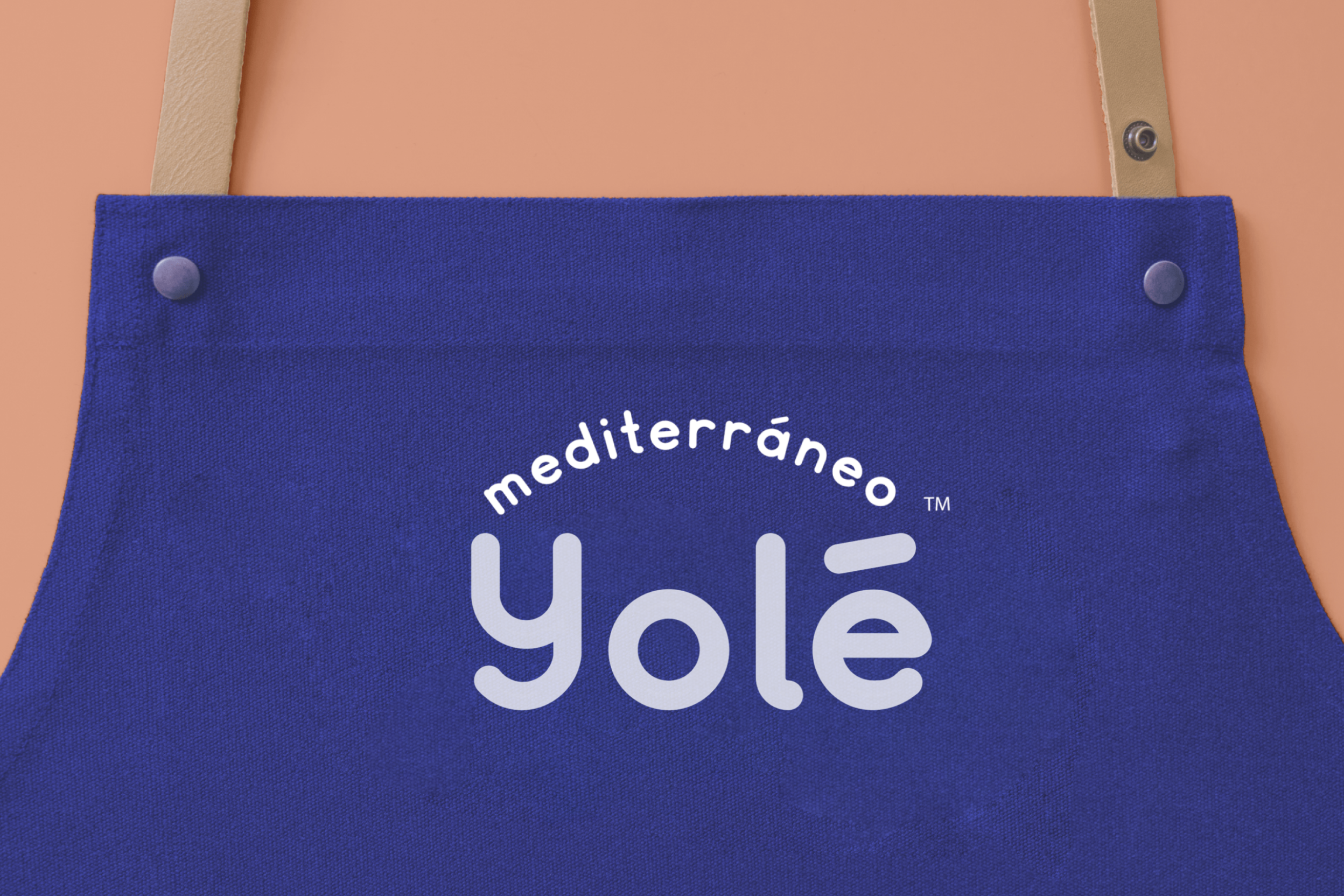
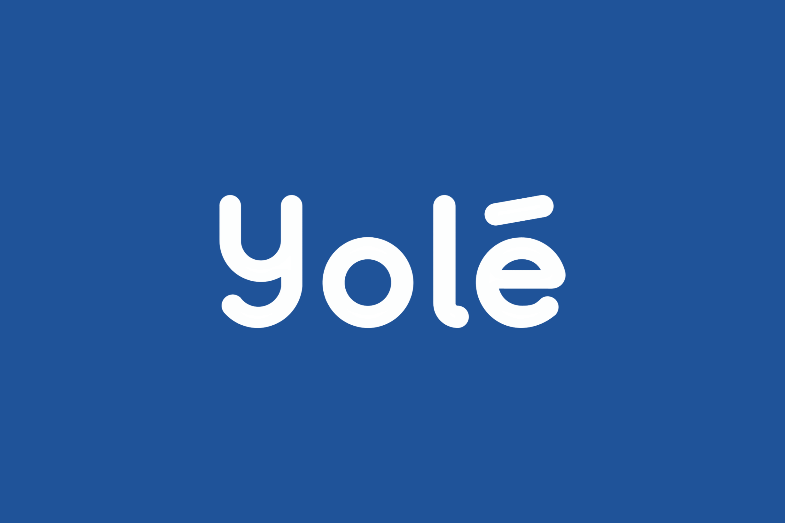
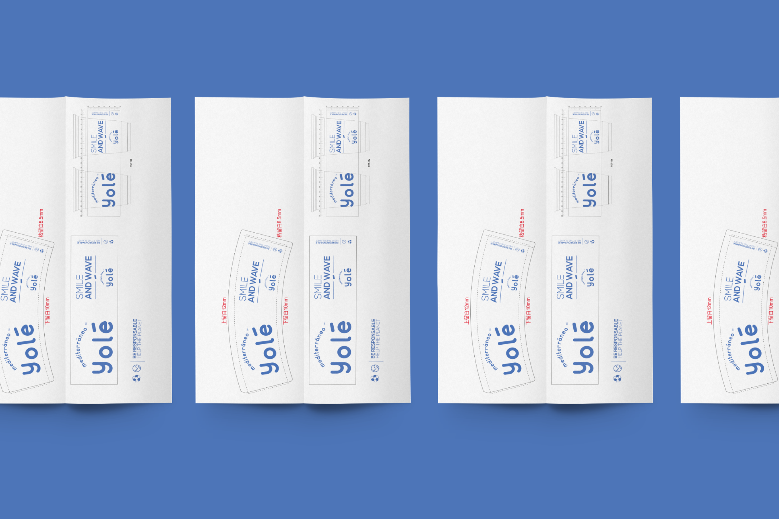
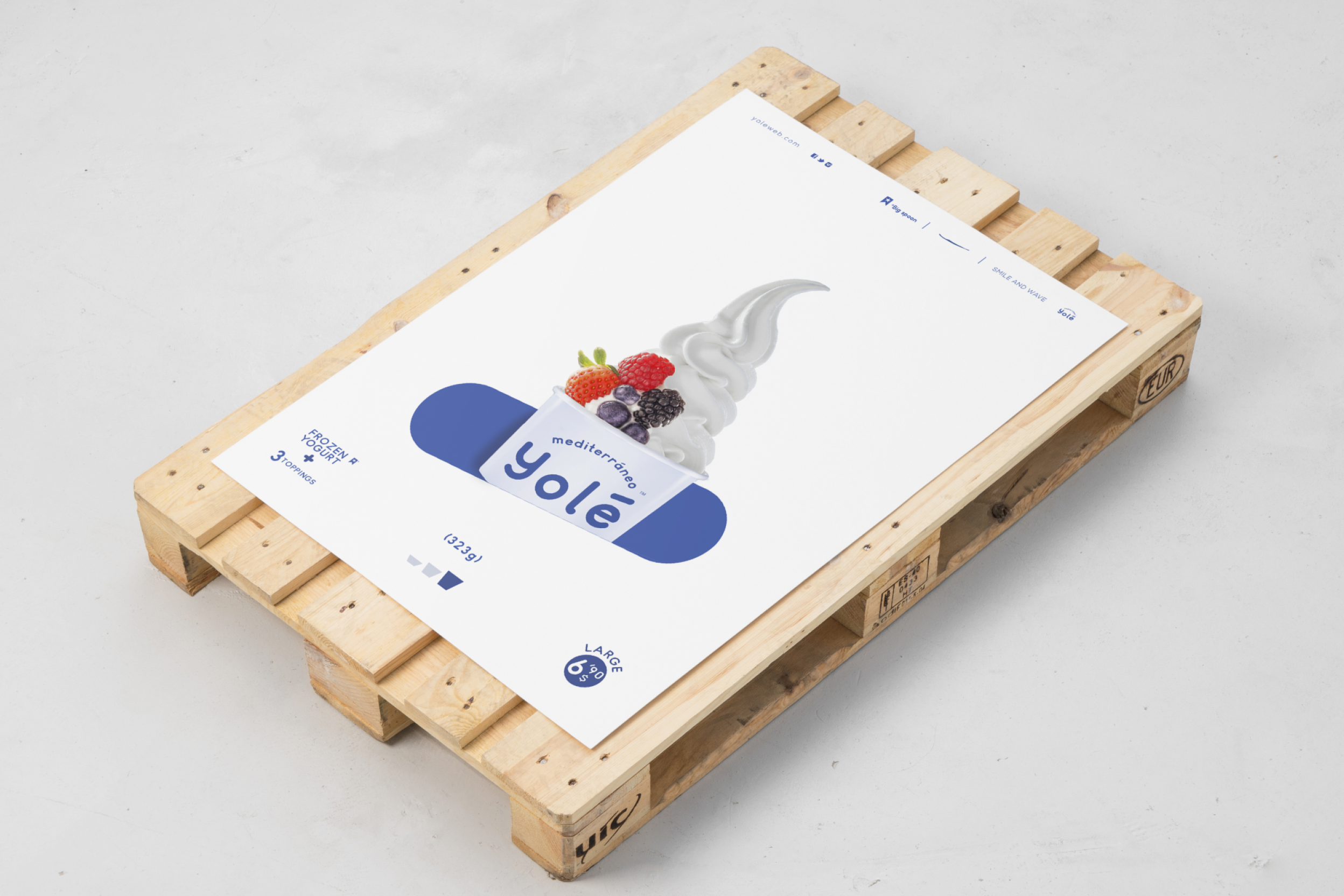
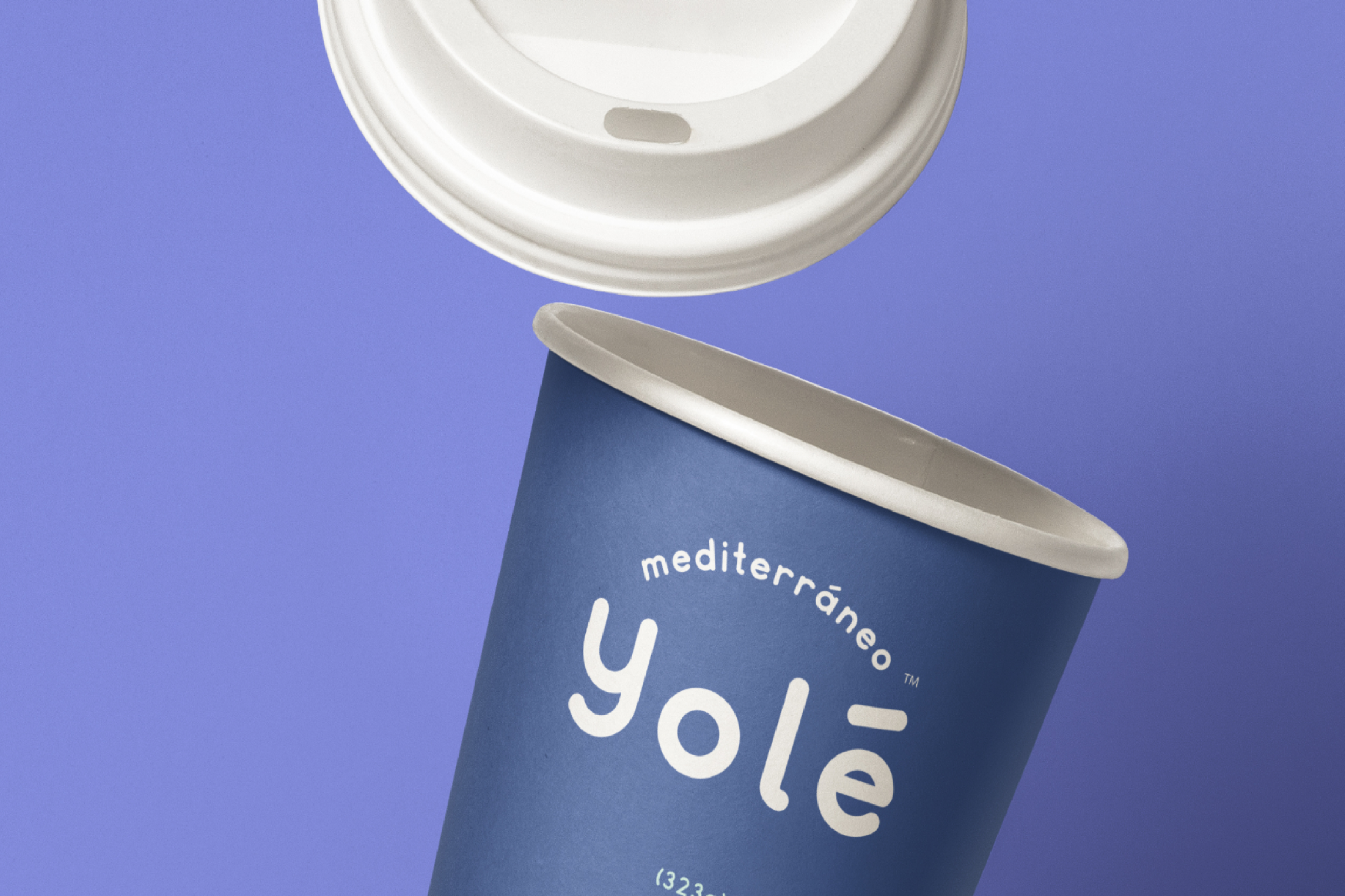
The Yolé logo moves away from sterile typography and embraces friendly, rounded and almost liquid forms, evoking the texture and creaminess of frozen yogurt itself.
The accent over the final e adds both phonetic and graphic tension, giving the name an international and memorable personality.
To complement the main brand, we developed the claim and secondary seal SMILE AND WAVE. This mantra, set in a clean geometric sans serif, creates a structural counterpoint to the organic shapes of the logo while capturing the carefree, bright and optimistic attitude of the brand.
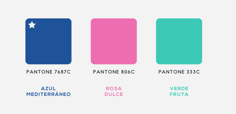
Mediterranean Blue
The most radical and defining decision of the project was chromatic. We rejected the pastel greens and magenta tones commonly found in the category. Instead, Yolé’s visual system is built around Cobalt Blue, a deep and electric shade.
This blue is not simply a corporate colour. It is a statement of intent, directly evoking the intensity of the Mediterranean Sea and the contemporary architectural design of Southern Europe’s coastal cities.
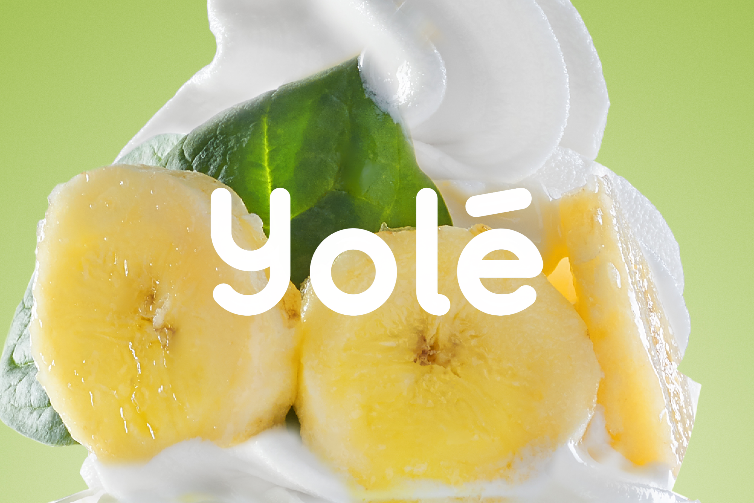
To create a softer and more appetising contrast, we introduced two secondary tones, pink and green. These colours balance the visual coolness of the blue while connecting naturally with the product’s ingredients, such as fruit, cereals and chocolate, as well as the freshness of the retail spaces.
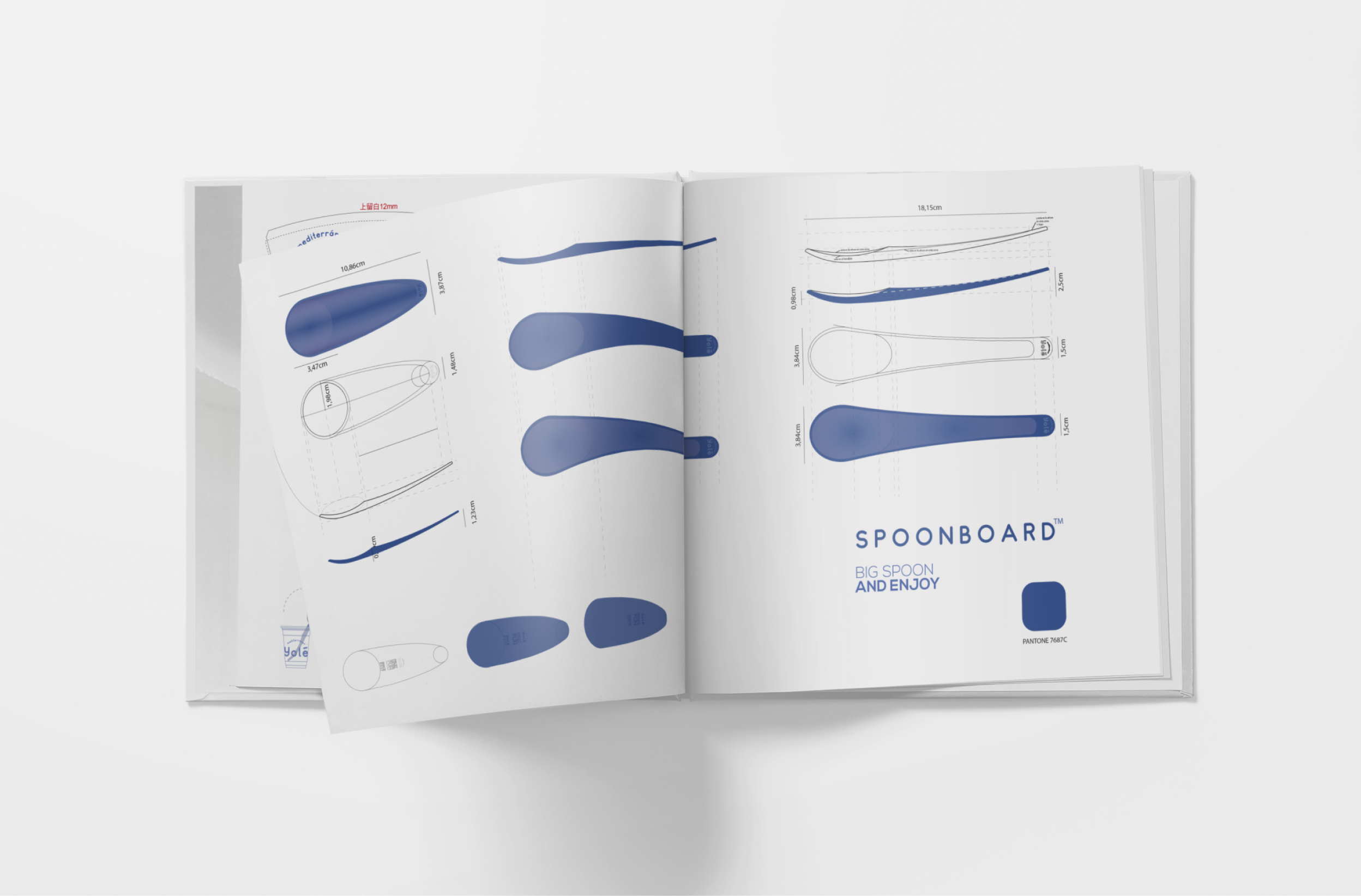
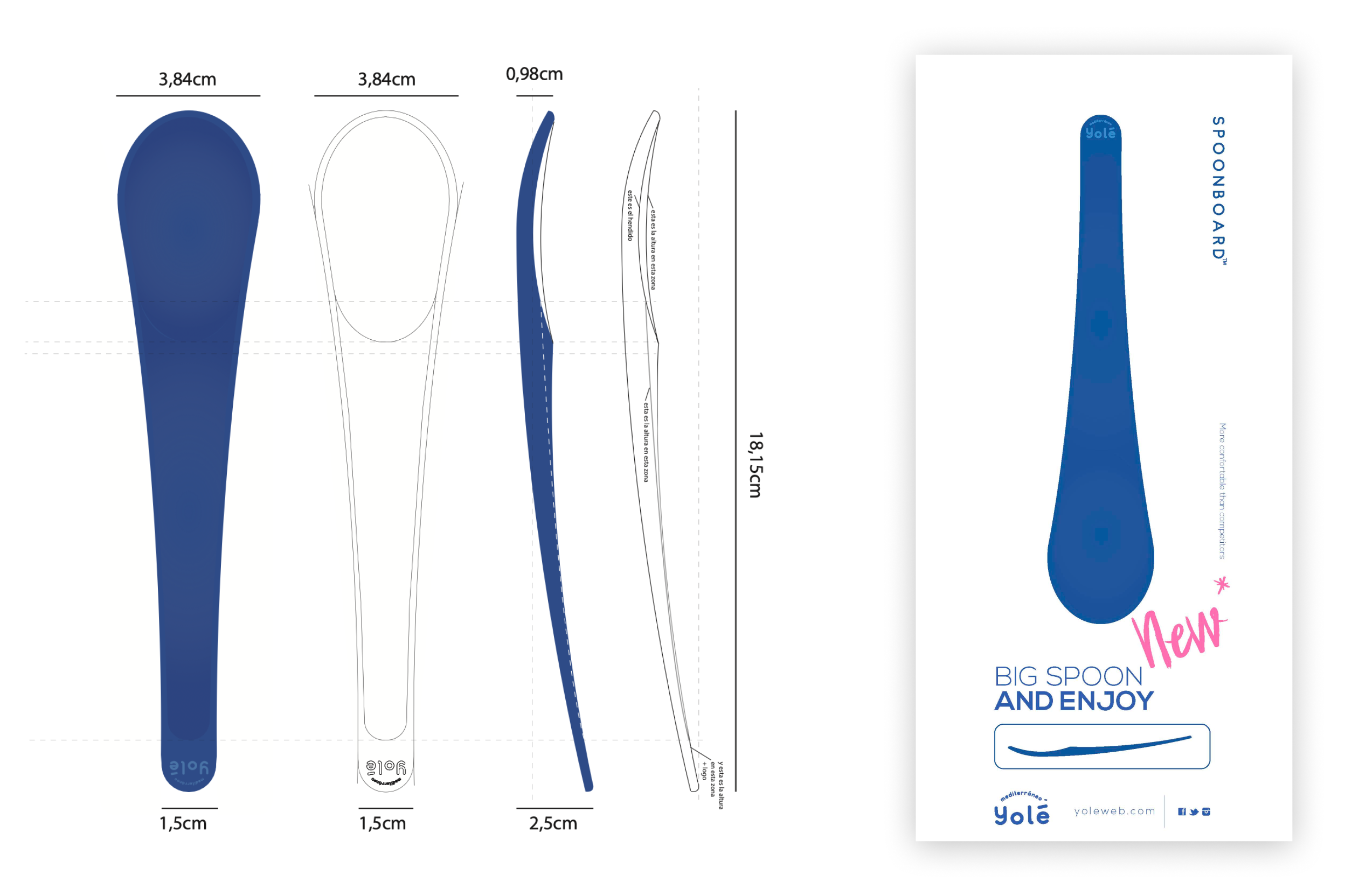
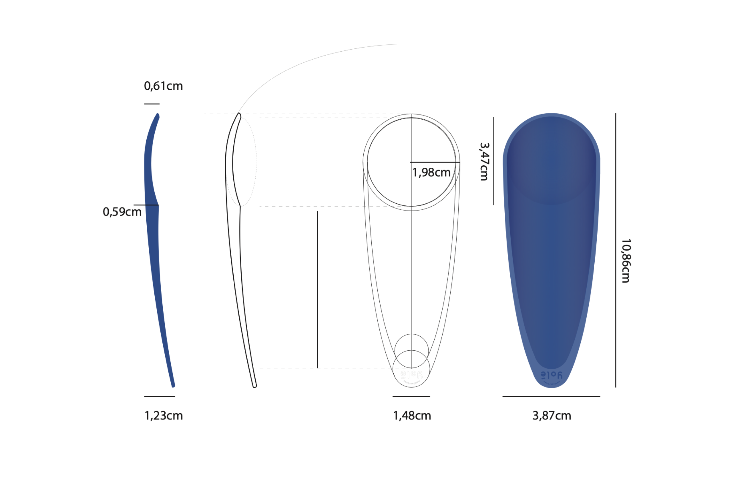
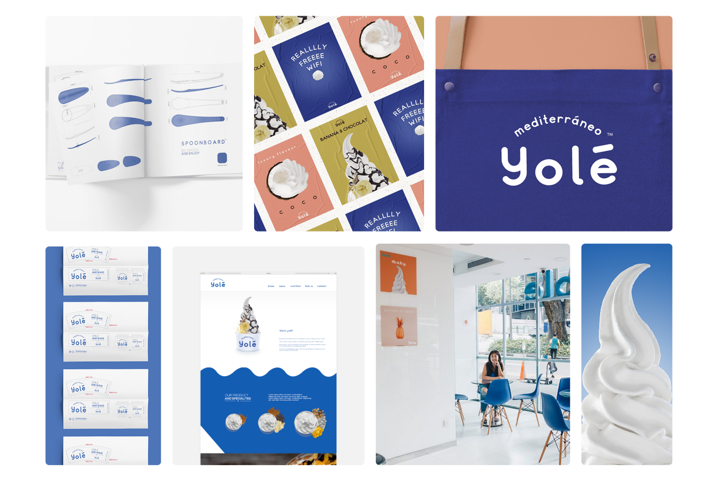
The Spoonboard
In a holistic brand creation project, the user experience must remain coherent across every physical touchpoint. For Yolé, Personaje Studio took on the challenge of redesigning the most iconic object in frozen yogurt consumption: the spoon.
Rather than settling for standard industrial options, we designed a custom utensil internally named Spoonboard.
Through a detailed ergonomic study, analysing length, width and curvature radius, the spoon was shaped with an elongated profile and a wide, flat base, subtly recalling the silhouette of a surfboard.
Injected in the brand’s signature Cobalt Blue, this industrial design piece elevates the consumption experience and reinforces the visual identity with every bite.
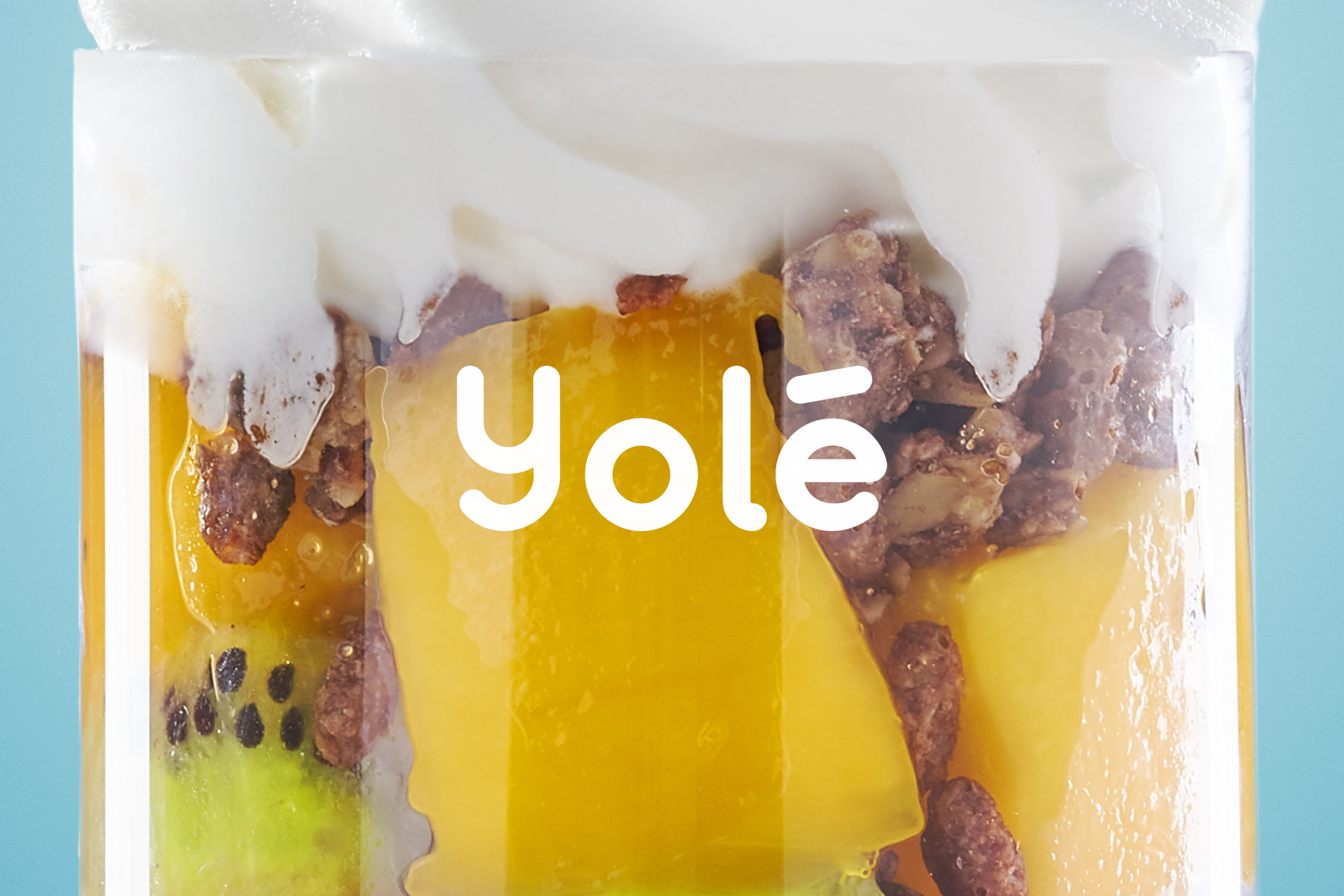
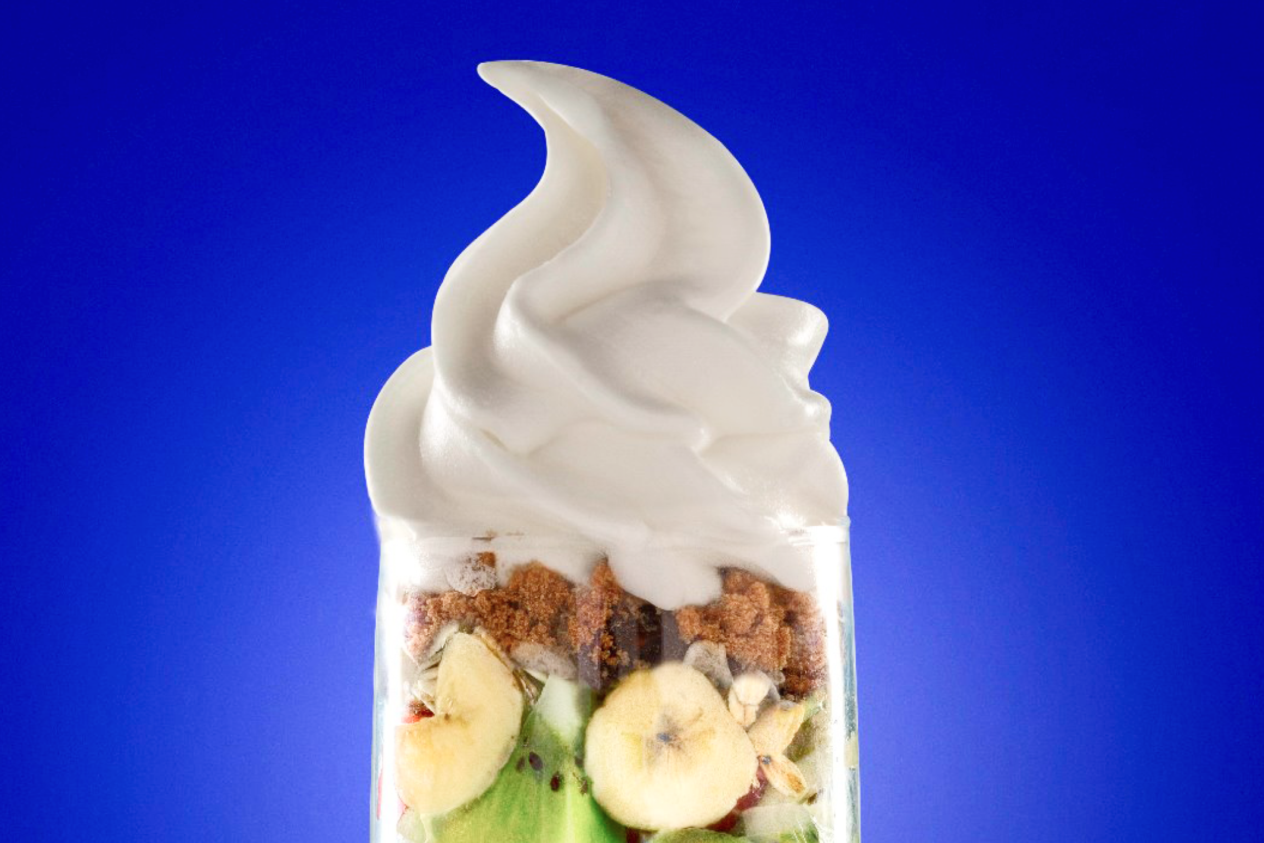
Photography and Editorial Composition
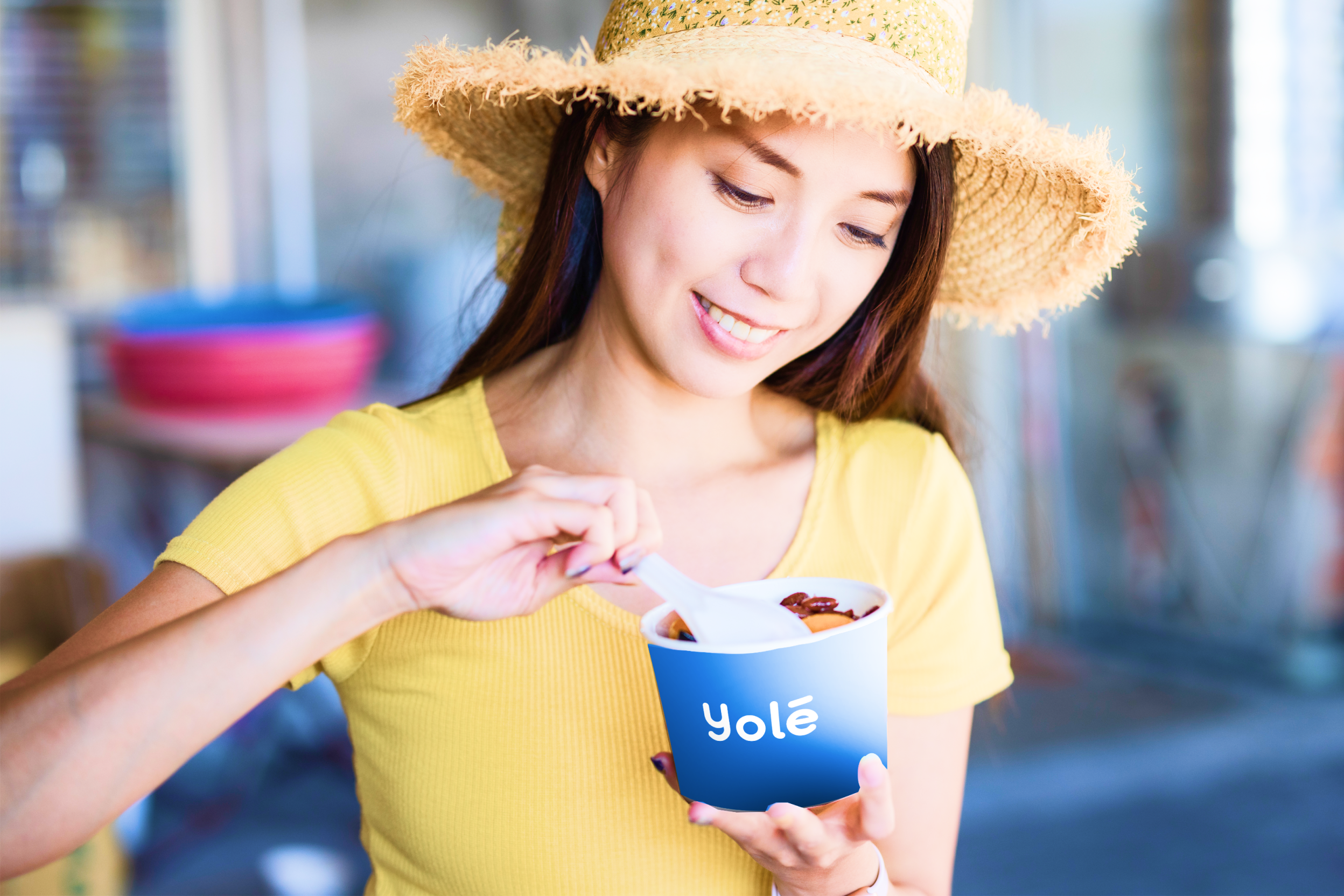
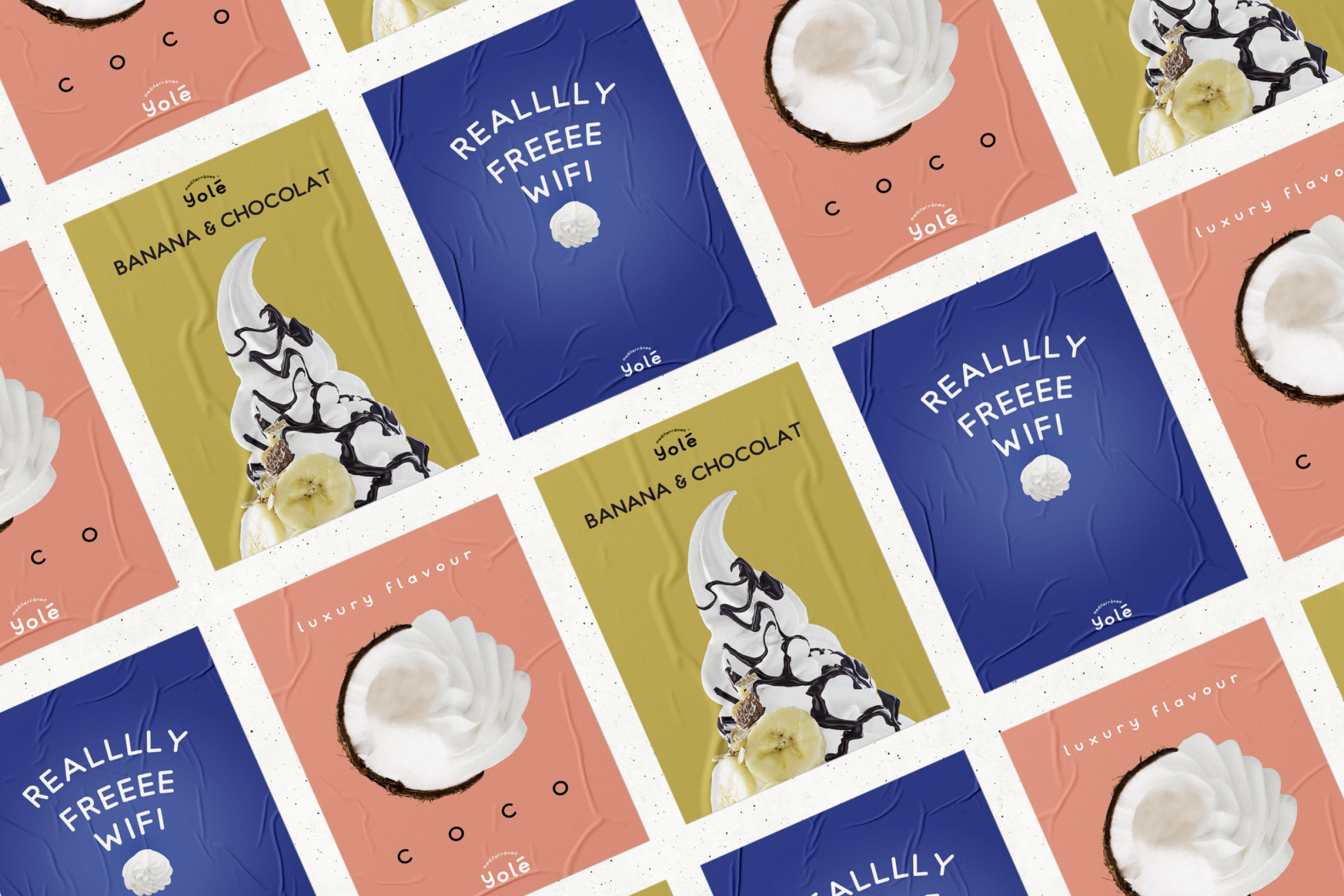
To give Yolé a more premium visual language, we created product photography sessions that moved away from the artificial and oversaturated still life imagery commonly used by competitors.
We chose clean, overhead and direct lighting to highlight the perfect texture of the frozen yogurt and the freshness of the toppings, from banana and kiwi to chocolate and red berries. These images are integrated into a modular card system inspired by contemporary editorial design.
We also designed flyposting style posters that play with zoomed in ingredients and playful handwritten typography, such as REALLY FREEEE WIFI. This creates an urban, street culture inspired aesthetic that connects naturally with a younger audience.
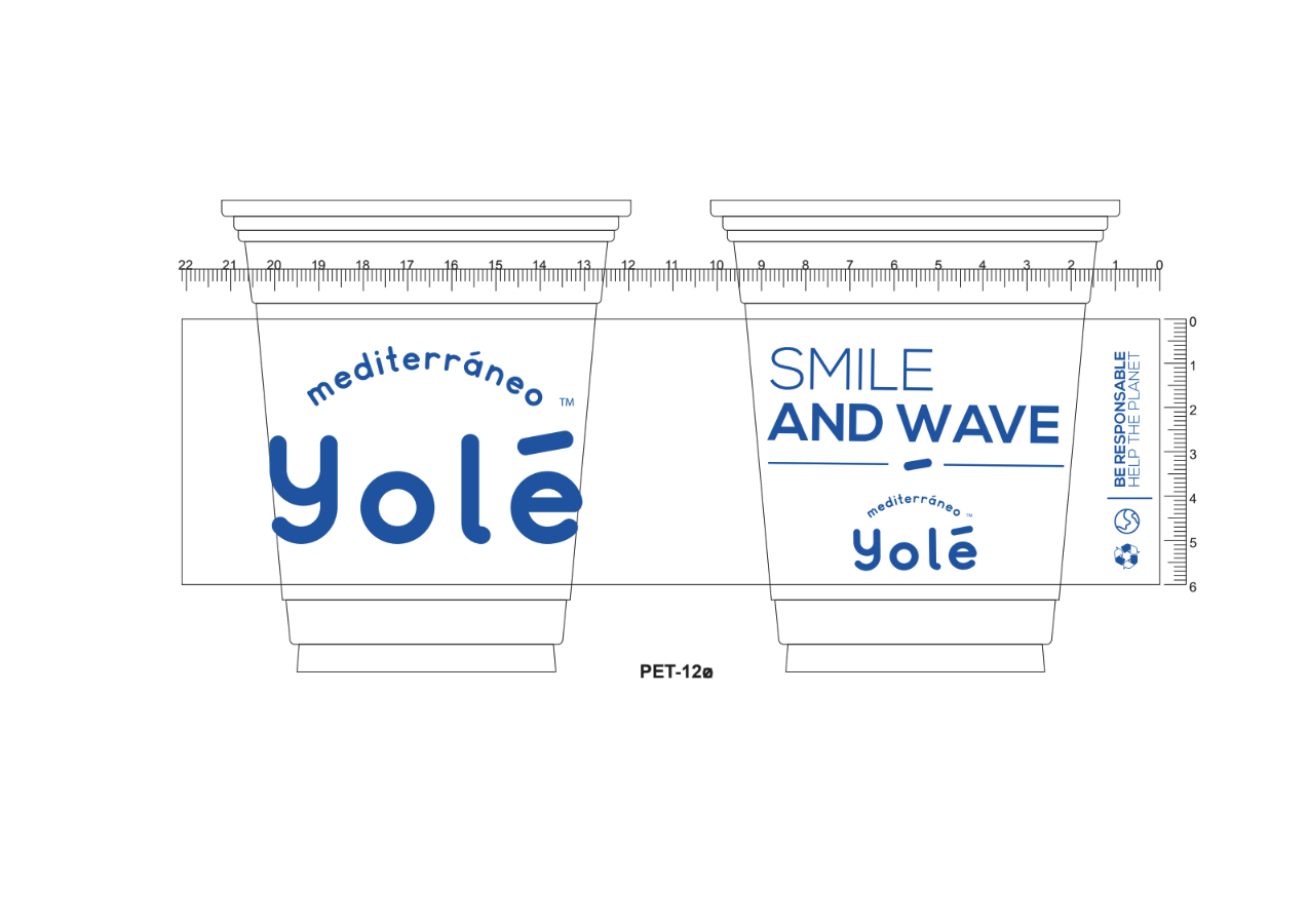
The repetition of modules and the confident use of negative space, built around pure white, ensure that the product remains the absolute hero across every graphic application. This approach extends from eco cups with messages such as BE RESPONSABLE, HELP THE PLANET, to staff aprons and the interior design of the retail spaces.
Fluidity and Clarity
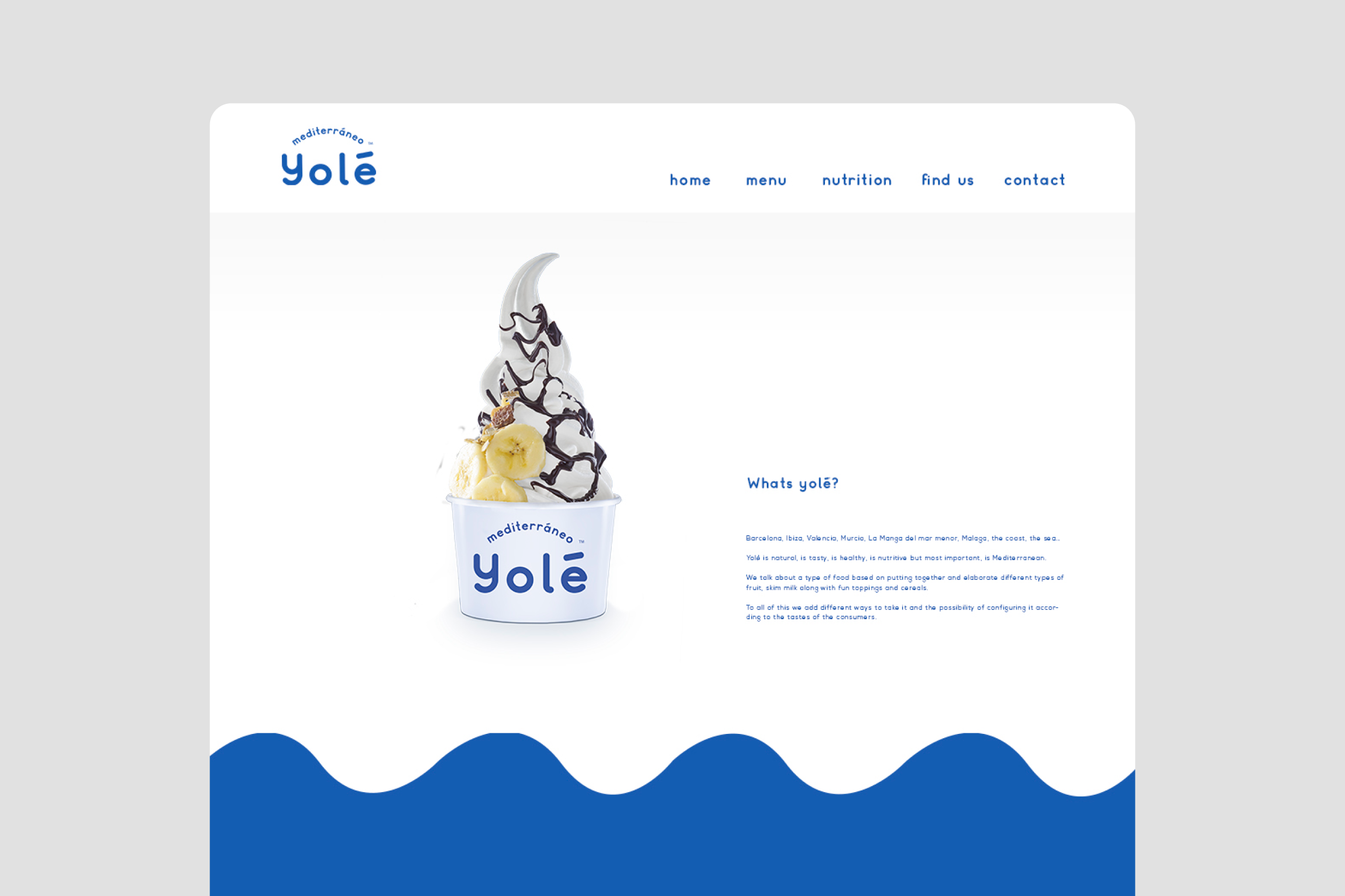
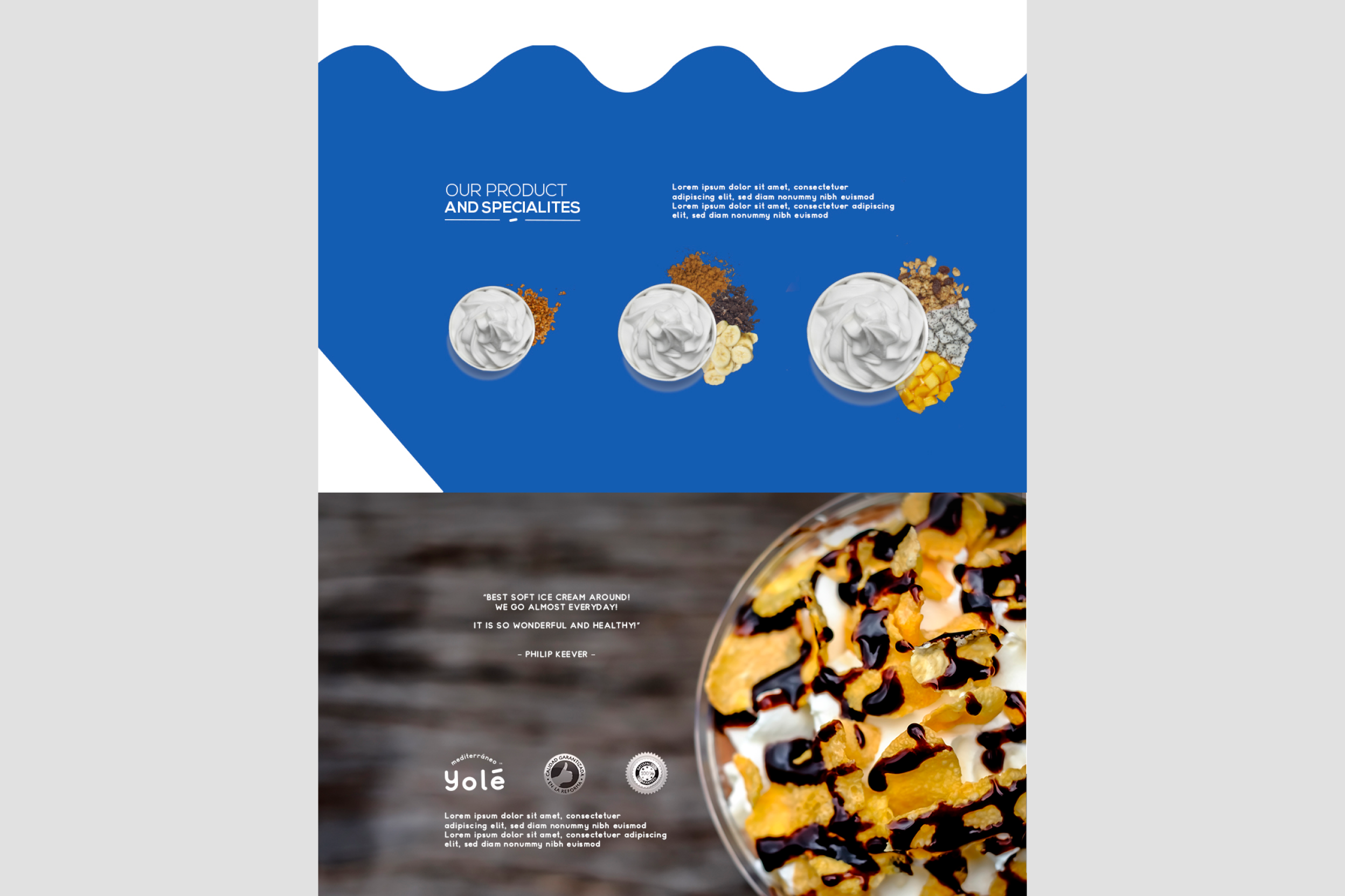
Translating the identity into the digital ecosystem, from web to social media, required preserving the same sense of freshness, clarity and ease.
The web experience was built around a predominantly white canvas, using Cobalt Blue to structure information through soft, wave like forms that evoke both the movement of the Mediterranean Sea and the smoothness of the yogurt.
The navigation is intuitive and clean, prioritising product visibility, nutritional values and store locations. Every interaction was designed to ensure that Yolé’s Mediterranean attitude feels consistent, effortless and unmistakable across every screen.
The Triumph of Differentiation
The Yolé project demonstrates how a mass market FMCG brand can be built from a genuinely strategic and design led perspective.
By bringing together naming, visual identity, industrial design and art direction under the guiding concept of the Mediterranean, we created a brand with the authority, energy and magnetism needed to compete globally and lead the category.
“YOLÉ”
— “Turning frozen yogurt into a Mediterranean state of mind.”